2.6.2. Configure Attribute
After creating your own custom attribute, you can use it when building a document type form, in the Constructor tab: Designer subtab.
When using an attribute on a document type form, you can also configure how the attribute appears.
Configure the created attribute according to its type, using the hints from one of the following sections:
- Text
- HTML Content
- Number
- Date and/or Time
- Reference
- Multiple Reference
- Hyperlink
- Boolean
- Table/Collection
- File
- File Collection
2.6.2.1. Text
To configure a custom attribute of type Text (marked with the icon in the attribute menu), follow these steps:
-
Open the document type in which you want to configure the attribute (see the Edit Document Type section).
-
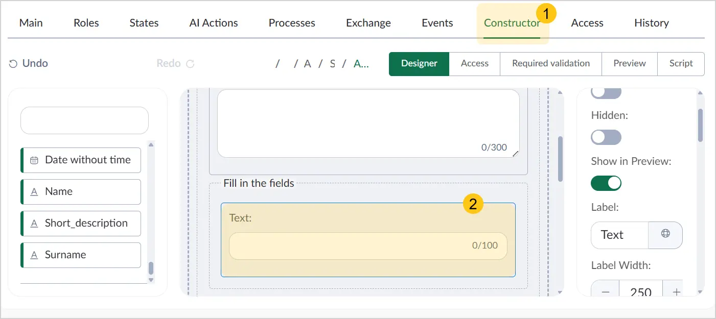
Go to the Constructor tab 1, then on the document form, select the added Text attribute 2.
-
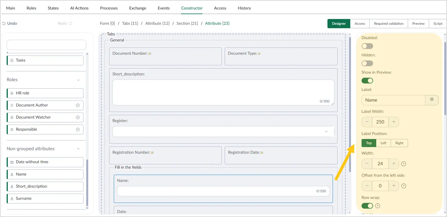
In the Settings menu on the right, configure the required parameters using the hints from the table below.
| Field name | Description |
|---|---|
| Disabled | Enable the toggle to prevent users from editing this attribute. Applies to all users and document type states. |
| Hidden | Enable the toggle to hide this attribute from users. Applies to all users and document type states. |
| Label | The attribute name displayed on the form. |
| Label width | Enter the desired label width. The value is measured in pixels (px). ℹ️ Note: Width settings are only available if you selected Left or Right in the Label position field. |
| Label position | Select where the label is placed relative to the attribute value. Available options:
|
| Width | Specify the width of the attribute input field. Minimum value — "0", maximum value — "24". |
| Offset from the left side | Size of the left indent. Minimum value — "0", maximum value — "24". |
| Row wrap | Enable this toggle if you want all subsequent attributes to start on a new line and not occupy the free space in the current attribute's row. |
| Height | Select a unit of measurement from the following options:
|
| Placeholder | Text displayed in the attribute as a hint. When the user selects the input field, it clears and becomes ready for input. ℹ️ Note: You can set an alternative placeholder for different languages. To do so, in the Placeholder field, select the icon and fill in the fields for other languages. Then select the Apply button. |
| Show character count | Enable the toggle to display the available character count. |
| Default value | Enter the value to be set as the default for the attribute. You can manually change the attribute value when creating a document. |
-
In the toolbar, select Save, then proceed to fill in the following sections:
- a Access section
- b Required validation section
- c Script section
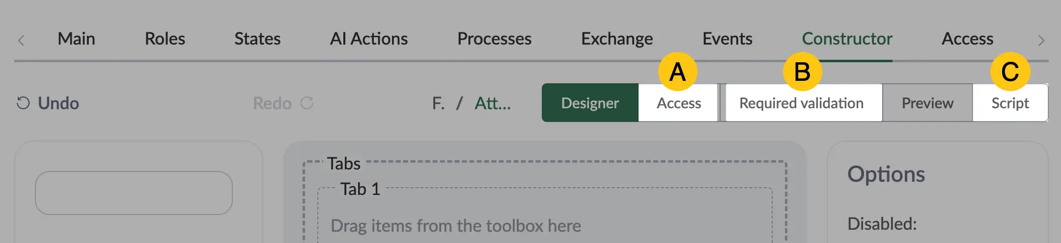
After completing the attribute settings, you can go to the Preview section to check how the attribute will appear on the document form.
2.6.2.2. HTML Content
To configure a custom attribute of type HTML Content (marked with the icon in the attribute menu), follow these steps:
-
Open the document type in which you want to configure the attribute (see the Edit Document Type section).
-
Go to the Constructor tab 1, then on the document form, select the added HTML Content attribute 2.
-
In the Settings menu on the right, configure the required parameters using the hints from the table below.
| Field name | Description |
|---|---|
| Width | Specify the width of the attribute input field. Minimum value — "0", maximum value — "24". |
| Offset from the left side | Size of the left indent. Minimum value — "0", maximum value — "24". |
| Row wrap | Enable this toggle if you want all subsequent attributes to start on a new line and not occupy the free space in the current attribute's row. |
-
In the toolbar, select Save, then proceed to fill in the following sections:
- a Access section
- b Required validation section
- c Script section
After completing the attribute settings, you can go to the Preview section to check how the attribute will appear on the document form.
2.6.2.3. Number
To configure a custom attribute of type Number (marked with the and icons in the attribute menu), follow these steps:
-
Open the document type in which you want to configure the attribute (see the Edit Document Type section).
-
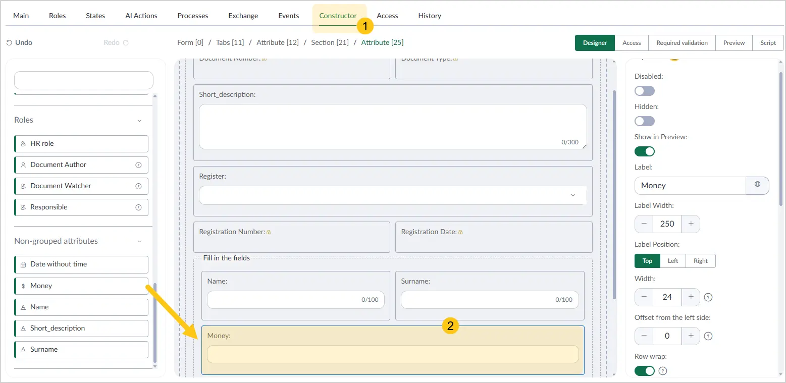
Go to the Constructor tab 1, then on the document form, select the added Number attribute 2.
-
In the Settings menu on the right, configure the required parameters using the hints from the table below.
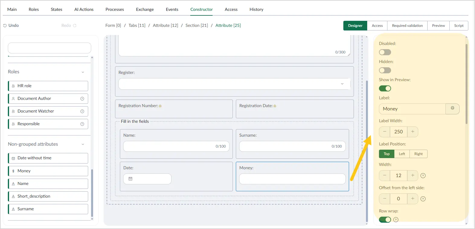
| Field name | Description |
|---|---|
| Disabled | Enable the toggle to prevent users from editing this attribute. Applies to all users and document type states. |
| Hidden | Enable the toggle to hide this attribute from users. Applies to all users and document type states. |
| Label | The attribute name displayed on the form. |
| Label width | Enter the desired label width. The value is measured in pixels (px). ℹ️ Note: Width settings are only available if you selected Left or Right in the Label position field. |
| Label position | Select where the label is placed relative to the attribute value. Available options:
|
| Width | Specify the width of the attribute input field. Minimum value — "0", maximum value — "24". |
| Offset from the left side | Size of the left indent. Minimum value — "0", maximum value — "24". |
| Row wrap | Enable this toggle if you want all subsequent attributes to start on a new line and not occupy the free space in the current attribute's row. |
| Height | Select a unit of measurement from the following options:
|
| Placeholder | Text displayed in the attribute as a hint. When the user selects the input field, it clears and becomes ready for input. ℹ️ Note: You can set an alternative placeholder for different languages. To do so, in the Placeholder field, select the icon and fill in the fields for other languages. Then select the Apply button. |
| Default value | Enter the value to be set as the default for the attribute. You can manually change the attribute value when creating a document. |
-
In the toolbar, select Save, then proceed to fill in the following sections:
- a Access section
- b Required validation section
- c Script section
After completing the attribute settings, you can go to the Preview section to check how the attribute will appear on the document form.
2.6.2.4. Date and/or Time
To configure a custom attribute of type Date and/or Time (marked with the and icons in the attribute menu), follow these steps:
-
Open the document type in which you want to configure the attribute (see the Edit Document Type section).
-
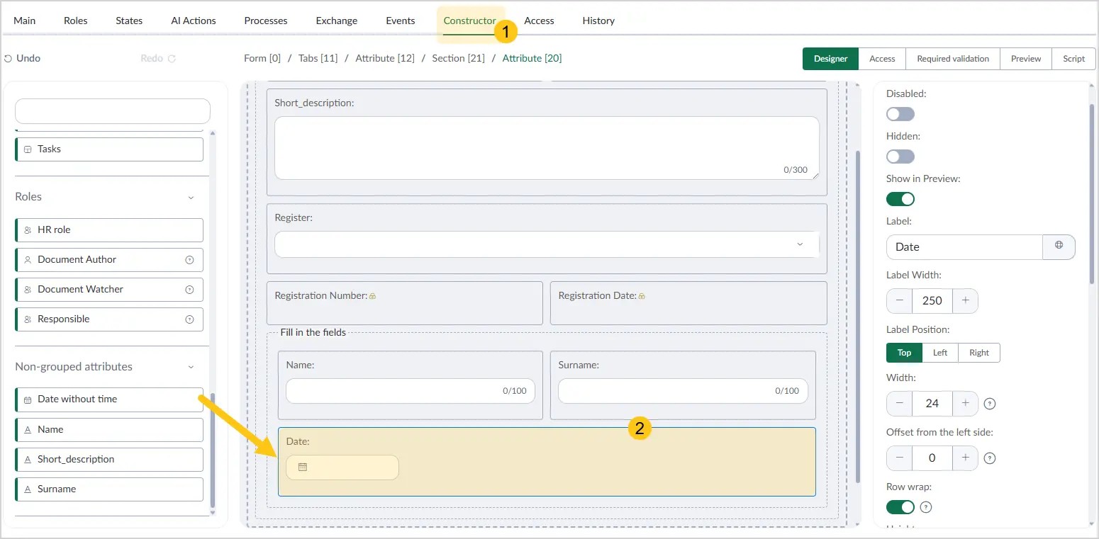
Go to the Constructor tab 1, then on the document form, select the added Date and/or Time attribute 2.
-
In the Settings menu on the right, configure the required parameters using the hints from the table below.
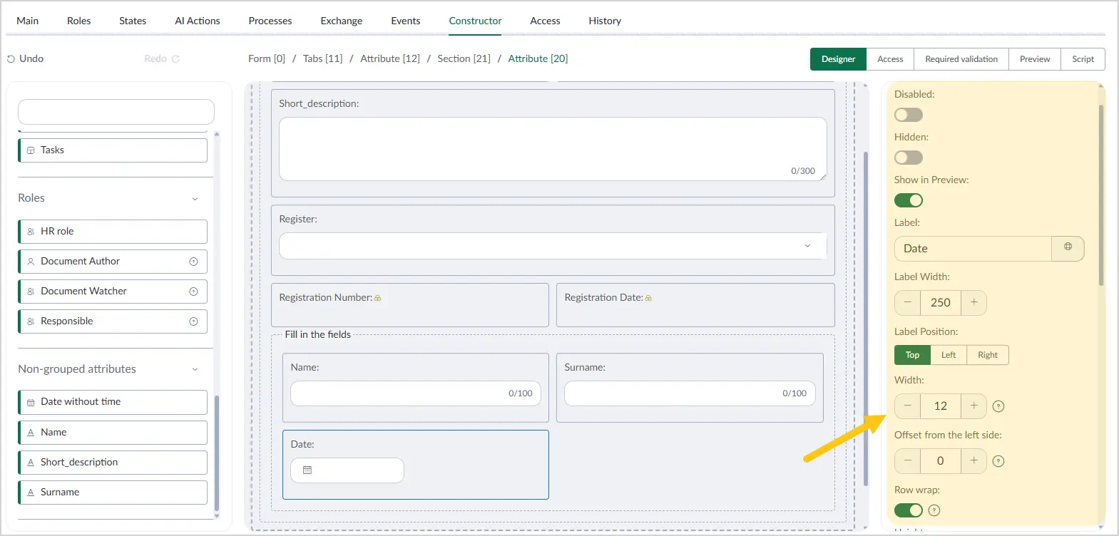
| Field name | Description |
|---|---|
| Disabled | Enable the toggle to prevent users from editing this attribute. Applies to all users and document type states. |
| Hidden | Enable the toggle to hide this attribute from users. Applies to all users and document type states. |
| Label | The attribute name displayed on the form. |
| Label width | Enter the desired label width. The value is measured in pixels (px). ℹ️ Note: Width settings are only available if you selected Left or Right in the Label position field. |
| Label position | Select where the label is placed relative to the attribute value. Available options:
|
| Width | Specify the width of the attribute input field. Minimum value — "0", maximum value — "24". |
| Offset from the left side | Size of the left indent. Minimum value — "0", maximum value — "24". |
| Row wrap | Enable this toggle if you want all subsequent attributes to start on a new line and not occupy the free space in the current attribute's row. |
| Height | Select a unit of measurement from the following options:
|
| Placeholder | Text displayed in the attribute as a hint. When the user selects the input field, it clears and becomes ready for input. ℹ️ Note: You can set an alternative placeholder for different languages. To do so, in the Placeholder field, select the icon and fill in the fields for other languages. Then select the Apply button. |
| Default value | Enter the value to be set as the default for the attribute. You can manually change the attribute value when creating a document. |
| Create calendar event | Toggle that enables the creation of a calendar event using the attribute value. |
| Calendar | Select the calendar in which the event will be created. |
| Description | The name of the event as it will appear in the calendar. |
-
In the toolbar, select Save, then proceed to fill in the following sections:
- a Access section
- b Required validation section
- c Script section
After completing the attribute settings, you can go to the Preview section to check how the attribute will appear on the document form.
2.6.2.5. Reference
To configure a custom attribute of type Reference (marked with the icon in the attribute menu), follow these steps:
-
Open the document type in which you want to configure the attribute (see the Edit Document Type section).
-
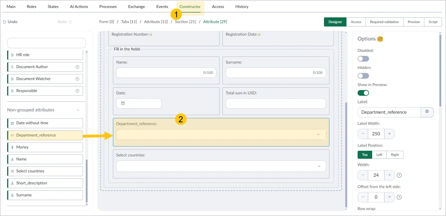
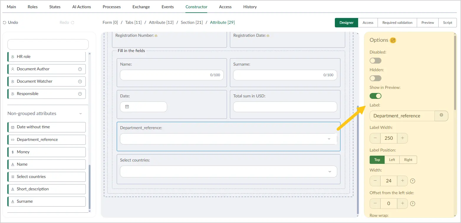
Go to the Constructor tab 1, then on the document form, select the added Reference attribute 2.
-
In the Settings menu on the right, configure the required parameters using the hints from the table below.
| Field name | Description |
|---|---|
| Disabled | Enable the toggle to prevent users from editing this attribute. Applies to all users and document type states. |
| Hidden | Enable the toggle to hide this attribute from users. Applies to all users and document type states. |
| Label | The attribute name displayed on the form. |
| Label width | Enter the desired label width. The value is measured in pixels (px). |
| Label position | Select where the label is placed on the form — top, right, or left. |
| Width | Specify the width of the attribute input field. Minimum value — "0", maximum value — "24". |
| Offset from the left side | Size of the left indent. Minimum value — "0", maximum value — "24". |
| Row wrap | Enable this toggle if you want all subsequent attributes to start on a new line and not occupy the free space in the current attribute's row. |
| Height | Select a unit of measurement from the following options:
|
| Placeholder | Text displayed in the attribute as a hint. When the user selects the input field, it clears and becomes ready for input. ℹ️ Note: You can set an alternative placeholder for different languages. To do so, in the Placeholder field, select the icon and fill in the fields for other languages. Then select the Apply button. |
| Search Strategy in Dictionary | When a user adds a value to this attribute, the platform will suggest selecting a value from the directory. Select one of the following search strategies:
|
| Default value | The default value to be set for the attribute. |
-
In the toolbar, select Save, then proceed to fill in the following sections:
- a Access section
- b Required validation section
- c Script section
After completing the attribute settings, you can go to the Preview section to check how the attribute will appear on the document form.
2.6.2.6. Multiple Reference
To configure a custom attribute of type Multiple Reference (marked with the icon in the attribute menu), follow these steps:
-
Open the document type in which you want to configure the attribute (see the Edit Document Type section).
-
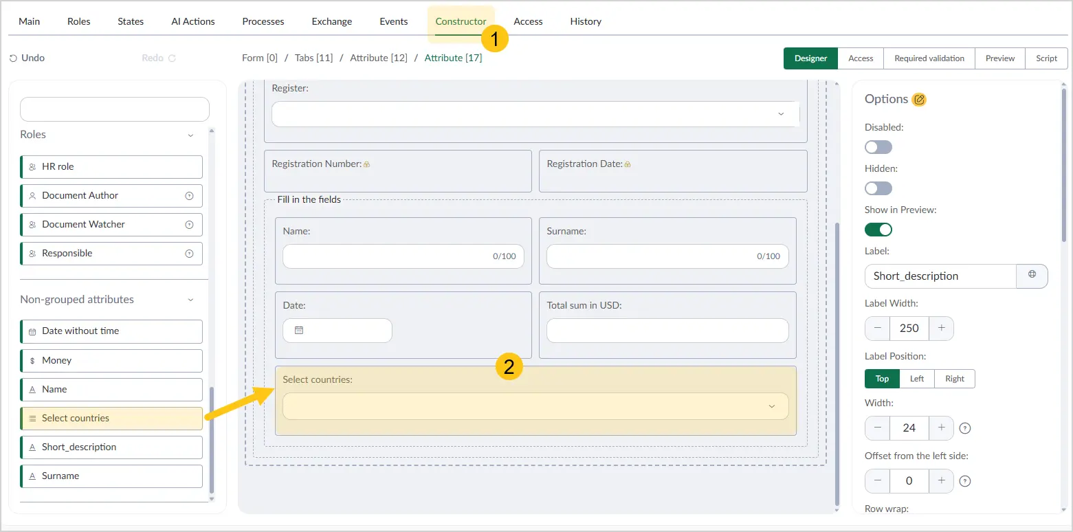
Go to the Constructor tab 1, then on the document form, select the added Multiple Reference attribute 2.
-
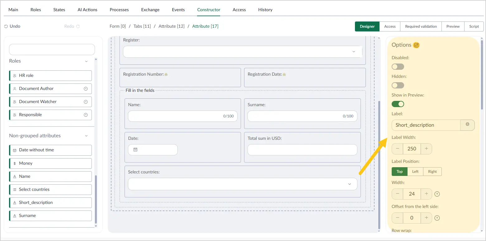
In the Settings menu on the right, configure the required parameters using the hints from the table below.
| Field name | Description |
|---|---|
| Disabled | Enable the toggle to prevent users from editing this attribute. Applies to all users and document type states. |
| Hidden | Enable the toggle to hide this attribute from users. Applies to all users and document type states. |
| Label | The attribute name displayed on the form. |
| Label width | Enter the desired label width. The value is measured in pixels (px). ℹ️ Note: Width settings are only available if you selected Left or Right in the Label position field. |
| Label position | Select where the label is placed relative to the attribute value. Available options:
|
| Width | Specify the width of the attribute input field. Minimum value — "0", maximum value — "24". |
| Offset from the left side | Size of the left indent. Minimum value — "0", maximum value — "24". |
| Row wrap | Enable this toggle if you want all subsequent attributes to start on a new line and not occupy the free space in the current attribute's row. |
| Height | Select a unit of measurement from the following options:
|
| Placeholder | Text displayed in the attribute as a hint. When the user selects the input field, it clears and becomes ready for input. ℹ️ Note: You can set an alternative placeholder for different languages. To do so, in the Placeholder field, select the icon and fill in the fields for other languages. Then select the Apply button. |
| Search Strategy in Dictionary | When a user adds a value to this attribute, the platform will suggest selecting a value from the directory. Select one of the following search strategies:
|
| Default value | The default value to be set for the attribute. |
-
In the toolbar, select Save, then proceed to fill in the following sections:
- a Access section
- b Required validation section
- c Script section
After completing the attribute settings, you can go to the Preview section to check how the attribute will appear on the document form.
2.6.2.7. Hyperlink
To configure a custom attribute of type Hyperlink (marked with the icon in the attribute menu), follow these steps:
-
Open the document type in which you want to configure the attribute (see the Edit Document Type section).
-
Go to the Constructor tab 1, then on the document form, select the added Hyperlink attribute 2.
-
In the Settings menu on the right, configure the required parameters using the hints from the table below.
| Field name | Description |
|---|---|
| Disabled | Enable the toggle to prevent users from editing this attribute. Applies to all users and document type states. |
| Hidden | Enable the toggle to hide this attribute from users. Applies to all users and document type states. |
| Label | The attribute name displayed on the form. |
| Label width | Enter the desired label width. The value is measured in pixels (px). ℹ️ Note: Width settings are only available if you selected Left or Right in the Label position field. |
| Label position | Select where the label is placed relative to the attribute value. Available options:
|
| Width | Specify the width of the attribute input field. Minimum value — "0", maximum value — "24". |
| Offset from the left side | Size of the left indent. Minimum value — "0", maximum value — "24". |
| Row wrap | Enable this toggle if you want all subsequent attributes to start on a new line and not occupy the free space in the current attribute's row. |
| Height | Select a unit of measurement from the following options:
|
| External link | Toggle that allows opening links to external web pages (they will open in a new window). |
| Default value | Enter the value to be set as the default for the attribute. You can manually change the attribute value when creating a document. |
-
In the toolbar, select Save, then proceed to fill in the following sections:
- a Access section
- b Required validation section
- c Script section
After completing the attribute settings, you can go to the Preview section to check how the attribute will appear on the document form.
2.6.2.8. Boolean
To configure a custom attribute of type Boolean (marked with the icon in the attribute menu), follow these steps:
-
Open the document type in which you want to configure the attribute (see the Edit Document Type section).
-
Go to the Constructor tab 1, then on the document form, select the added Boolean attribute 2.
-
In the Settings menu on the right, configure the required parameters using the hints from the table below.
| Field name | Description |
|---|---|
| Disabled | Enable the toggle to prevent users from editing this attribute. Applies to all users and document type states. |
| Hidden | Enable the toggle to hide this attribute from users. Applies to all users and document type states. |
| Label | The attribute name displayed on the form. |
| Label width | Enter the desired label width. The value is measured in pixels (px). ℹ️ Note: Width settings are only available if you selected Left or Right in the Label position field. |
| Label position | Select where the label is placed relative to the attribute value. Available options:
|
| Width | Specify the width of the attribute input field. Minimum value — "0", maximum value — "24". |
| Offset from the left side | Size of the left indent. Minimum value — "0", maximum value — "24". |
| Row wrap | Enable this toggle if you want all subsequent attributes to start on a new line and not occupy the free space in the current attribute's row. |
| Height | Select a unit of measurement from the following options:
|
| Default value | Enter the value to be set as the default for the attribute. You can manually change the attribute value when creating a document. |
-
In the toolbar, select Save, then proceed to fill in the following sections:
- a Access section
- b Required validation section
- c Script section
After completing the attribute settings, you can go to the Preview section to check how the attribute will appear on the document form.
2.6.2.9. Table/Collection
To configure a custom attribute of type Table/Collection (marked with the icon in the attribute menu), follow these steps:
-
Open the document type in which you want to configure the attribute (see the Edit Document Type section).
-
Go to the Constructor tab 1, then on the document form, select the added Table/Collection attribute 2.
-
In the Settings menu on the right, configure the required parameters using the hints from the table below.
| Field name | Description |
|---|---|
| Label | The attribute name displayed on the form. |
| Label width | Enter the desired label width. The value is measured in pixels (px). ℹ️ Note: Width settings are only available if you selected Left or Right in the Label position field. |
| Label position | Select where the label is placed relative to the attribute value. Available options:
|
| Width | Specify the width of the attribute input field. Minimum value — "0", maximum value — "24". |
| Offset from the left side | Size of the left indent. Minimum value — "0", maximum value — "24". |
| Row wrap | Enable this toggle if you want all subsequent attributes to start on a new line and not occupy the free space in the current attribute's row. |
| Height | Select a unit of measurement from the following options:
|
-
Configure the actions that the user can perform on the table. These actions will be displayed as buttons when using the attribute. To do this, hover over the added attribute and select the icon.
-
Enable the action toggles 1 you want to activate for the user, then select the Save 2 button. See the Enable File Attribute Actions and Perform File Attribute Actions sections.
-
In the toolbar, select Save, then proceed to fill in the following sections:
- a Access section
- b Required validation section
- c Script section
After completing the attribute settings, you can go to the Preview section to check how the attribute will appear on the document form.
2.6.2.10. File
To configure a custom attribute of type File (marked with the icon in the attribute menu), follow these steps:
-
Open the document type in which you want to configure the attribute (see the Edit Document Type section).
-
Go to the Constructor tab 1, then on the document form, select the added File attribute 2.
-
In the Settings menu on the right, configure the required parameters using the hints from the table below.
| Field name | Description |
|---|---|
| Label | The attribute name displayed on the form. |
| Width | Specify the width of the attribute input field. Minimum value — "0", maximum value — "24". |
| Offset from the left side | Size of the left indent. Minimum value — "0", maximum value — "24". |
| Row wrap | Enable this toggle if you want all subsequent attributes to start on a new line and not occupy the free space in the current attribute's row. |
| Height | Select a unit of measurement from the following options:
|
| Recognition templates | Select one of the recognition templates. A recognition template defines the rules and settings for recognizing text in an image and adding it to the document as a text layer. The recognized text is then automatically entered by the platform as attribute values in the document. ℹ️ Note: Recognition templates are only available when the additional package dfx-idp is installed. |
| AI scenario | Select the AI scenario you want to apply to the document. |
| Document templates | Select a document template from the dropdown list. |
Section Stamp templates
This section is available when the additional package dfx-stamp is installed.
| Field name | Description |
|---|---|
| Stamp templates | Select a stamp template from the dropdown list. |
| Form template | Select a form template from the dropdown list. |
| Allow user to change | Enable the toggle to allow the user to select the stamp template and its placement before applying the stamp. |
| Source | Select the source from which the platform should take the document to stamp. Currently, one option is available: Self — the document to be stamped will be taken from the current document form. |
| Action | Select one of the actions to be performed after the stamp is applied:
|
| Save conditions | Select one of the conditions for handling a signed file:
|
| Destination | Select where to save the stamped file:
|
Section Export settings
This section is available when the additional package dfx-ua-sign-file-export is installed.
| Field name | Description |
|---|---|
| Export rules | Select one of the export conditions:
|
| Allow user to change toggle Available only when With document image and QES visualization is selected in the Export rules field. | When enabled, the user can choose the signature placement parameters. |
| QES page selection Available only when With document image and QES visualization is selected in the Export rules field. | Select the page where QES information will be placed: first or last. |
| QES display order Available only when With document image and QES visualization is selected in the Export rules field. | From first to last or from last to first. |
| QES placement Available only when With document image and QES visualization is selected in the Export rules field. | Select where the QES will be placed on the form:
|
| Related elements | Select one or more attributes from the list to be exported together with this attribute. The list shows all File type attributes on the document form. |
| On version creation | Defines how the File attribute content is handled when a new document version is created.
|
-
Configure the actions the user can perform on the file. Actions will be displayed as buttons when using the attribute. To do this, hover over the added attribute and select the icon.
-
Enable the action toggles 1 you want to activate for the user, then select the Save 2 button. See the Enable File Attribute Actions and Perform File Attribute Actions sections.
-
In the toolbar, select Save, then proceed to fill in the following sections:
- a Access section
- b Required validation section
- c Script section
After completing the attribute settings, you can go to the Preview section to check how the attribute will appear on the document form.
2.6.2.11. File Collection
To configure a custom attribute of type File Collection (marked with the icon in the attribute menu), follow these steps:
-
Open the document type in which you want to configure the attribute (see the Edit Document Type section).
-
Go to the Constructor tab 1, then on the document form, select the added File Collection attribute 2.
-
In the Settings menu on the right, configure the required parameters using the hints from the table below.
| Field name | Description |
|---|---|
| Label | The attribute name displayed on the form. |
| Width | Specify the width of the attribute input field. Minimum value — "0", maximum value — "24". |
| Offset from the left side | Size of the left indent. Minimum value — "0", maximum value — "24". |
| Row wrap | Enable this toggle if you want all subsequent attributes to start on a new line and not occupy the free space in the current attribute's row. |
| Height | Select a unit of measurement from the following options:
|
| Display mode | Select the display mode for the file list:
|
| Document templates | Select a document template from the dropdown list. |
| On version creation | Defines how the attribute content is handled when a new document version is created.
|
| AI scenario | Select the AI scenario you want to apply to the document. |
Section File dialog parameters
| Field name | Description |
|---|---|
| Title | Set a custom title for the file upload dialog window. |
| Hide file description | Hide the File description field in the file upload dialog window. |
Section Stamp templates
This section is available when the additional package dfx-stamp is installed.
| Field name | Description |
|---|---|
| Stamp templates | Select a stamp template from the dropdown list. |
| Form template | Select a form template from the dropdown list. |
| Allow user to change | Enable the toggle to allow the user to select the stamp template and its placement before applying the stamp. |
| Source | Select the source from which the platform should take the document to stamp. Currently, one option is available: Self — the document to be stamped will be taken from the current document form. |
| Action | Select one of the actions to be performed after the stamp is applied:
|
| Save conditions | Select one of the conditions for handling a signed file:
|
| Destination | Select where to save the stamped file:
|
Section Export settings
This section is available when the additional package dfx-ua-sign-file-export is installed.
| Field name | Description |
|---|---|
| Export rules | Select one of the export conditions:
|
| Allow user to change toggle (Available only when With document image and QES visualization is selected in the Export rules field.) | When enabled, the user can choose the signature placement parameters. |
| QES page selection (Available only when With document image and QES visualization is selected in the Export rules field.) | Select the page where QES information will be placed: first or last. |
| QES display order (Available only when With document image and QES visualization is selected in the Export rules field.) | From first to last or from last to first. |
| QES placement (Available only when With document image and QES visualization is selected in the Export rules field.) | Select where the QES will be placed on the form:
|
| Related elements | Select one or more attributes from the list to be exported together with this attribute. The list shows all File type attributes on the document form. |
-
Configure the actions the user can perform on the file collection. Actions will be displayed as buttons when using the attribute. To do this, hover over the added attribute and select the icon.
-
Enable the action toggles 1 you want to activate for the user, then select the Save 2 button. See the Enable File Attribute Actions and Perform File Attribute Actions sections.
-
In the toolbar, select Save, then proceed to fill in the following sections:
- a Access section
- b Required validation section
- c Script section
After completing the attribute settings, you can go to the Preview section to check how the attribute will appear on the document form.