2.2.6. Document Type Attributes
Attributes are components added to a document for entering and displaying information. Attributes can be various document elements, such as a project name, product price, document signing date, or a hyperlink to a company website.
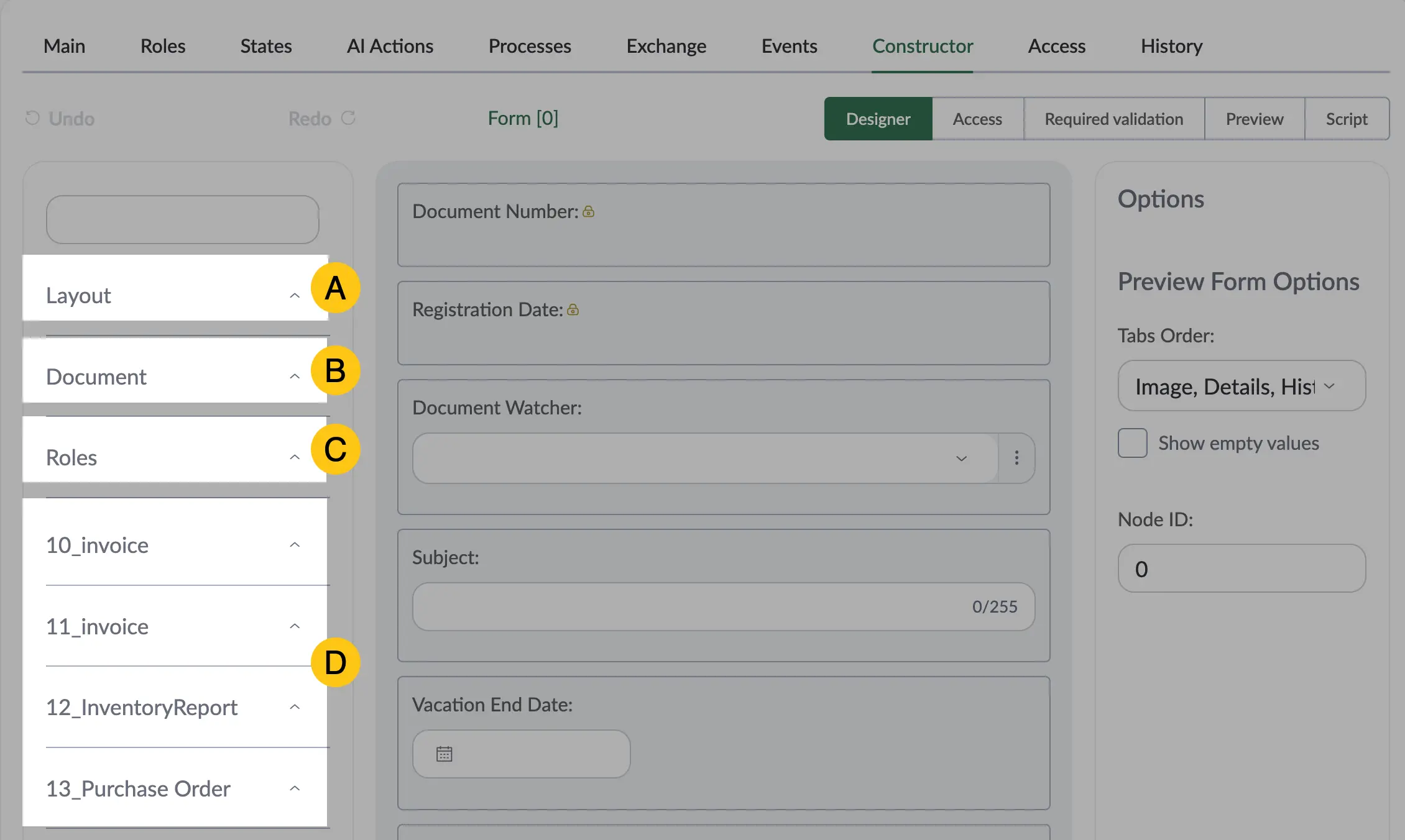
There are four types of attributes:
- A Layout Attributes — auxiliary elements used for arranging and grouping other attributes on a document form, making its structure more convenient to work with.
- B Standard Attributes — attributes that exist by default in the platform and can be used in documents without additional configuration.
- C Role Attributes — attributes used to define and manage user roles and access rights in the system, providing control over who has access to specific information in a document.
-
D Custom Attributes — attributes created by the user according to their needs in the Attribute Library. They are grouped into folders created by the user and allow configuring documents to meet specific requirements.
2.2.6.1. Layout Attributes
Layout Attributes are auxiliary elements used for arranging and grouping other attributes on a document form, making its structure more convenient to work with.
To view layout attributes, follow these steps:
-
In the navigation panel, select the Studio 1 workspace.
-
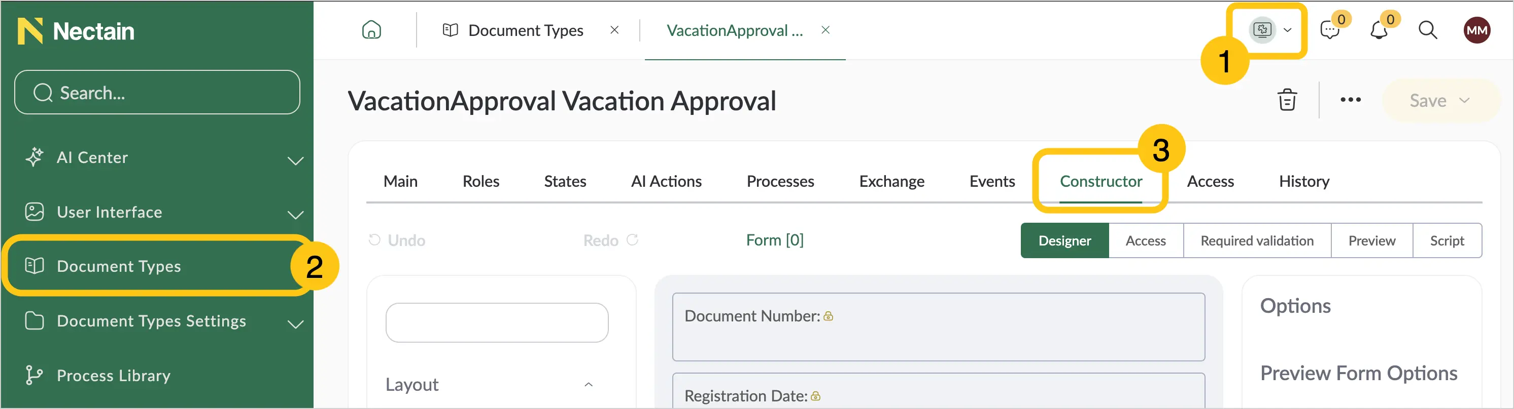
If you want to add this attribute to a document type, go to the Document Types 2 shortcut > the desired document type > Constructor tab 3.
Or
-
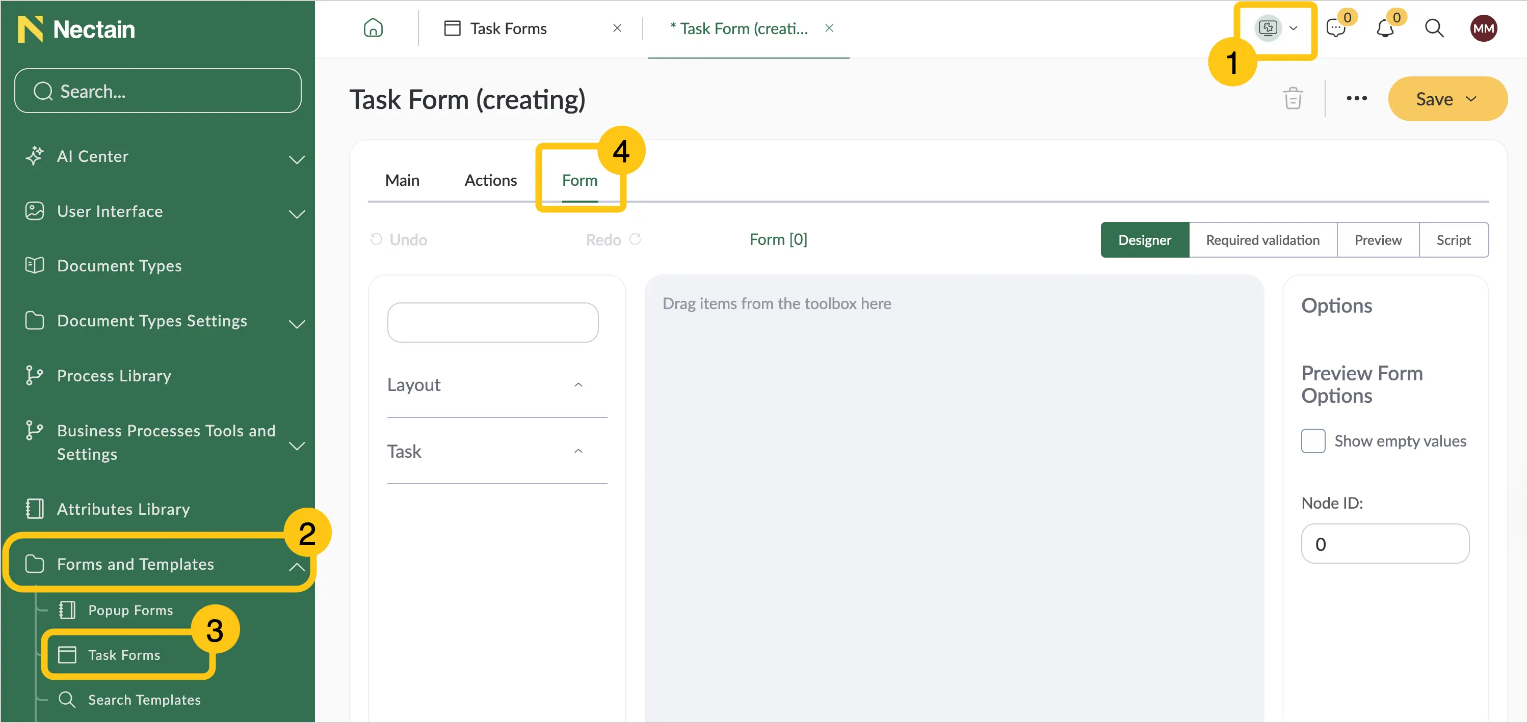
If you want to add the attribute to a task form, go to the Forms & Templates 2 shortcut group > Task Forms 3 shortcut > Form tab 4.
-
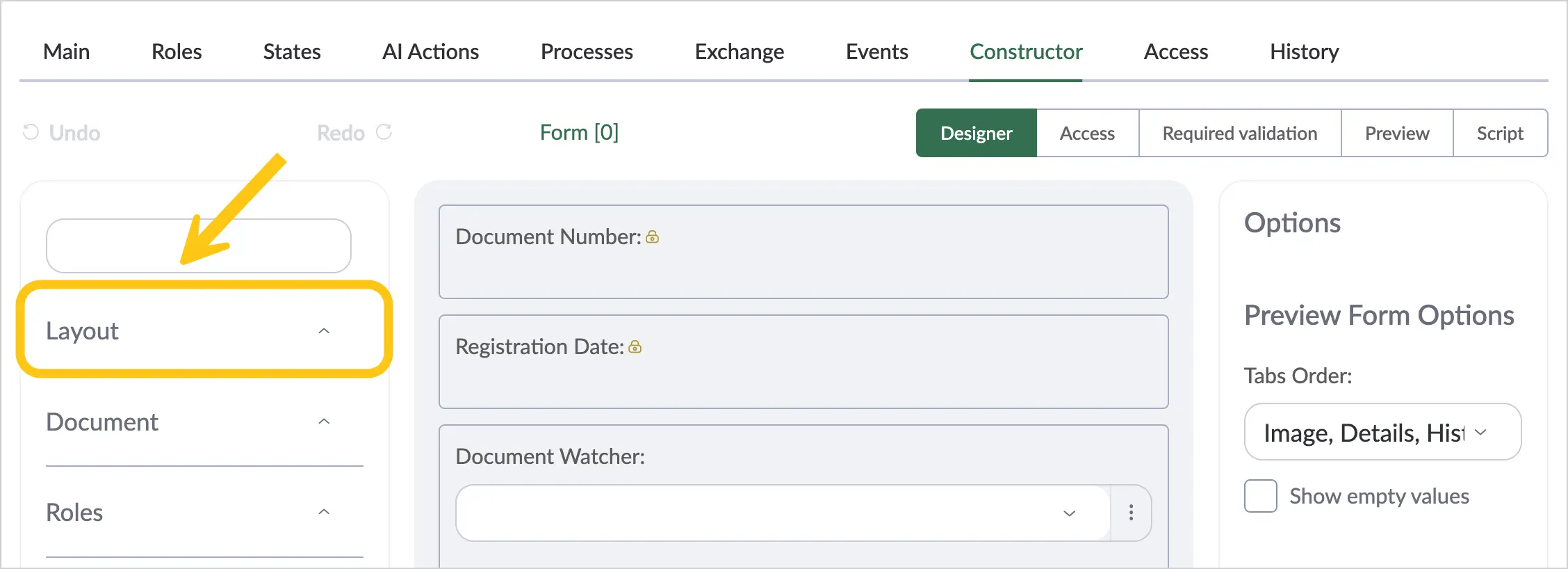
In the attribute menu, select the Layout folder.
2.2.6.1.1. Tabs
The Tab layout attribute allows organizing attributes on a document form as tabs.

To add and configure the Tab attribute, follow these steps:
-
In the navigation panel, select the Studio 1 workspace.
-
If you want to add this attribute to a document type, go to the Document Types 2 shortcut > the desired document type > Constructor tab 3.
Or
-
If you want to add the attribute to a task form, go to the Forms & Templates 2 shortcut group > Task Forms 3 shortcut > Form tab 4.
-
In the attribute menu, select the Layout folder.
-
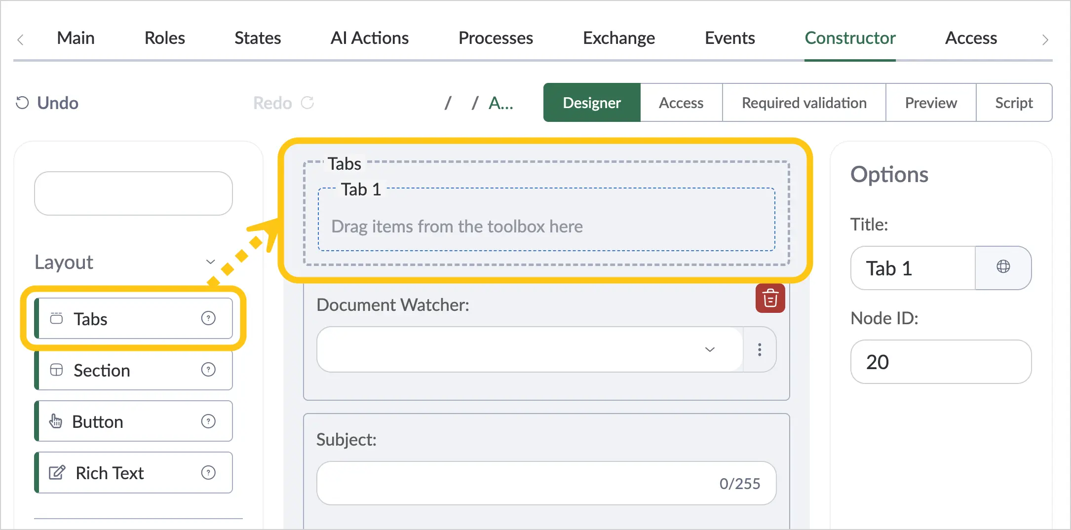
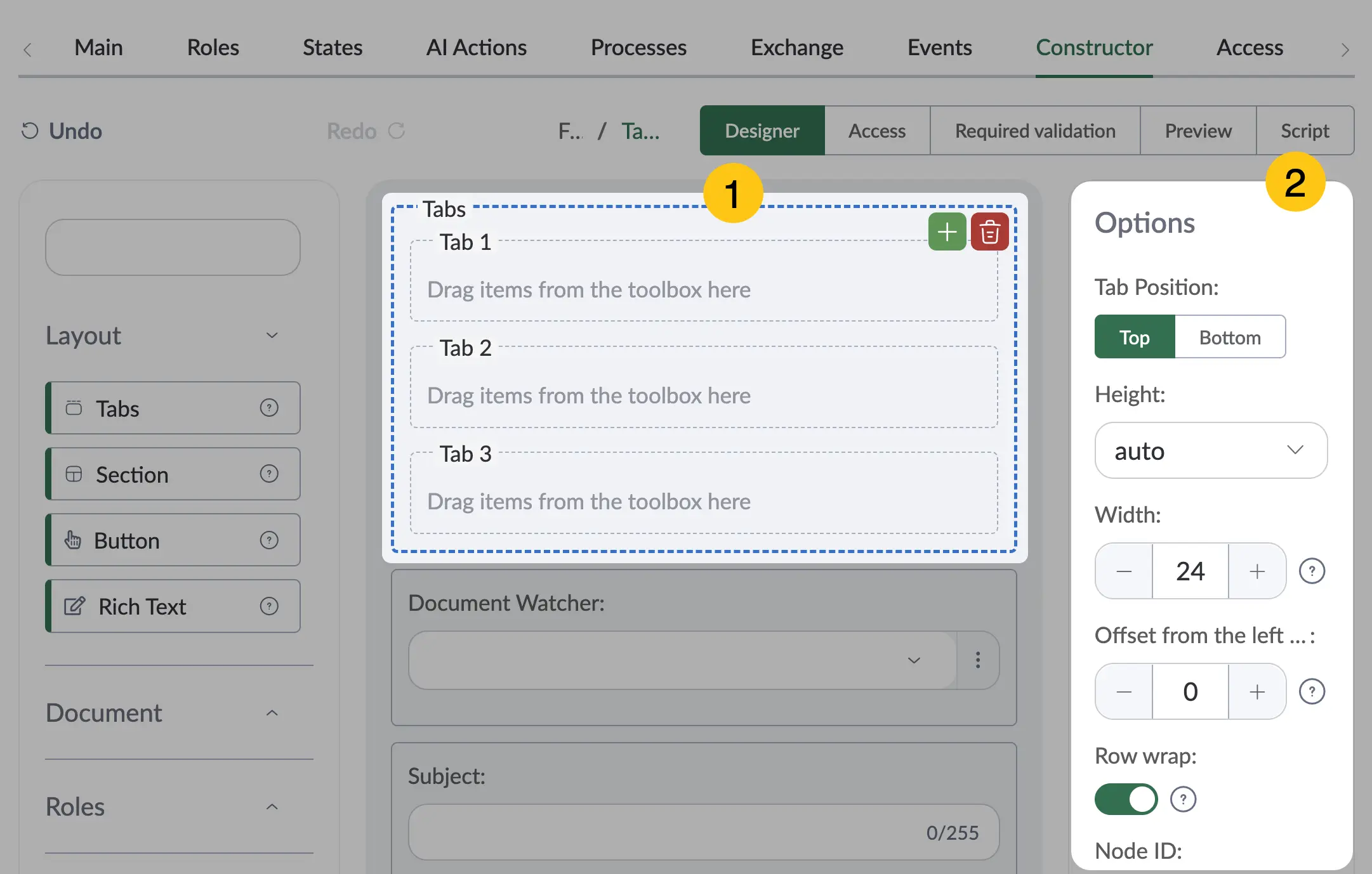
Find the Tabs attribute 1, then drag it onto the document form 2.
-
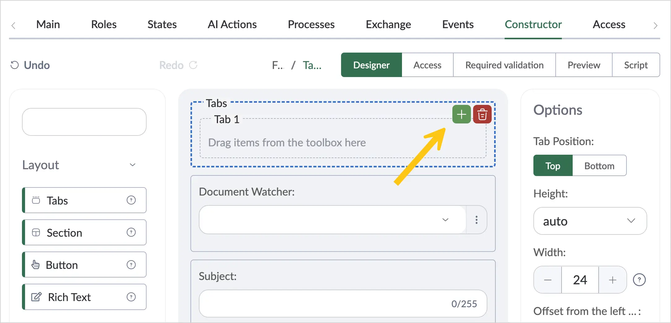
By default, one tab is created. To add more, hover your cursor over the added Tabs attribute on the document form, then click the + button.
-
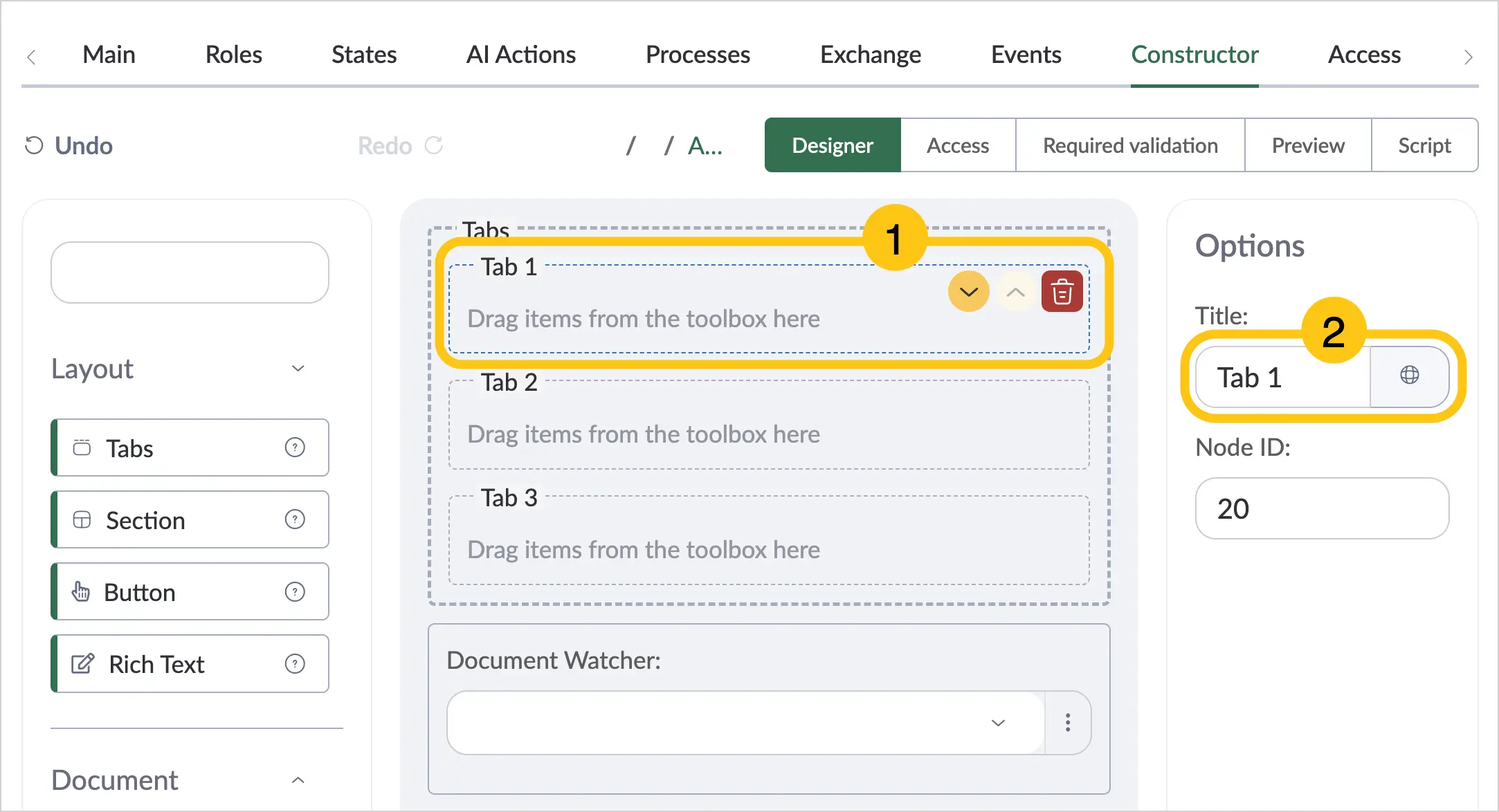
Set titles for the tabs by clicking on the desired tab 1, then in the Title field 2, enter the desired title.
 Note:
Note:You can set alternative titles for different languages. To do this, in the Title field, select the icon and fill in the fields for other languages. Then click the Apply button.
-
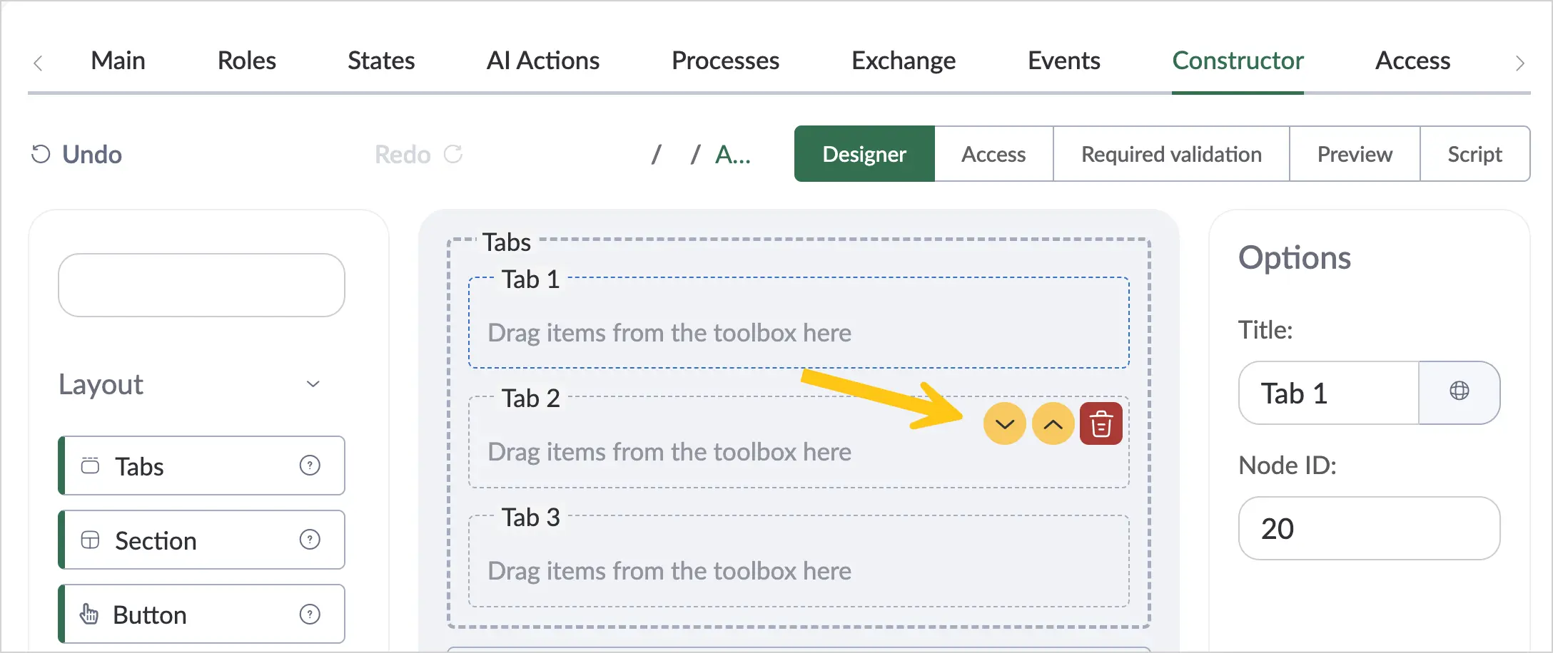
If you have added more than one tab within a single Tabs attribute, you can change their display order. To do this, hover your cursor over the tab you want to move, then click the button with the desired direction.
-
Configure additional settings for the attribute. To do this, click on the attribute 1, then fill in the fields in the Options menu 2 using the hints in the table below.
| Field Name | Description |
|---|---|
| Tab Position | Select one of the following options: Top — the tab title will be placed above its content Bottom — the tab title will be placed below its content |
| Height | Select a unit of measurement from the following options:
|
| Width | Specify the width of the attribute value input field. Minimum value — "0", maximum value — "24". |
| Offset from the left | Left indent size. Minimum value — "0", maximum value — "24". |
| Row wrap | Enable this toggle if you want all subsequent attributes to be placed on a new line and not occupy the available space in the current attribute's row. |
-
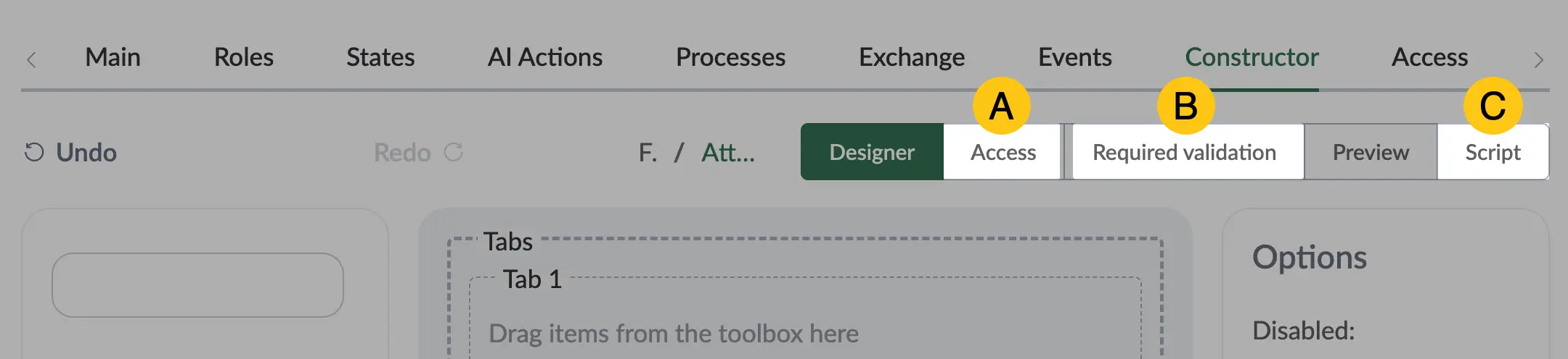
In the toolbar, select Save, then proceed to fill in the following sections:
- a Access section
- b Required validation section
- c Script section
Once the attribute configuration is complete, go to the Preview section to check how the attribute will appear on the document form.
2.2.6.1.2. Sections
The Sections layout attribute allows organizing attributes on a document form as sections. Inside sections, you can place attributes or other sections. Changing the width of a section changes the width of all attributes inside it.
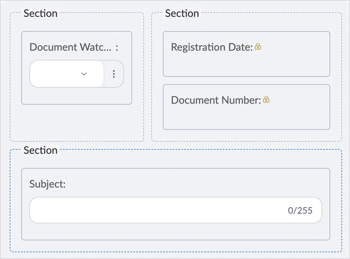
To add and configure the Sections attribute, follow these steps:
-
In the navigation panel, select the Studio 1 workspace.
-
If you want to add this attribute to a document type, go to the Document Types 2 shortcut > the desired document type > Constructor tab 3.
Or
-
If you want to add the attribute to a task form, go to the Forms & Templates 2 shortcut group > Task Forms 3 shortcut > Form tab 4.
-
In the attribute menu, select the Layout folder.
-
Find the Sections attribute 1, then drag it onto the document form 2.
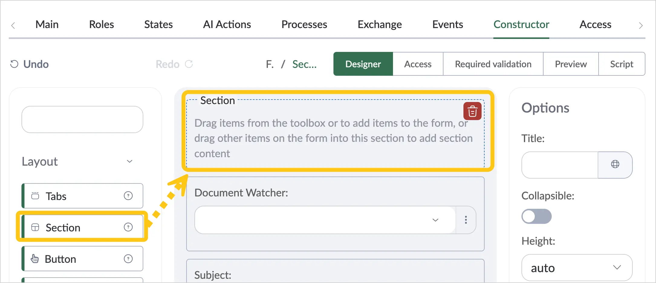
-
Configure additional settings for the attribute. To do this, click on the attribute 1, then fill in the fields in the Options menu 2 using the hints in the table below.
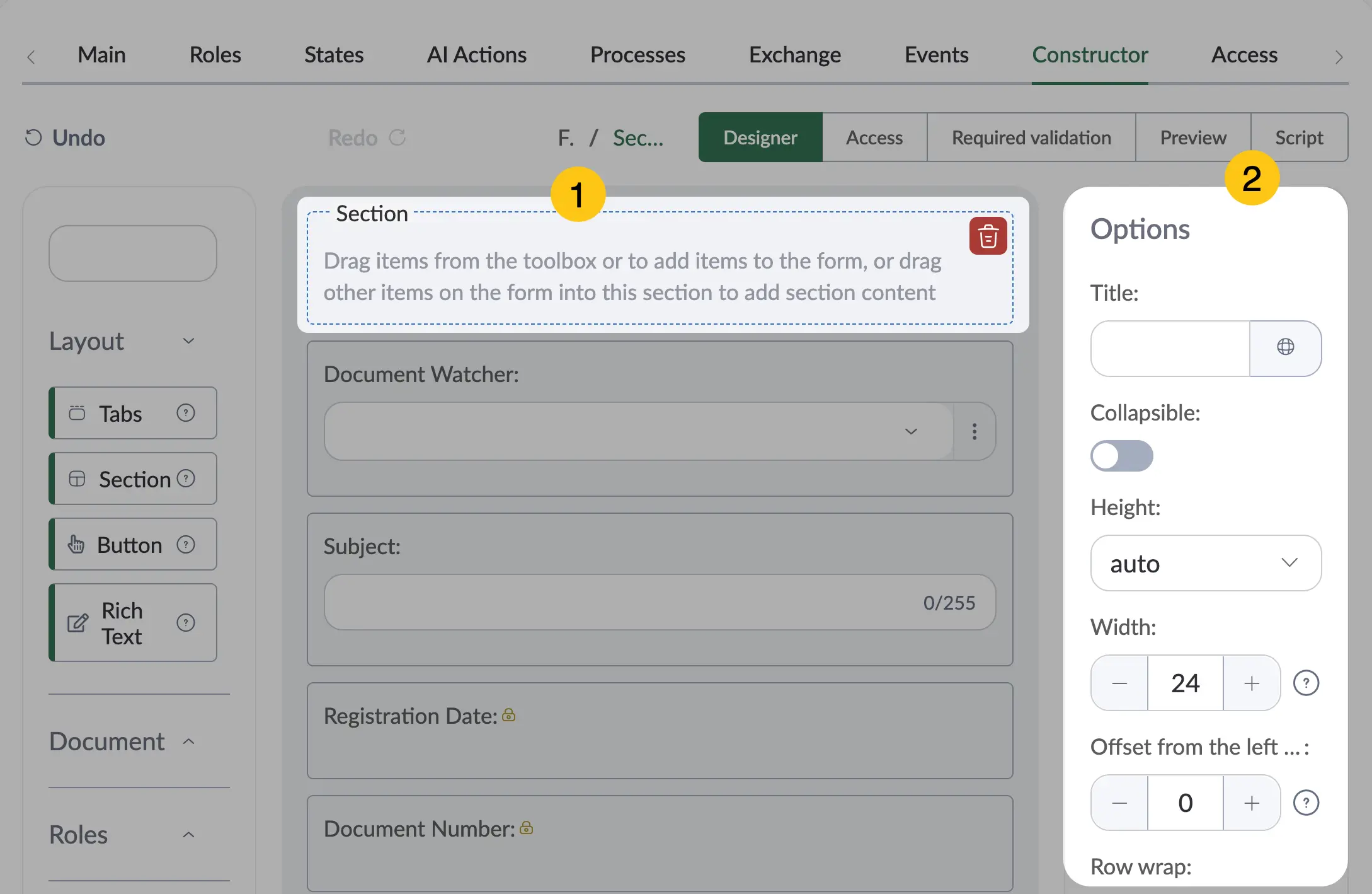
| Field Name | Description |
|---|---|
| Title | Enter the desired section title. ℹ️ Note: You can set alternative titles for different languages. To do this, in the Title field, select the icon and fill in the fields for other languages. Then click the Apply button. |
| Collapsible | Enable this toggle if you want the section to be collapsible. When viewing, the section will be collapsed by default. The user can expand it by clicking the icon. |
| Height | Select a unit of measurement from the following options:
|
| Width | Specify the width of the attribute value input field. Minimum value — "0", maximum value — "24". The width of the Sections attribute determines the width of all attributes placed inside it. |
| Offset from the left | Left indent size. Minimum value — "0", maximum value — "24". |
| Row Wrap | Enable this toggle if you want all subsequent attributes to be placed on a new line and not occupy the available space in the current attribute's row. |
-
In the toolbar, select Save, then proceed to fill in the following sections:
- a Access section
- b Required validation section
- c Script section
Once the attribute configuration is complete, go to the Preview section to check how the attribute will appear on the document form.
2.2.6.1.3. Button
The Button layout attribute is used for automation via scripts (executing a script when the button is clicked) or for invoking pop-up forms. The Button layout attribute can be placed on document forms, task forms, and inside the Table/Collection attribute.

To add and configure the Button attribute, follow these steps:
-
In the navigation panel, select the Studio 1 workspace.
-
If you want to add this attribute to a document type, go to the Document Types 2 shortcut > the desired document type > Constructor tab 3.
Or
-
If you want to add the attribute to a task form, go to the Forms & Templates 2 shortcut group > Task Forms 3 shortcut > Form tab 4.
-
In the attribute menu, select the Layout folder.
-
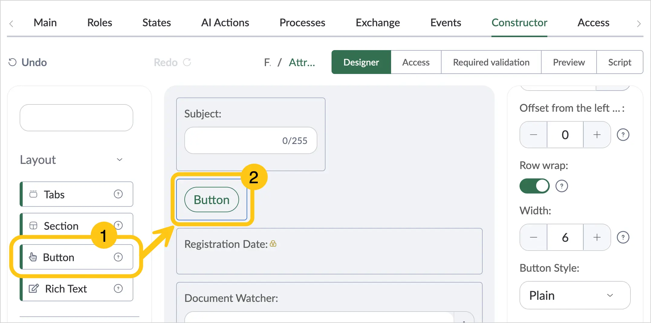
Find the Button attribute 1, then drag it onto the document form 2.
-
Configure additional settings for the attribute. To do this, click on the attribute 1, then fill in the fields in the Options menu 2 using the hints in the table below.
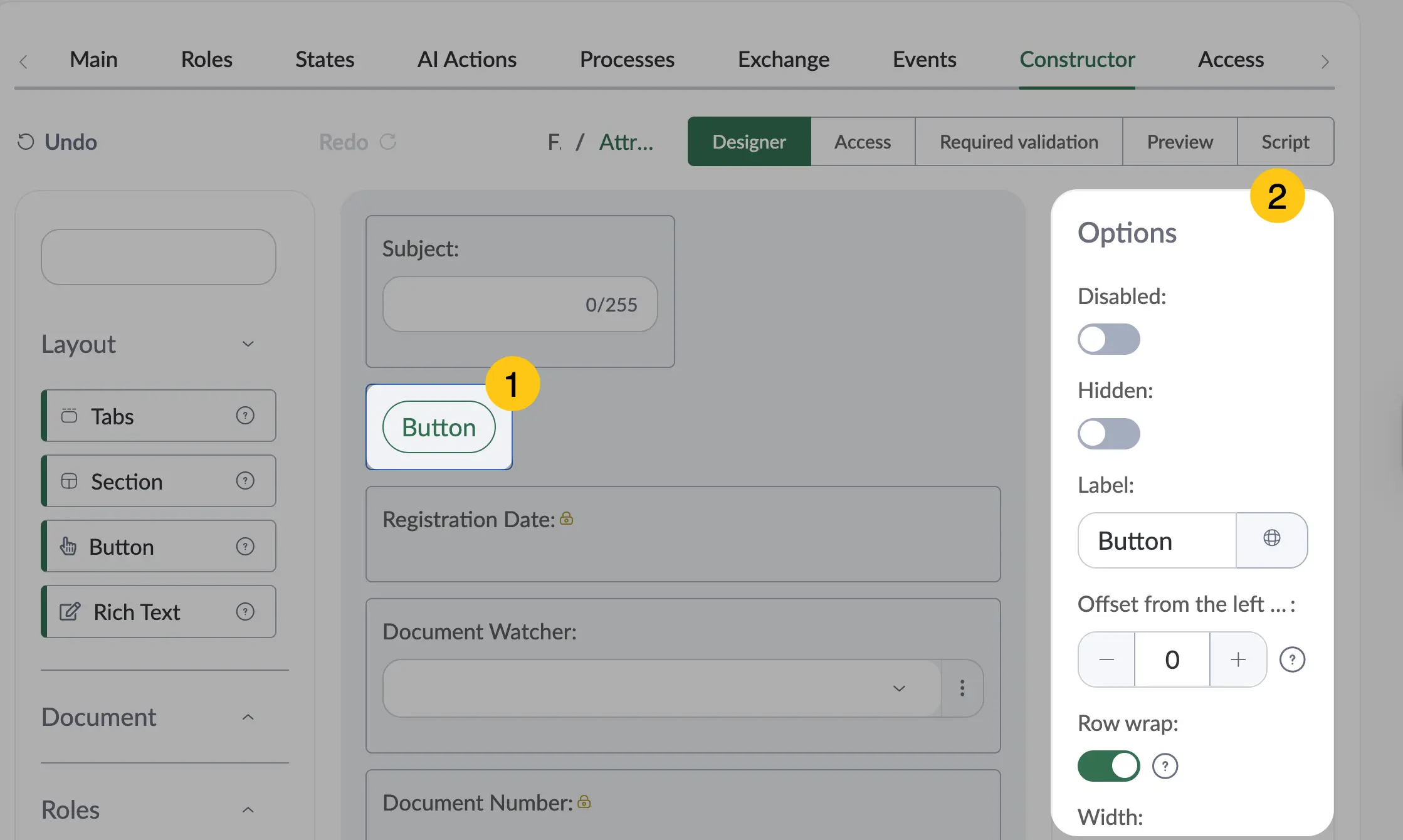
| Field Name | Description |
|---|---|
| Disabled | Enable this toggle if you want to prevent users from editing this attribute. Applies to all users and document type states. |
| Hidden | Enable this toggle if you want to hide this attribute from users. Applies to all users and document type states. |
| Label | The attribute name displayed on the form. |
| Offset from the left | Left indent size. Minimum value — "0", maximum value — "24". |
| Row Wrap | Enable this toggle if you want all subsequent attributes to be placed on a new line and not occupy the available space in the current attribute's row. |
| Width | Specify the width of the attribute value input field. Minimum value — "0", maximum value — "24". |
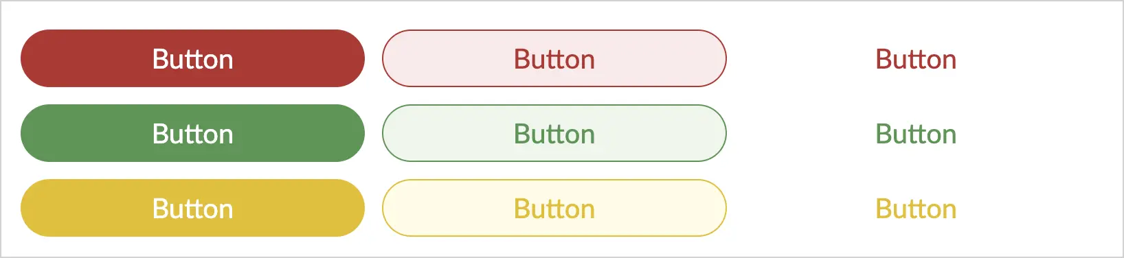
| Button Style | The display style of the button on the form. Available options:
 |
| Button Type | The button type, which determines its color. Available options:
 |
| Button Size | The size of the button on the form. Available options:
 |
| Left Icon | Click the icon and select from the menu an icon to display to the left of the button label. |
| Right Icon | Click the icon and select from the menu an icon to display to the right of the button label. |
| Pop-up Form Settings | Select from the list a pop-up form to display when the button is clicked. The list shows all pop-up forms from the Pop-up Forms Directory. |
| Attribute Mapping | Displayed only after selecting a pop-up form. Allows mapping attributes from the pop-up form to attributes from the document/task form. |
-
In the toolbar, select Save, then proceed to fill in the following sections:
- a Access section
- b Required validation section
- c Script section
Once the attribute configuration is complete, go to the Preview section to check how the attribute will appear on the document form.
2.2.6.1.4. Rich Text
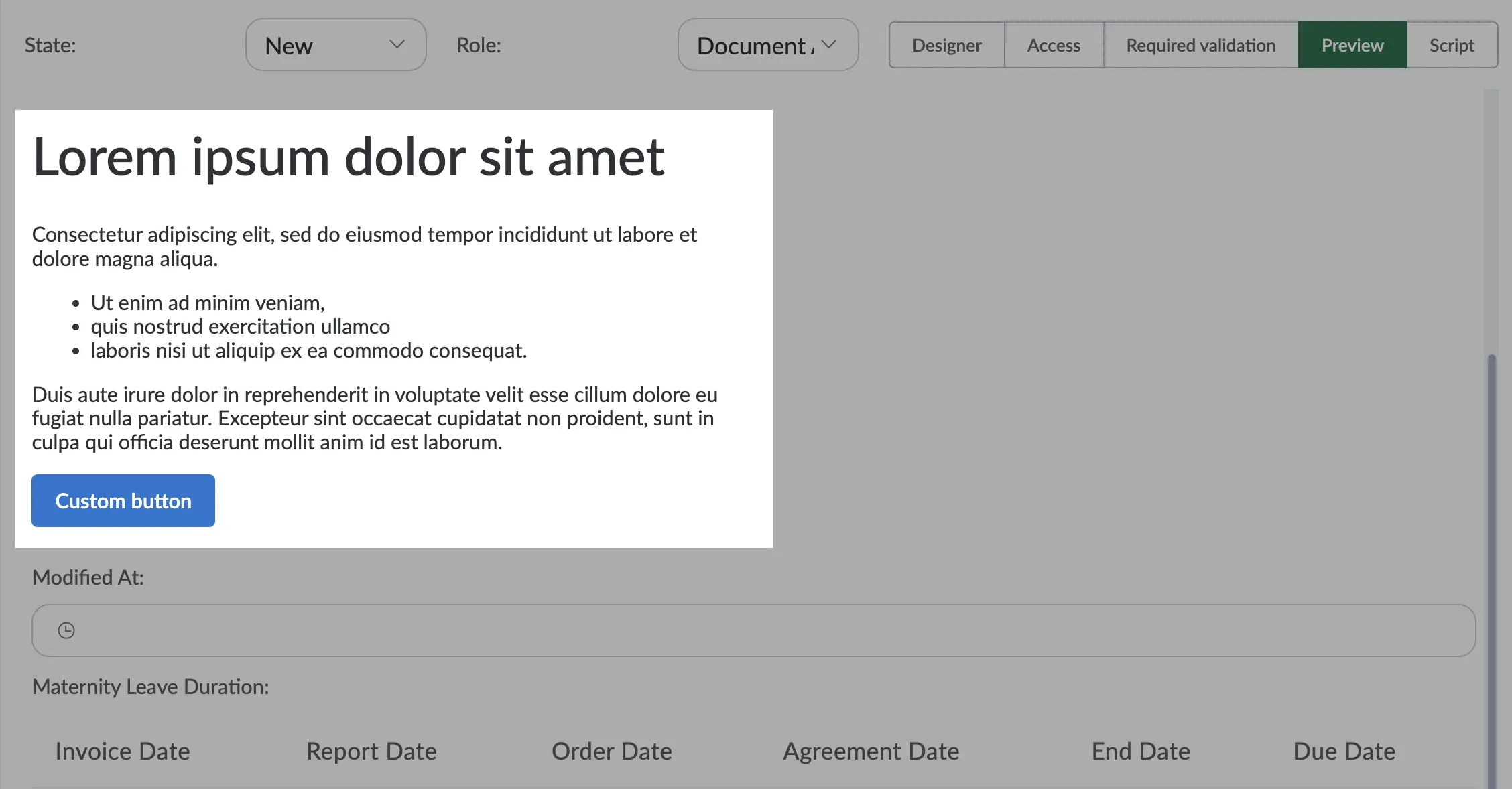
The Rich Text layout attribute is used to place static information on a form. You can insert text, links, and tables into the attribute. The following formatting options are available: alignment, various fonts, text sizes, styles, text or background color, numbered lists.
To add and configure the Rich Text attribute, follow these steps:
-
In the navigation panel, select the Studio 1 workspace.
-
If you want to add this attribute to a document type, go to the Document Types 2 shortcut > the desired document type > Constructor tab 3.
Or
-
If you want to add the attribute to a task form, go to the Forms & Templates 2 shortcut group > Task Forms 3 shortcut > Form tab 4.
-
In the attribute menu, select the Layout folder.
-
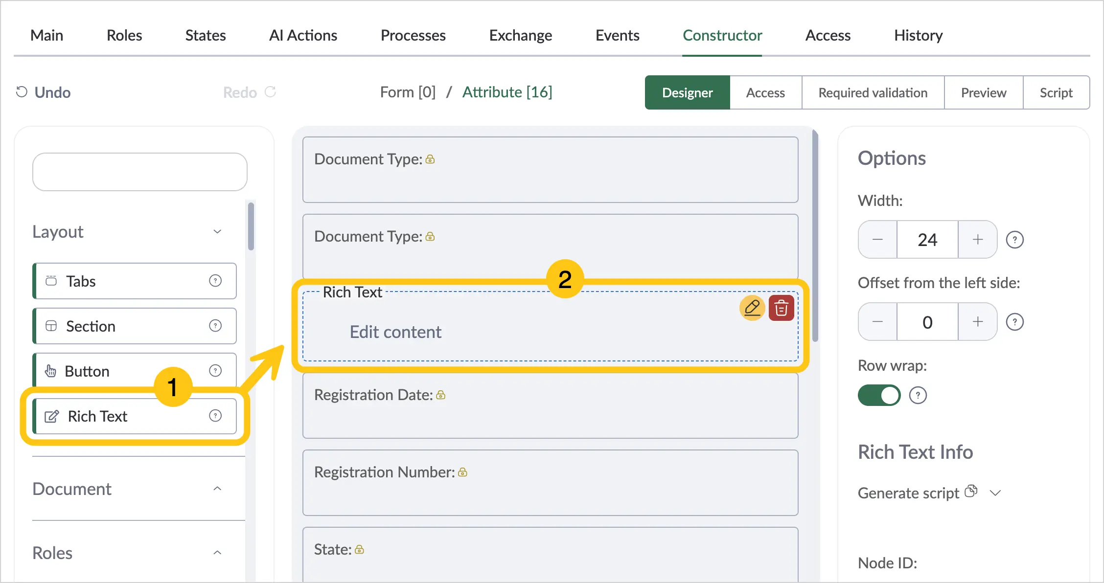
Find the Rich Text attribute, then drag it onto the document form.
-
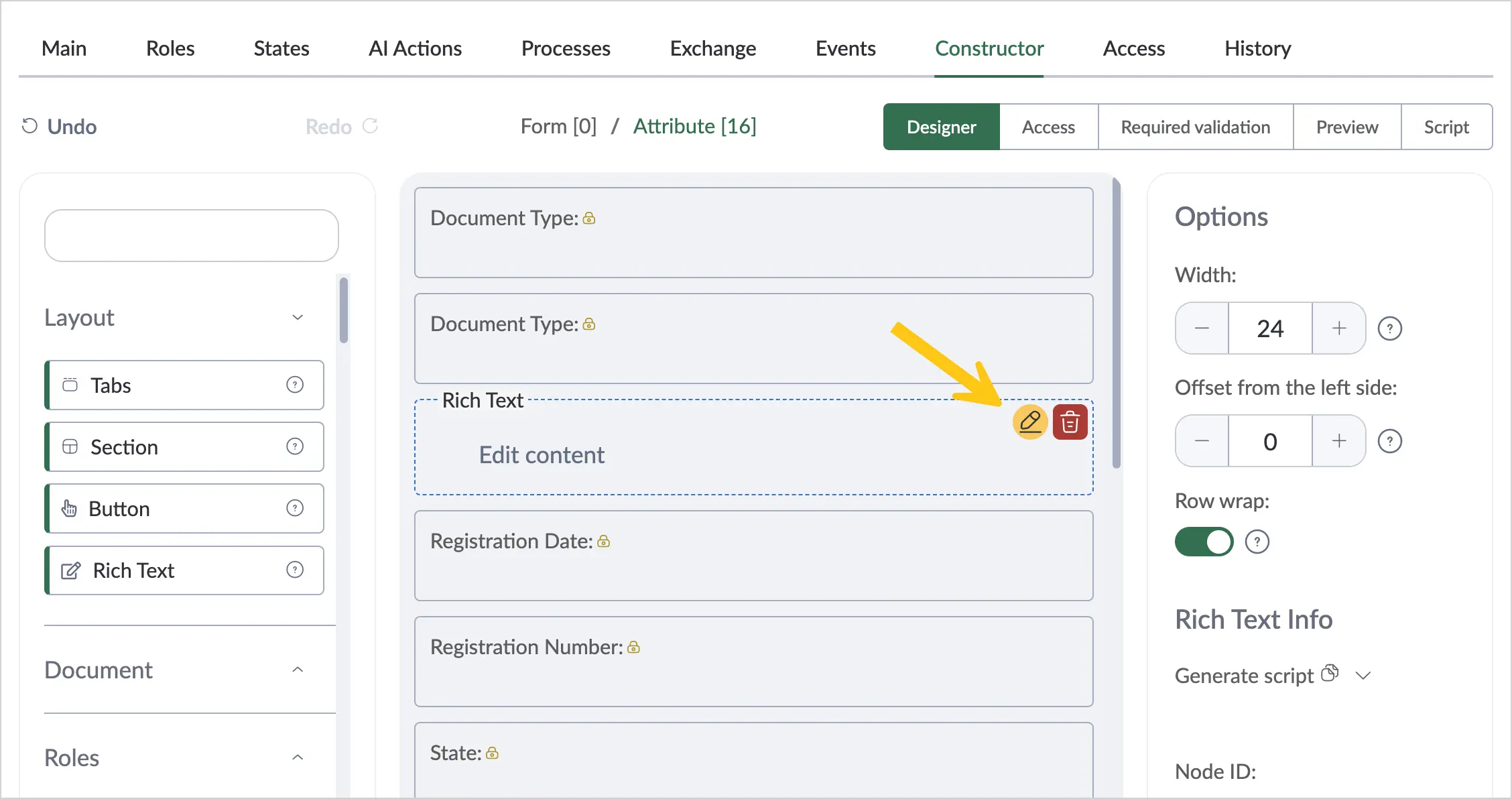
Hover your cursor over the added attribute, then click the button.
-
In the Edit Content 1 window, add the desired content and formatting, then click the Save button 2.
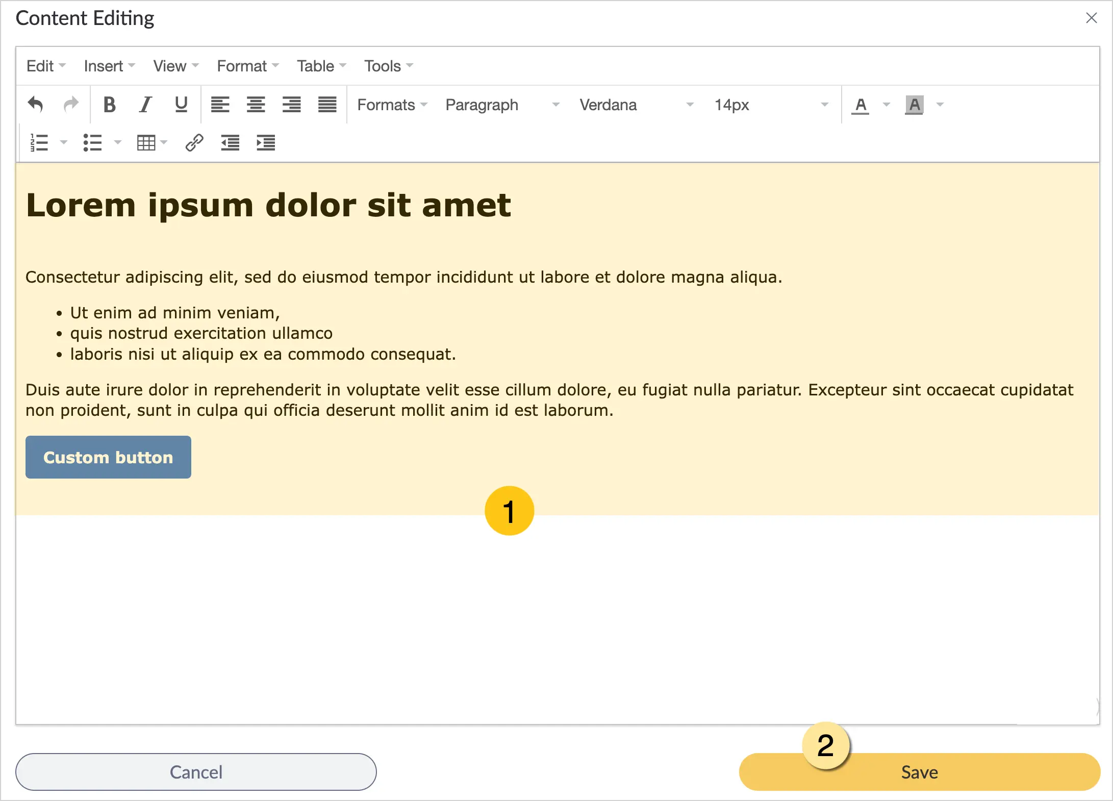
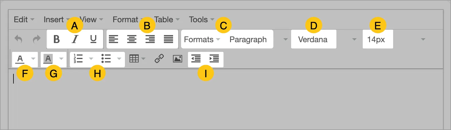
The editor provides flexible text formatting options, including:
- A text styles
- B alignment
- C styles
- D font
- E font size
- F font color
- G background color
- H numbered and bulleted list formatting
- I left indentation
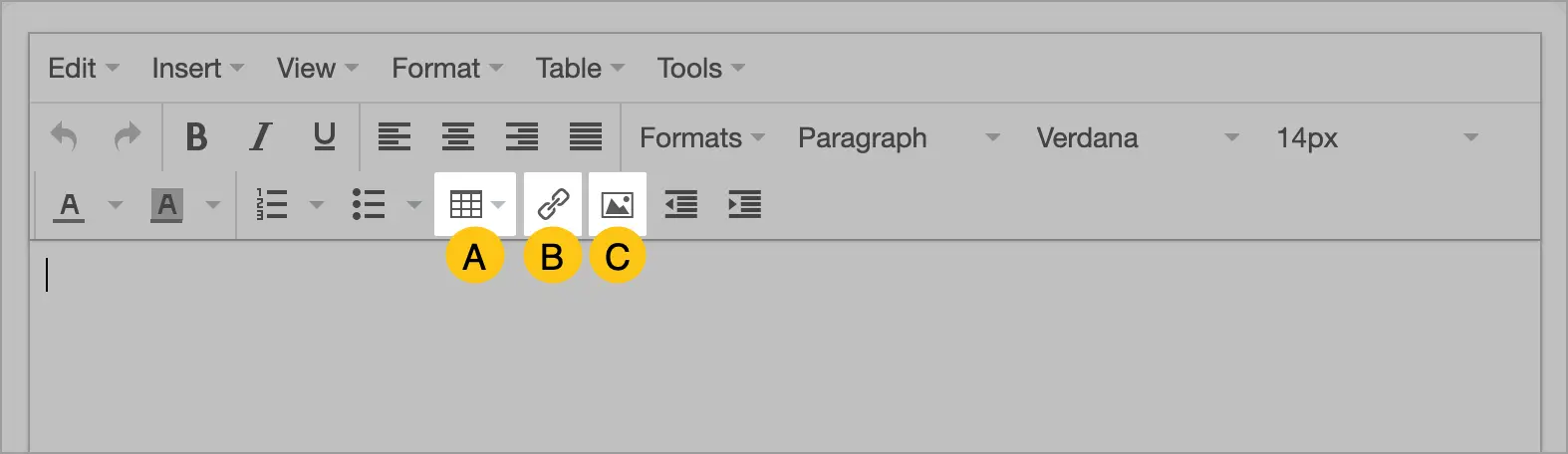
You can also add tables A, links B, and images C.
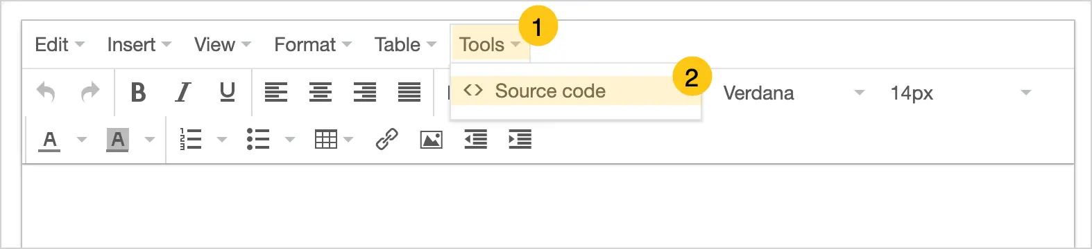
If necessary, you can view and edit the HTML content through the Tools 1 > Source Code 2 menu.
-
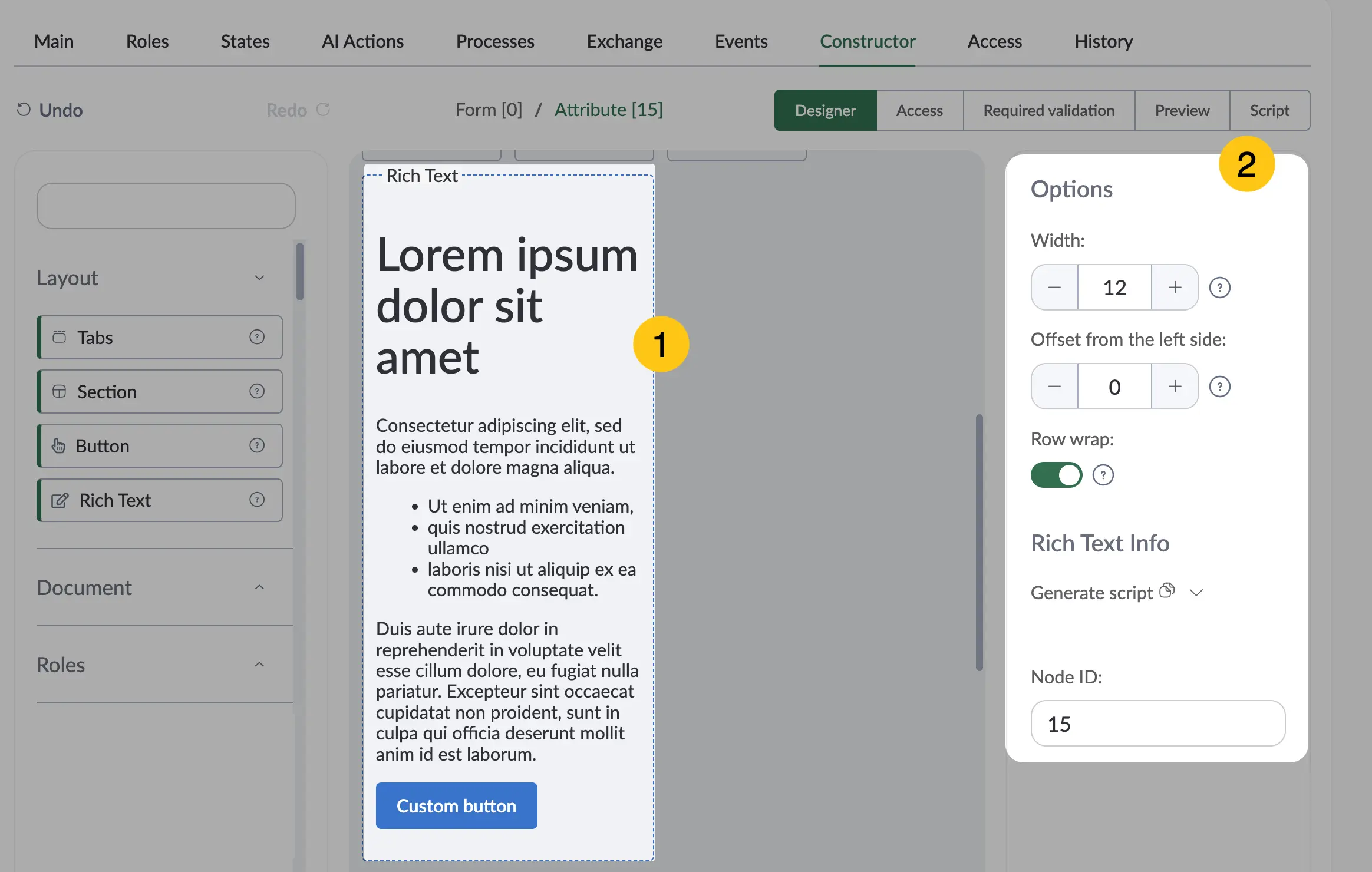
Configure additional settings for the attribute. To do this, click on the attribute 1, then fill in the fields in the Options menu 2 using the hints in the table below.
| Field Name | Description |
|---|---|
| Width | Specify the width of the attribute value input field. Minimum value — "0", maximum value — "24". |
| Offset from the left | Left indent size. Minimum value — "0", maximum value — "24". |
| Row Wrap | Enable this toggle if you want all subsequent attributes to be placed on a new line and not occupy the available space in the current attribute's row. |
-
In the toolbar, select Save, then proceed to fill in the following sections:

Once the attribute configuration is complete, go to the Preview section to check how the attribute will appear on the document form.
It is possible to add additional fonts for use in this attribute. To do so, contact the support engineer for your Nectainium platform.
2.2.6.2. Standard Attributes
Standard Attributes are attributes that exist by default in the platform and can be used in documents without additional configuration. This section describes only those standard attributes that contain additional optional settings.
To view standard attributes, follow these steps:
-
In the navigation panel, select the Studio 1 workspace.
-
Go to the Document Types shortcut, then open the desired document type 2.
-
Go to the Constructor tab 3.
-
In the attribute menu, select the Document folder. There you will see all standard attributes.
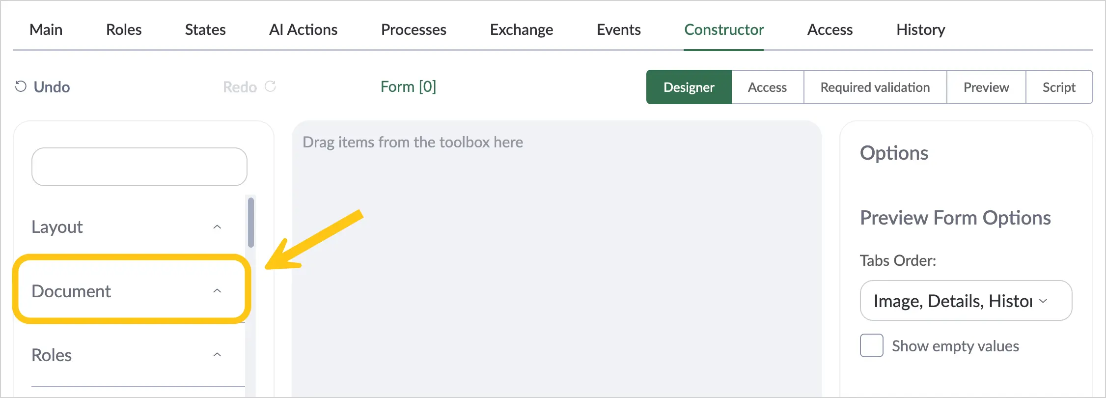
2.2.6.2.1. Document Image
The Document Image standard attribute displays the document's image (file) on the form with the ability to quickly preview it without opening it separately. You can also zoom the document image if it is saved in .pdf format. Attachments in .doc, .docx, and .rtf formats are automatically converted and displayed as an image in .pdf format.
To add and configure the Document Image attribute, follow these steps:
-
In the navigation panel, select the Studio 1 workspace.
-
If you want to add this attribute to a document type, go to the Document Types 2 shortcut > the desired document type > Constructor tab 3.
Or
-
If you want to add the attribute to a task form, go to the Forms & Templates 2 shortcut group > Task Forms 3 shortcut > Form tab 4.
-
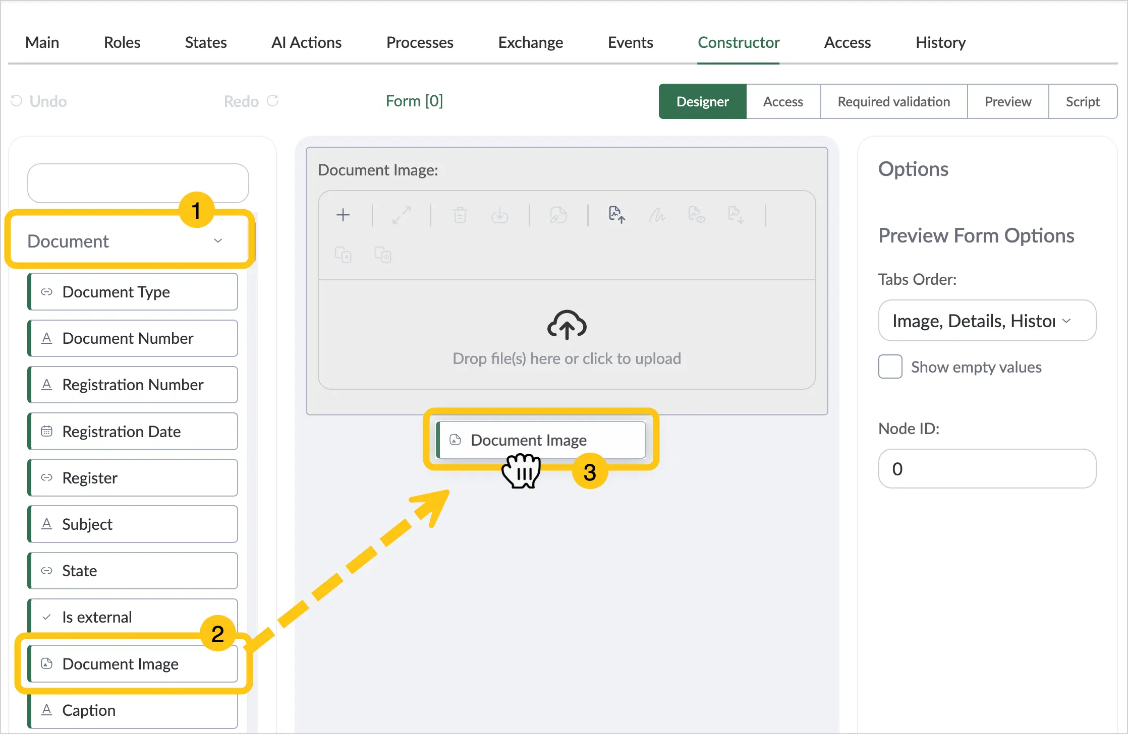
In the attribute menu, select the Document folder 1.
-
Find the Document Image attribute 2, then drag it onto the document form 3.
-
Configure additional settings for the attribute. To do this, click on the attribute 1, then fill in the fields in the Options menu 2 using the hints in the table below.
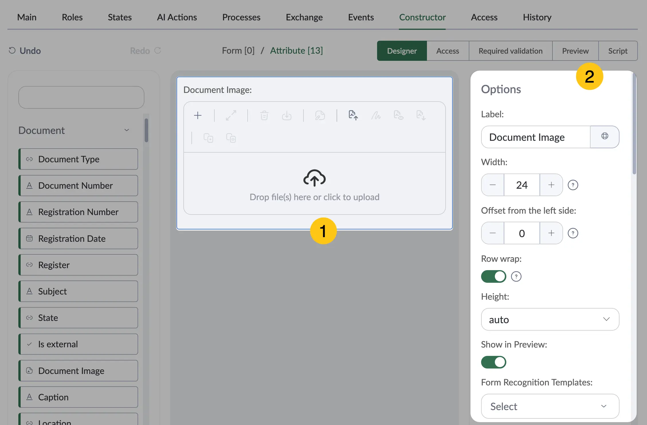
| Field Name | Description |
|---|---|
| Label | The attribute name displayed on the form. |
| Width | Specify the width of the attribute value input field. Minimum value — "0", maximum value — "24". |
| Offset from the left | Left indent size. Minimum value — "0", maximum value — "24". |
| Row Wrap | Enable this toggle if you want all subsequent attributes to be placed on a new line and not occupy the available space in the current attribute's row. |
| Height | Select a unit of measurement from the following options:
|
| Display in Preview Form | Enable this toggle if you want to display the attribute in the document preview form. |
| Recognition Templates | Select one of the recognition templates. A recognition template defines the rules and settings for recognizing text in an image and adding it to the document as a text layer. The platform then automatically fills in the attribute values with the recognized text. ℹ️ Note: Recognition templates are only available when the additional package dfx-idp is installed. |
| AI Scenario | Select the AI scenario you want to apply to the document. |
| Document Templates | Select a document template from the drop-down list. |
"Stamp Templates" Section
ℹ️ Note: This section is available when the additional package dfx-stamp is installed.
| Field Name | Description |
|---|---|
| Stamp Templates | Select a stamp template from the drop-down list. |
| Letterhead Template | Select a letterhead template from the drop-down list. |
| Allow User to Change | Enable this toggle if you want to allow the user to select a stamp template and its placement before applying the stamp. |
| Source | Select from the list the source from which the platform should take the document to stamp. Currently, there is one available option: Self — the document to be stamped will be taken from itself (i.e., the document form you are currently working in). |
| Action | Select from the list one of the actions to perform after applying the stamp:
|
| Save Conditions | Select from the list one of the conditions for handling a signed file:
|
| Destination | Select from the list where to save the stamped file:
|
"Export Settings" Section
ℹ️ Note: This section is available when the additional package dfx-ua-sign-file-export is installed.
| Field Name | Description |
|---|---|
| Export Rules | Select from the list one of the export conditions: |
| Toggle "Allow User to Change" available only when the "With Document Image and QES Visualization" option is selected in the "Export Rules" field | When enabled, the user can choose the signature placement parameters themselves. |
| QES Page Selection available only when the "With Document Image and QES Visualization" option is selected in the "Export Rules" field | Select the page on which the QES information will be placed: first or last. |
| QES Display Order available only when the "With Document Image and QES Visualization" option is selected in the "Export Rules" field | From first to last or from last to first. |
| QES Placement available only when the "With Document Image and QES Visualization" option is selected in the "Export Rules" field | Select from the list where the QES will be placed on the form: • bottom right corner • bottom left corner • top right corner • top left corner |
| Related Elements | Select one or more attributes from the list to be exported together with this attribute. The list displays all File-type attributes present on the document form. |
"Mass Export" Section
ℹ️ Note: This section is available when the additional package dfx-mass-export is installed.
| Field Name | Description |
|---|---|
| Mass Export Rules | This field defines how the Document Image attribute will be exported along with its associated documents during mass export. Available options:
|
| On Version Creation | This field defines how the content of the Document Image attribute will be handled when a new version of the document image is created. Available options:
|
-
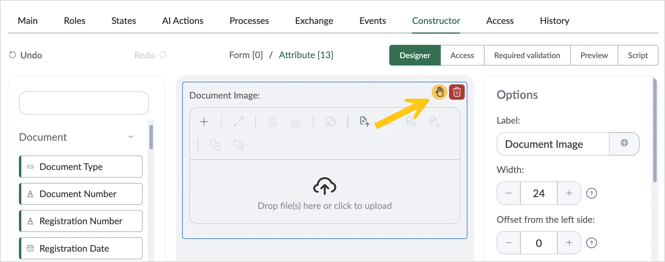
Configure the actions available to the user for the file. Actions will be displayed as buttons when using the attribute. To do this, hover over the added attribute, then click the icon.
-
Enable the action toggles 1 you want to activate for the user, then click the Save button 2. See the Enable File Attribute Actions and Execute File Attribute Actions sections.
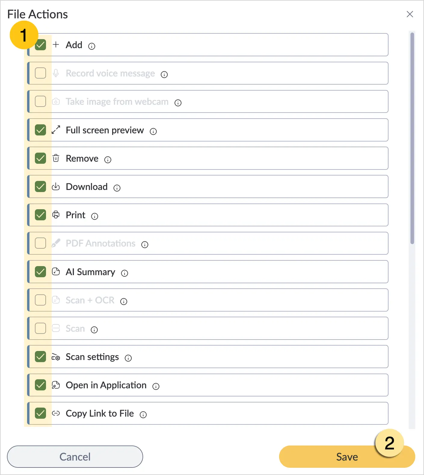
By default, all actions are enabled. If the Download action is enabled, the user will only be able to download the original file extension, without the automatically generated PDF duplicate.
-
In the toolbar, select Save, then proceed to fill in the following sections:
- a Access section
- b Required validation section
- c Script section
Once the attribute configuration is complete, you can go to the Preview section to check how the attribute will appear on the document form.
2.2.6.2.2. Deletion Prohibition
The Deletion Prohibition attribute allows you to restrict the deletion of a document.
This attribute is only available when the additional package dfx-ks is installed.
To add and configure the Deletion Prohibition attribute, follow these steps:
-
In the navigation panel, select the Studio 1 workspace.
-
If you want to add this attribute to a document type, go to the Document Types 2 shortcut > the desired document type > Constructor tab 3.
Or
-
If you want to add the attribute to a task form, go to the Forms & Templates 2 shortcut group > Task Forms 3 shortcut > Form tab 4.
-
In the attribute menu, select the Document folder 1.
-
Find the Deletion Prohibition attribute 2, then drag it onto the document form 3.
-
The Deletion Prohibition toggle can be enabled on the document form created based on this document type. When the Deletion Prohibition toggle is enabled, any attempt to delete the document will show an error with the text defined in the Deletion Prohibition Reason attribute.
-
Configure additional settings for the attribute. To do this, click on the attribute 1, then fill in the fields in the Options menu 2 using the hints in the table below.
| Field Name | Description |
|---|---|
| Disabled | Enable this toggle if you want to prevent users from editing this attribute. Applies to all users and document type states. |
| Hidden | Enable this toggle if you want to hide this attribute from users. Applies to all users and document type states. |
| Label | The attribute name displayed on the form. |
| Label Width | Enter the desired label width. The value is measured in pixels (px). ℹ️ Note: Width settings are only available if you selected Left or Right in the Label Position field. |
| Label Position | Select how the label is positioned relative to the attribute value. Available options:
|
| Width | Specify the width of the attribute value input field. Minimum value — "0", maximum value — "24". |
| Offset from the left | Left indent size. Minimum value — "0", maximum value — "24". |
| Row Wrap | Enable this toggle if you want all subsequent attributes to be placed on a new line and not occupy the available space in the current attribute's row. |
| Height | Select a unit of measurement from the following options:
|
| Default Value | Enable this toggle if you want all documents of this type to have deletion prohibited by default. |
-
In the toolbar, select Save, then proceed to fill in the following sections:
- a Access section
- b Required validation section
2.2.6.2.3. Deletion Prohibition Reason
The Deletion Prohibition Reason attribute allows you to specify the reason why a document cannot be deleted. When a user attempts to delete a document with the Deletion Prohibition toggle enabled, they will see an error with the text from the Deletion Prohibition Reason attribute.
This attribute is used together with the Deletion Prohibition attribute and is only available when the additional package dfx-ks is installed.
To add and configure the Deletion Prohibition Reason attribute, follow these steps:
-
In the navigation panel, select the Studio 1 workspace.
-
If you want to add this attribute to a document type, go to the Document Types 2 shortcut > the desired document type > Constructor tab 3.
Or
-
If you want to add the attribute to a task form, go to the Forms & Templates 2 shortcut group > Task Forms 3 shortcut > Form tab 4.
-
In the attribute menu, select the Document folder 1.
-
Find the Deletion Prohibition Reason attribute 2, then drag it onto the document form 3.
-
Configure additional settings for the attribute. To do this, click on the attribute 1, then fill in the fields in the Options menu 2 using the hints in the table below.
| Field Name | Description |
|---|---|
| Disabled | Enable this toggle if you want to prevent users from editing this attribute. Applies to all users and document type states. |
| Hidden | Enable this toggle if you want to hide this attribute from users. Applies to all users and document type states. |
| Label | The attribute name displayed on the form. |
| Label Width | Enter the desired label width. The value is measured in pixels (px). ℹ️ Note: Width settings are only available if you selected Left or Right in the Label Position field. |
| Label Position | Select how the label is positioned relative to the attribute value. Available options:
|
| Width | Specify the width of the attribute value input field. Minimum value — "0", maximum value — "24". |
| Offset from the left | Left indent size. Minimum value — "0", maximum value — "24". |
| Row Wrap | Enable this toggle if you want all subsequent attributes to be placed on a new line and not occupy the available space in the current attribute's row. |
| Height | Select a unit of measurement from the following options:
|
| Default Value | Specify the deletion prohibition reason that will be the same for all documents of this type. ℹ️ Note: If no default value is set, the deletion prohibition reason must be specified in each document individually. |
-
In the toolbar, select Save, then proceed to fill in the following sections:
- a Access section
- b Required validation section
2.2.6.2.4. Document Attachments
The Document Attachments attribute is used to work with files attached to a document. It displays a list of attachments and allows users to view, add, sign, download, and — with the appropriate permissions — delete files. Users can also compare file versions or add new ones. Multiple files can be uploaded to this attribute at once.
To add and configure the Document Attachments attribute, follow these steps:
-
In the navigation panel, select the Studio 1 workspace.
-
If you want to add this attribute to a document type, go to the Document Types 2 shortcut > the desired document type > Constructor tab 3.
Or
-
If you want to add the attribute to a task form, go to the Forms & Templates 2 shortcut group > Task Forms 3 shortcut > Form tab 4.
-
In the attribute menu, select the Document folder.
-
Find the Document Attachments attribute 1, then drag it onto the document form 2.
-
Configure additional settings for the attribute. To do this, click on the attribute 1, then fill in the fields in the Options menu 2 using the hints in the table below.
| Field Name | Description |
|---|---|
| Label | The attribute name displayed on the form. |
| Width | Specify the width of the attribute value input field. Minimum value — "0", maximum value — "24". |
| Offset from the left | Left indent size. Minimum value — "0", maximum value — "24". |
| Row Wrap | Enable this toggle if you want all subsequent attributes to be placed on a new line and not occupy the available space in the current attribute's row. |
| Height | Select a unit of measurement from the following options:
|
| Display Mode | Select the view for displaying the attachments list:
|
| Document Templates | Select a document template from the drop-down list. |
| On Version Creation | This field defines how the content of the Document Image attribute will be handled when a new version is created. Available options:
|
| AI Scenario | Select the AI scenario you want to apply to documents. |
File Dialog Parameters
| Field Name | Description |
|---|---|
| Title | Option to set the title of the file upload dialog window. |
| Hide File Description | Option to hide the "File Description" field in the file upload dialog window. |
Stamp Templates
This section is available when the additional package dfx-stamp is installed.
| Field Name | Description |
|---|---|
| Stamp Templates | Select the stamp template you want to apply to the document. |
| Letterhead Template | Select the letterhead template you want to move the document content to. |
| Allow User to Change | Enable this toggle if you want to allow the user to change the stamp template and its placement before applying the stamp. |
| Source | Select from the list the source from which the platform should take the document to stamp. Currently, there is one available option: "Self" — the document to be stamped will be taken from itself (i.e., the document form you are currently working in). |
| Action | Select from the list one of the actions to perform after applying the stamp:
|
| Save Conditions | Select from the list one of the conditions for handling a signed file:
|
| Destination | Select from the list where to save the stamped file:
|
Export Settings
This section is available when the additional package dfx-ua-sign-file-export is installed.
| Field Name | Description |
|---|---|
| Export Rules | Select from the list one of the export conditions: |
| Allow User to Change | ℹ️ Note: available only when the "With Document Image and QES Visualization" option is selected in the "Export Rules" field When enabled, the user can choose the signature placement parameters themselves. |
| QES Page Selection | ℹ️ Note: available only when the "With Document Image and QES Visualization" option is selected in the "Export Rules" field Select the page on which the QES information will be placed: first or last. |
| QES Display Order | ℹ️ Note: available only when the "With Document Image and QES Visualization" option is selected in the "Export Rules" field From first to last or from last to first. |
| QES Placement | ℹ️ Note: available only when the "With Document Image and QES Visualization" option is selected in the "Export Rules" field Select from the list where the QES will be placed on the form: • bottom right corner • bottom left corner • top right corner • top left corner |
| Related Elements | Select one or more attributes from the list to be exported together with this attribute. The list displays all attributes of type "File" present on the document form. |
-
Configure the actions available to the user for the file. Actions will be displayed as buttons when using the attribute. To do this, hover over the added attribute, then click the icon.
-
Enable the action toggles 1 you want to activate for the user, then click the Save button 2. See the Enable File Attribute Actions and Execute File Attribute Actions sections.
Note:By default, all actions are enabled. If the Download action is enabled, the user will only be able to download the original file extension, without the automatically generated PDF duplicate.
-
In the toolbar, select Save, then proceed to fill in the following sections:
- a Access section
- b Required validation section
- c Script section
Once the attribute configuration is complete, go to the Preview section to check how the attribute will appear on the document form.
2.2.6.2.5. Document Discussion
The Document Discussion attribute is used to facilitate communication between process participants directly in the context of a specific document or task. This attribute allows users to exchange messages, discuss details, ask questions, and receive answers in real time without leaving the platform.
Messages from the Document Discussion attribute will be displayed for discussion participants in the upper right corner of the platform, in the icon, regardless of the selected workspace.
To add and configure the Document Discussion attribute, follow these steps:
-
In the navigation panel, select the Studio 1 workspace.
-
If you want to add this attribute to a document type, go to the Document Types 2 shortcut > the desired document type > Constructor tab 3.
Or
-
If you want to add the attribute to a task form, go to the Forms & Templates 2 shortcut group > Task Forms 3 shortcut > Form tab 4.
-
In the attribute menu, select the Document folder.
-
Find the Document Discussion attribute 1, then drag it onto the document form 2.
-
Configure additional settings for the attribute. To do this, click on the attribute 1, then fill in the fields in the Options menu 2 using the hints in the table below.
| Field Name | Description |
|---|---|
| Label | The attribute name displayed on the form. |
| Width | Specify the width of the attribute value input field. Minimum value — "0", maximum value — "24". |
| Offset from the left | Left indent size. Minimum value — "0", maximum value — "24". |
| Row Wrap | Enable this toggle if you want all subsequent attributes to be placed on a new line and not occupy the available space in the current attribute's row. |
| Height | Select a unit of measurement from the following options:
|
- In the toolbar, select Save, then if needed, proceed to fill in the Access section.
Once the attribute configuration is complete, go to the Preview section to check how the attribute will appear on the document form.
2.2.6.2.6. Document Links
You can use the standard Document Links attribute to display non-hierarchical links between the current document and other documents as a table. Linked documents can also be used for mass export.
To add and configure the Document Links attribute, follow these steps:
-
In the navigation panel, select the Studio 1 workspace.
-
If you want to add this attribute to a document type, go to the Document Types 2 shortcut > the desired document type > Constructor tab 3.
Or
-
If you want to add the attribute to a task form, go to the Forms & Templates 2 shortcut group > Task Forms 3 shortcut > Form tab 4.
-
In the attribute menu, select the Document folder.
-
Find the Document Links attribute 1, then drag it onto the document form 2.
-
Configure additional settings for the attribute. To do this, click on the attribute 1, then fill in the fields in the Options menu 2.
| Field Name | Description |
|---|---|
| Label | The attribute name displayed on the form. |
| Width | Specify the width of the attribute value input field. Minimum value — "0", maximum value — "24". |
| Offset from the left | Left indent size. Minimum value — "0", maximum value — "24". |
| Row Wrap | Enable this toggle if you want all subsequent attributes to be placed on a new line and not occupy the available space in the current attribute's row. |
| Height | Select a unit of measurement from the following options:
|
-
To configure the table view, hover your cursor over the attribute 1, then click the icon 2.
-
Drag the desired attributes from the attribute menu to the appropriate field on the right 1, then click the Save button 2.
-
Configure the actions available to the user for the file. Actions will be displayed as buttons when using the attribute. To do this, hover over the added attribute, then click the icon.
-
Enable the action toggles 1 you want to activate for the user, then click the Save button 2. See the Enable File Attribute Actions and Execute File Attribute Actions sections.
-
In the toolbar, click the Save icon, then if needed, proceed to fill in the Access section.
Once the attribute configuration is complete, go to the Preview section to check how the attribute will appear on the document form.
2.2.6.2.6.1. Fill in "Document Links" on a Document Form
Method 1 (Manual)
To configure the Document Links attribute, make sure you have created a document or task based on the document type or task form that includes the Document Links attribute.
-
If you want to configure the Document Links attribute on a document form, open the required document.
or
-
If you want to configure the Document Links attribute on a task form, open the required task.
-
In the top menu of the Document Links attribute, click the + icon.
-
Fill in the fields 1 using the hints in the table below, then click Save 2.
| Field Name | Description |
|---|---|
| Document* | This field is automatically populated with the ID of the current document or the document linked to the current task. This field cannot be edited. |
| Linked Document* | Select the document from the list that should be linked to the current document. |
| Link Type* | Select the link type from the list of available options. The list displays all types from the link types directory. |
| Link Direction* | Select one of the following options:
|
Fields marked with "*" are required.
Method 2 (Automatic)
The Document Links attribute value will be automatically populated in a document if the document type has a corresponding handler configured on the Events tab for creating such links.
-
In the navigation panel, select the Studio 1 workspace.
-
If you want to add this attribute to a document type, go to the Document Types 2 shortcut > the desired document type > Constructor tab 3.
Or
-
If you want to add the attribute to a task form, go to the Forms & Templates 2 shortcut group > Task Forms 3 shortcut > Form tab 4.
-
In the attribute menu, select the Document folder.
-
Find the Document Links attribute 1, then drag it onto the document form 2.
-
Configure the additional attribute settings.
-
Go to the Events tab 1, then click Add Handler 2.
-
In the Event field 1, select the action that will trigger the creation of document links:
a. Document Created — the link will be created when a new document is created
b. Document Copied — the link will be created when the document is copied
c. Transition to State — the link will be created when the document transitions to a specific state
d. Exit from State — the link will be created when the document exits a specific state
e. Process Completed — the link will be created when the associated business process completes (if one exists)
Note:The "Transition to State" and "Exit from State" options depend on the states activated in the States tab.
Example: if the states "New" and "In Progress" were activated in the States tab, the following options will be available: Transition to State (New), Exit from State (New), Transition to State (In Progress), Exit from State (In Progress).
-
In the Handler Type field 2, select Set Document Link.
-
Select how you want to establish the link with the document:
a. Specified Attribute — choose this option if the ID of the linked document is stored in a specific attribute of the current document. In the Attribute field, specify the name of the attribute that contains the linked document's ID.
b. Specify Variable Name — choose this option if the ID of the linked document is stored in a process variable. In the Variable Name field, specify the name of the process variable.
Note:The variable context depends on the event type.
Example: for process completion events, these are the variables of the completed process. The variable value must match the ID/number of the linked document.
-
In the Correlation section 1, select the document identification method:
a. Document Number — the document number is used for lookup
b. Document ID — the unique identifier of the document is used
-
In the Link Type field 2, select the required type or create one.
-
In the Link Direction field 1, select one of the following options:
- The other document references this document — the current document is the target of the reference
- This document references the other document — the current document is the source of the reference
-
Click the Add button 2.
-
In the toolbar, click Save.
After this configuration, all documents or tasks created based on this document type (or task form) will automatically populate the Document Links attribute value according to the configured rules.
Usage example: When creating a "Contract" document, the system will automatically create a link with the "Request" document whose ID is stored in the "Request_ID" attribute of the current contract.
2.2.6.2.7. Parent Documents
You can use the standard Parent Documents attribute to display the parent documents of the current document. Unlike the Document Attachments attribute which displays non-hierarchical links, the Parent Documents attribute is used to display hierarchical relationships between documents, where the current document is subordinate to another, more general document.
Example: if you have a Project document, subordinate documents such as Tasks will have a reference to the parent Project document. This attribute will display the parent document numbers on the current document. To open a parent document, click its number.
To create a parent document, when configuring the Document Type, add a handler of type Create Document and enable the "Make new document a child of the current one" checkbox. As a result, your document will become the parent of the new document, which will be created with a "child" status.
To add and configure the Parent Documents attribute, follow these steps:
-
In the navigation panel, select the Studio 1 workspace.
-
If you want to add this attribute to a document type, go to the Document Types 2 shortcut > the desired document type > Constructor tab 3.
Or
-
If you want to add the attribute to a task form, go to the Forms & Templates 2 shortcut group > Task Forms 3 shortcut > Form tab 4.
-
In the attribute menu, select the Document folder.
-
Find the Parent Documents attribute 1, then drag it onto the document form 2.
-
Configure additional settings for the attribute. To do this, click on the attribute 1, then fill in the fields in the Options menu 2 using the hints in the table below.
| Field Name | Description |
|---|---|
| Label | The attribute name displayed on the form. |
| Width | Specify the width of the attribute value input field. Minimum value — "0", maximum value — "24". |
| Offset from the left | Left indent size. Minimum value — "0", maximum value — "24". |
| Row Wrap | Enable this toggle if you want all subsequent attributes to be placed on a new line and not occupy the available space in the current attribute's row. |
| Height | Select a unit of measurement from the following options:
|
| Levels | Display levels for documents: All Levels, Parent Document, Top-Level Document |
- In the toolbar, click Save, then if needed, proceed to fill in the Access section.
Once the attribute configuration is complete, go to the Preview section to check how the attribute will appear on the document form.
2.2.6.2.8. Child Documents
You can use the standard Child Documents attribute to display the child documents of the current document. This attribute will display the child document numbers on the current document. To open a child document, click its number.
To create a child document, when configuring the Document Type, add a handler of type Create Document and enable the "Make new document a child of the current one" checkbox. This means that when a specific event occurs, it will trigger the handler, which will automatically create a new document and make it a child of the document that triggered the event.
To add and configure the Child Documents attribute, follow these steps:
-
In the navigation panel, select the Studio 1 workspace.
-
If you want to add this attribute to a document type, go to the Document Types 2 shortcut > the desired document type > Constructor tab 3.
Or
-
If you want to add the attribute to a task form, go to the Forms & Templates 2 shortcut group > Task Forms 3 shortcut > Form tab 4.
-
In the attribute menu, select the Document folder.
-
Find the Child Documents attribute 1, then drag it onto the document form 2.
-
Configure additional settings for the attribute. To do this, click on the attribute 1, then fill in the fields in the Options menu 2 using the hints in the table below.
| Field Name | Description |
|---|---|
| Label | The attribute name displayed on the form. |
| Width | Specify the width of the attribute value input field. Minimum value — "0", maximum value — "24". |
| Offset from the left | Left indent size. Minimum value — "0", maximum value — "24". |
| Row Wrap | Enable this toggle if you want all subsequent attributes to be placed on a new line and not occupy the available space in the current attribute's row. |
| Height | Select a unit of measurement from the following options:
|
| Display Child Documents | All Levels, First Level |
-
To configure the table view, hover your cursor over the attribute 1, then click the icon 2.
-
Drag the desired attributes from the attribute menu to the appropriate field on the right 1, then click the Save button 2.
-
Configure the actions available to the user for the file. Actions will be displayed as buttons when using the attribute. To do this, hover over the added attribute, then click the icon.
-
Enable the action toggles 1 you want to activate for the user, then click the Save button 2. See the Enable File Attribute Actions and Execute File Attribute Actions sections.
-
In the toolbar, click Save, then if needed, proceed to fill in the following sections:
a Access section
b Script section
Once the attribute configuration is complete, go to the Preview section to check how the attribute will appear on the document form.
2.2.6.2.9. Processes
You can use the standard Processes attribute to display as a table the list of all processes that were launched and completed in the context of working with a specific document or task. It allows you to conveniently track and analyze completed processes directly in the document or task form.
To add and configure the Processes attribute, follow these steps:
-
In the navigation panel, select the Studio 1 workspace.
-
If you want to add this attribute to a document type, go to the Document Types 2 shortcut > the desired document type > Constructor tab 3.
Or
-
If you want to add the attribute to a task form, go to the Forms & Templates 2 shortcut group > Task Forms 3 shortcut > Form tab 4.
-
In the attribute menu, select the Document folder.
-
Find the Processes attribute 1, then drag it onto the document form 2.
-
Configure additional settings for the attribute. To do this, click on the attribute 1, then fill in the fields in the Options menu 2 using the hints in the table below.
| Field Name | Description |
|---|---|
| Label | The attribute name displayed on the form. |
| Width | Specify the width of the attribute value input field. Minimum value — "0", maximum value — "24". |
| Offset from the left | Left indent size. Minimum value — "0", maximum value — "24". |
| Row Wrap | Enable this toggle if you want all subsequent attributes to be placed on a new line and not occupy the available space in the current attribute's row. |
| Height | Select a unit of measurement from the following options:
|
-
To configure the table view, hover your cursor over the attribute 1, then click the icon 2.
-
Drag the desired attributes from the attribute menu to the appropriate field on the right 1, then click the Save button 2.
-
Configure the actions available to the user for the file. Actions will be displayed as buttons when using the attribute. To do this, hover over the added attribute, then click the icon.
-
Enable the action toggles 1 you want to activate for the user, then click the Save button 2. See the Enable File Attribute Actions and Execute File Attribute Actions sections.
-
In the toolbar, click Save, then if needed, proceed to fill in the following sections:
a Access section
b Script section
Once the attribute configuration is complete, go to the Preview section to check how the attribute will appear on the document form.
2.2.6.2.10. Tasks
You can use the standard Tasks attribute to display as a table the list of all tasks from processes that were launched and completed in the context of working with a specific document or task.
To add and configure the Tasks attribute, follow these steps:
-
In the navigation panel, select the Studio 1 workspace.
-
If you want to add this attribute to a document type, go to the Document Types 2 shortcut > the desired document type > Constructor tab 3.
Or
-
If you want to add the attribute to a task form, go to the Forms & Templates 2 shortcut group > Task Forms 3 shortcut > Form tab 4.
-
In the attribute menu, select the Document folder.
-
Find the Tasks attribute 1, then drag it onto the document form 2.
-
Configure additional settings for the attribute. To do this, click on the attribute 1, then fill in the fields in the Options menu 2 using the hints in the table below.
| Field Name | Description |
|---|---|
| Label | The attribute name displayed on the form. |
| Width | Specify the width of the attribute value input field. Minimum value — "0", maximum value — "24". |
| Offset from the left | Left indent size. Minimum value — "0", maximum value — "24". |
| Row Wrap | Enable this toggle if you want all subsequent attributes to be placed on a new line and not occupy the available space in the current attribute's row. |
| Height | Select a unit of measurement from the following options:
|
-
To configure the table view, hover your cursor over the attribute 1, then click the icon 2.
-
Drag the desired attributes from the attribute menu to the appropriate field on the right 1, then click the Save button 2.
-
Configure the actions available to the user for the file. Actions will be displayed as buttons when using the attribute. To do this, hover over the added attribute, then click the icon.
-
Enable the action toggles 1 you want to activate for the user, then click the Save button 2. See the Enable File Attribute Actions and Execute File Attribute Actions sections.
-
In the toolbar, click Save, then if needed, proceed to fill in the following sections:
a Access section
b Script section
Once the attribute configuration is complete, go to the Preview section to check how the attribute will appear on the document form.
2.2.6.3. Role Attributes
Role attributes are a special type of attributes that allow linking information to specific roles assigned to users.
Before adding role attributes to the form, make sure you have met the following conditions:
-
To place role attributes on a document type form, activate the required roles in the Roles tab of the desired document type. After that, the roles you activated will appear as attributes in the Constructor tab under the Roles folder.
-
To place role attributes on a task form, make sure the task form is linked to a Nectainium document (see the Related Entity section). Only those attributes that are available in the linked document will be accessible.
2.2.6.3.1. Add a Role Attribute to a Form
-
In the navigation panel, select the Studio 1 workspace.
-
If you want to add this attribute to a document type, go to the Document Types 2 shortcut > the desired document type > Constructor tab 3.
Or
-
If you want to add the attribute to a task form, go to the Forms & Templates 2 shortcut group > Task Forms 3 shortcut > Form tab 4.
-
In the attribute menu, select the Roles folder.
-
Select the required role attribute 1, then drag it onto the form 2.
-
Configure additional settings for the attribute. To do this, click on the attribute 1, then fill in the fields in the Options menu 2 using the hints in the table below.
| Field Name | Description |
|---|---|
| Disabled | Enable this toggle if you want to prevent users from editing this attribute. Applies to all users and document type states. |
| Hidden | Enable this toggle if you want to hide this attribute from users. Applies to all users and document type states. |
| Label | The attribute name displayed on the form. |
| Label Width | Enter the desired label width. The value is measured in pixels (px). ℹ️ Note: Width settings are only available if you selected Left or Right in the Label Position field. |
| Label Position | Select how the label is positioned relative to the attribute value. Available options:
|
| Width | Specify the width of the attribute value input field. Minimum value — "0", maximum value — "24". |
| Offset from the left | Left indent size. Minimum value — "0", maximum value — "24". |
| Row Wrap | Enable this toggle if you want all subsequent attributes to be placed on a new line and not occupy the available space in the current attribute's row. |
| Height | Select a unit of measurement from the following options:
|
| Directory Search Strategy | When a user adds a value to this attribute, the platform will suggest selecting a value from the directory. Choose one of the following search strategies:
|
| Input Method | Select the display option: • Drop-down list (default) • Table |
| Participant View | Select one of the proposed participant views: • Organizational Units • Administration Subjects |
- In the toolbar, select Save, then if needed, proceed to fill in the following sections:
Once the attribute configuration is complete, go to the Preview section to check how the attribute will appear on the document form.
2.2.6.3.2. Add a Role Participant to a Document or Task
If you have added a role attribute to a document type form, you can enter the value of this attribute in the document form created based on that document type.
-
Open the document that contains the role attribute to which you want to add a user. If the document form does not have a role attribute, make sure you have added the role attribute to the document type on which the current document is based.
-
On the required role attribute, click the icon 1, then select the required user from the list 2.
You can change the participant view to Administration Subjects or Organizational Units. To do this, select 1, then select Change Participant View 2. This feature is only available if you enabled the Prohibit Adding More Than One Role Participant option when configuring roles in the document type.
2.2.6.4. Add an Attribute to a Document or Task Form
-
In the navigation panel, select the Studio 1 workspace.
-
If you want to add an attribute to a document type, go to the Document Types 2 shortcut > the desired document type > Constructor tab 3.
Or
-
If you want to add the attribute to a task form, go to the Forms & Templates 2 shortcut group > Task Forms 3 shortcut > Form tab 4.
-
In the attribute menu, select the appropriate attribute folder.
Tip:You can also use the search field to find the required attribute by its name or code.
-
Select the required attribute 1, then drag it onto the form 2.