2.1. Interface
Interface is a shortcut group in the Studio desktop. This group contains the following shortcuts: Desktops, Shortcuts, Interface Theme and Logo, Calendars, Widgets and Dashboards.
2.1.1. Desktops
The platform allows you to edit existing desktops and create new ones.
2.1.1.1. View Existing Desktops
-
In the navigation panel, select the Studio desktop 1.
-
Select the Interface shortcut group 2, then select the Desktops shortcut 3.
When editing system desktops, settings may be reset after a system update.
2.1.1.2. Create a Desktop
-
In the navigation panel, select the Studio desktop 1.
-
Select the Interface shortcut group 2, then select the Desktops shortcut 3.
-
In the toolbar, select Create 4.
-
Fill in the fields 1 using the hints in the table below, then select Save in the toolbar 2.
| Field Name | Description |
|---|---|
| Code* |
|
| Desktop Name* | Name of the desktop. |
| Description | Description of the desktop, displayed when selecting the desktop or hovering over its name. |
| Default? | Check this box if you want this desktop to be shown first upon login. |
| Icon (CSS class)* | Desktop icon displayed in the navigation menu and desktop menu, to the left of the desktop name. Click the icon, then select the desired icon from the menu. |
| Order No.* | Enter a sequential number for the new desktop. This number determines the desktop's position in the navigation menu:
|
| Administration Subject | Select a user, user group, or role from the list that will have access to the desktop. They will be able to work in it without the right to change its settings. |
Fields marked with "*" are required.
To open a new desktop:
- In the navigation menu, click on the current desktop name.
- In the list that appears, select the desired desktop.
- Desktops are displayed in the order they were created.
- On a desktop you can add shortcut groups and individual shortcuts.
2.1.2. Shortcuts
Shortcuts are navigation elements located inside desktops or shortcut groups. Shortcuts display registers of documents, custom directories, tasks, and processes.
A — desktop, B — shortcut group, C — shortcuts
Users in the Admin or Developer role can:
- create shortcut groups (with limited nesting)
- create individual shortcuts or shortcuts nested in shortcut groups
- attach registers of corresponding entities (documents, custom directories, tasks, processes, calendars) to shortcuts, with the ability to select the entity type(s) and the list of attributes displayed as register columns
- select and change the icon of a shortcut or shortcut group
- select users, user groups, or roles that will have access to the shortcut or shortcut group.
2.1.2.1. Create a Shortcut
Users in the Admin and Developer roles can create new shortcuts and manage access rights to them. To create a shortcut, follow these steps:
-
Hover over any existing shortcut in the navigation panel, then right-click.
-
In the context menu, select Add Shortcut.
or
-
In the navigation panel, select the Studio desktop 1.
-
Select the Interface shortcut group 2, then select the Shortcuts shortcut 3.
-
In the toolbar, select Create 4.
-
Fill in the fields using the hints in the table below, then in the toolbar select Save.
| Field Name | Description |
|---|---|
| Shortcut Name* | The name displayed in the navigation pane. |
| Code* |
|
| Description | Enter a short description of the shortcut or shortcut group content. This description will be displayed when hovering over the shortcut name in the navigation pane. For example: "The shortcut contains a list of tasks for the accounting department." |
| Type* | Select the shortcut type according to the content you want to display in it. Available options:
|
| Icon (CSS Class) | Click the icon, and then select the required icon from the menu. |
| Shortcut Group* | Click the edit icon . In the window with the folder tree navigation, select the target location for your shortcut. Click "OK" to save. |
| Sequence Number* | Specify the shortcut sequence number. This allows you to more precisely define the shortcut position within groups in the navigation menu. For example: You created a new shortcut called Favorite Document Types and want to add it to the Document Type Settings shortcut group, but you need it to appear first within the group. Assign it the sequence number 1, and it will automatically appear at the top of the list.
|
| Group? | Enable the switch if you want to create a shortcut group that will contain child shortcuts. |
| Administration Subject | Specify the administration subjects you want to grant access to the shortcut. A user with the Admin role always has permission for the created shortcut. If you leave the default value, access to the shortcut will be granted to all authorized users. |
Fields marked with "*" are required.
-
Go to the Typed tab. On this tab, you can configure how records are displayed in the shortcut grid.
Note:If you selected the System shortcut type, the Typed tab will not be available. In that case, skip steps 5 and 6.
-
Configure the grid layout in which records will be displayed. You can configure the following parameters:
Note:Grid layout configuration is not available for the Calendar shortcut type.
-
If needed, configure the actions that the user will be able to perform in the shortcut. To do this, in the upper-right corner, select the Action Settings button.
Note:Action configuration is not available for the Calendar shortcut type.
-
Select the action checkboxes 1 you want to activate for the user, then select the Save button 2.
-
Fill in the remaining fields, which will differ depending on the shortcut type. Use the field descriptions in the tables below.
"System" shortcut type
This shortcut type does not have a Typed tab or the corresponding fields on it. Configuration of this shortcut is done manually using a script on the Command tab.
"Custom Directory" shortcut type
| Field name | Description |
|---|---|
| Custom Directory | Select the custom directory whose fields will be used when generating the registry. |
"Documents" shortcut type
| Field name | Description |
|---|---|
| Document Types | Select the document types whose fields will be used when generating the registry. |
| With Folders | A toggle that enables the display of smart folders in the document registry. |
| Smart Folders | Select smart folders; this field appears only when the With Folders toggle is enabled. |
"Tasks" shortcut type
| Field name | Description |
|---|---|
| Related Entity | List of entity bindings. Possible options:
|
"Processes" shortcut type
| Field name | Description |
|---|---|
| Related Entity | List of entity bindings. Possible options:
|
"Calendar" shortcut type
| Field name | Description |
|---|---|
| Calendars | Calendars or Calendars with manually created events. |
| Default View | Agenda, Monthly, Weekly, or Daily. |
| First Day of Week | Select the first day of the week in the displayed calendar. |
-
If you want to disable filtering on a specific shortcut column, go to the Command tab 1, then in the columns section 2 add the property
"filterable": falsefor the required column. Example:{ "id": "docTypeID", "filterable": false }. -
In the toolbar, select Save.
2.1.2.1.1. Disable Document Preview in a Shortcut
Available only for Document type shortcuts.
By default, all shortcuts have the option to change the document display view enabled. This feature allows you to preview document content without fully opening them. You can disable this action at the shortcut level.
To disable document preview in a shortcut:
-
Go to the Typed tab. On this tab, you can configure how records are displayed in the shortcut grid.
-
In the upper-right corner, select the Action Settings button.
-
Uncheck the Display View checkbox 1, then select the Save button 2.
2.1.2.2. Create a Shortcut with Nested Directory Attributes
-
When creating a shortcut, go to the Typed tab 1.
-
In the attribute folder menu, expand the Nested Directory Data folder 2.
-
Expand the required attribute that references a directory 1, select the desired attribute inside it, or continue expanding further attributes 2.
-
Drag the nested attribute 3 to the desired section of the shortcut form.
Once you drag the required attribute onto the form, its name will change and will start displaying the names of elements at higher levels (parent attribute name, directory name). Accordingly, the column in the shortcut will have the same name.
Try to give elements short names so that when using nested attributes, the generated name fits within the field.
2.1.2.3. Create a Shortcut Group
A shortcut group is a folder in which other shortcuts can be placed. To create a shortcut group, perform the following steps:
-
Hover over any existing shortcut in the navigation menu, then right-click.
-
In the context menu, select Add Group.
or
-
In the navigation panel, select the Studio desktop 1.
-
Select the Interface shortcut group 2, then select the Shortcuts shortcut 3.
-
In the toolbar, select Create 4.
-
Fill in the fields 1 using the hints in the Create Shortcut table, then in the toolbar select Save 2.
Note:To create a shortcut group, you must enable the Group toggle; the Type field will then be hidden.
2.1.2.4. Edit a Shortcut or Shortcut Group
2.1.2.4.1. Method 1
Users with the Admin and Developer roles can edit shortcuts and shortcut groups created in the platform. To edit a shortcut or shortcut group, perform the following steps:
-
Hover over the required shortcut in the navigation menu, then right-click.
-
In the context menu, select Edit.
2.1.2.4.2. Method 2
You can also open the registry of all system shortcuts and edit them there. To do this, perform the following steps:
-
In the navigation panel, select the Studio desktop 1.
-
Select the Interface shortcut group 2, then select the Shortcuts shortcut 3.
-
Select the required shortcut, then right-click on it.
-
In the context menu, select Open 4.
When editing shortcuts, the shortcut type cannot be changed.
2.1.2.5. Delete a Shortcut or Shortcut Group
2.1.2.5.1. Method 1
-
Hover over the required shortcut in the navigation menu, then right-click.
-
In the context menu, select Delete.
A shortcut group can only be deleted if it is empty and contains no shortcuts.
2.1.2.5.2. Method 2
You can also open the registry of all platform shortcuts and delete them there. To do this, perform the following steps:
-
In the navigation panel, select the Studio desktop 1.
-
Select the Interface shortcut group 2, then select the Shortcuts shortcut 3.
-
Select the required shortcut or shortcut group, then right-click on it.
-
In the context menu, select Delete 4.
A shortcut group can only be deleted if it is empty and contains no shortcuts.
- In the dialog box, select Yes. Upon selecting Yes, the platform will delete the shortcut/shortcut group from the desktop.
2.1.2.6. Search Shortcuts
The navigation panel provides search functionality across shortcut groups and the shortcuts they contain.
This feature is useful when the navigation menu contains a large number of shortcuts.
2.1.3. Interface Theme and Logo
You can choose different interface themes and set logos for the authentication page and the shortcut navigation menu. To change the settings, perform the following steps:
-
In the navigation panel, select the Studio desktop.
-
Select the Interface shortcut group, then select the Interface Theme and Logo shortcut.
-
Fill in the fields 1 using the hints in the table below, then in the toolbar select Save 2.
To restore default settings, select the Reset button.
| Field name | Description |
|---|---|
| Application Title | The HTML page title (text on the browser tab). |
| Application Name | The application name on the login form. Choose one of the following options:
|
| Support Email Address | The support email address. This field enables an error reporting button that allows sending error text to the specified address. The value must comply with the rules for creating an HTML link with the mailto: modifier. |
| UI Color Theme | Select the interface theme. |
| Login Page Logo | The logo displayed on the login page. |
| Expanded Sidebar Top Logo | The sidebar top logo in the expanded state. |
| Collapsed Sidebar Top Logo | The sidebar top logo in the collapsed state. |
| Browser Tab Icon (favicon) | A 16×16 px .ico icon used as the favicon. |
2.1.4. Calendars
You can create calendars with custom settings to display events. Events are automatically generated from Date type attributes in documents. Events can also be created manually by users.
2.1.4.1. Create a Calendar
-
In the navigation panel, select the Studio desktop 1.
-
Select the Interface shortcut group 2, then select the Calendars shortcut 3.
-
In the toolbar, select Create 4.
-
Fill in the fields using the hints in the table below.
-
Fill in the fields 1 using the hints in the table below.
Note:To enable the ability to create events manually, turn on the Event-Level Access toggle 2.
| Field name | Description |
|---|---|
| Code* |
|
| Name* | The display name of the calendar. |
| Description | A short description of the calendar. |
| Event Color* | Select the color to highlight events in the calendar. |
| Event-Level Access | A toggle to enable event-level access for the calendar. Turn it on if you need the ability to create events manually. |
Fields marked with "*" are required.
-
Go to the Access tab 1, then select Add 2.
-
Fill in the fields (1–2) using the hints in the table below.
Note:If you want to allow the user to create events manually, select Author in the Role field 1.
-
Select the Add button 3.
Calendar Access
Calendar Access Roles
| Field name | Description |
|---|---|
| Role | Roles that have access to the calendar. ℹ️ Note: if you want to allow the user to create events manually, select Author in the Role field. |
Administration Subjects
| Field name | Description |
|---|---|
| User Groups | Specify the user groups you want to grant calendar access to. |
| System Roles | Specify the system roles you want to grant calendar access to. |
| Users | Specify the users you want to grant calendar access to. |
Organizational Structure
| Field name | Description |
|---|---|
| Our Organizations | Specify the organizations you want to grant calendar access to. All their members will have access to the calendar. |
| Departments | Specify the departments you want to grant calendar access to. All members of the specified departments will have access to the calendar. |
| Positions | Specify the positions you want to grant calendar access to. |
| Executor Groups | Specify the executor groups you want to grant calendar access to. All members of the specified groups will have access to the calendar. |
When adding a new organization or department to the Access tab, the type of organizational unit, its code, subject name, and child elements are recorded (all elements subordinate to the organizational unit will automatically have access).
2.1.4.2. Delete a Calendar
Users with the Admin and Developer roles can delete calendars that are no longer in use.
-
In the navigation panel, select the Studio desktop 1.
-
Select the Interface shortcut group 2, then select the Calendars shortcut 3.
-
Select the required calendar, then right-click on it.
-
In the context menu, select Delete 4.
-
In the pop-up menu, select Yes.
2.1.4.3. Edit an Existing Calendar
-
In the navigation panel, select the Studio desktop 1.
-
Select the Interface shortcut group 2, then select the Calendars shortcut 3.
-
Select the required calendar, then right-click on it.
-
In the context menu, select Open 4.
-
Make the required changes, then in the toolbar select Save.
2.1.4.4. Create a Calendar Shortcut
To view and create events in a calendar, it must be displayed using a shortcut. This way, you can access the calendar by navigating to the shortcut in the navigation menu.
To configure the calendar view and create a shortcut for it, perform the following steps:
-
Create a shortcut named Calendar 1 with the type Calendar 2 (see Create a Shortcut).
-
In the shortcut creation form, go to the Typed tab 1, then in the Calendars field 2 select the calendar or calendars from the list that you want to display in the shortcut.
-
Fill in the Default View 3 and First Day of Week 4 fields.
-
In the toolbar, select Save.
2.1.4.5. Configure Automatic Events from Documents
To have events automatically created in a calendar based on specific documents, you need to link a Date type attribute from a document to the calendar.
To do this, perform the following steps:
-
In the navigation panel, select the Studio desktop 1, then select the Document Types shortcut 2.
-
Find the document whose events you want to display in the calendar, then double-click on it 3.
-
Go to the Constructor tab 1, and make sure you are in Designer mode 2.
-
In the document, select the Date type attribute 1, then in the Settings panel, enable the Create Calendar Event toggle 2.
-
In the Calendar field 1, select the calendar you want to link the attribute to, then in the Description field 2, add an event description that will be displayed as the event name in the calendar.
-
In the toolbar, select Save.
-
Create a calendar shortcut (see Create a Calendar Shortcut).
Now, when you navigate to the shortcut you created in the previous step, you will see the calendar, which will automatically pull in events from documents.
2.1.4.6. Create an Event Manually
To create events in a calendar manually, without linking them to documents:
-
Create a calendar (see Create a Calendar) or open an existing calendar in which you want to create an event (see Edit an Existing Calendar).
-
On the Properties tab 1, make sure that event-level access is enabled for the calendar 2 (see step 5 in the Create a Shortcut section).
-
On the Access tab 1, make sure the user has the Author role 2 (see step 7 in the Create a Calendar section).
-
Create a calendar shortcut (see Create a Calendar Shortcut).
-
Select the shortcut you created in the previous step, then select the + button.
-
In the Calendar field 1, select from the drop-down list the calendar in which you want to create the event, then in the Description field 2, enter the text that will be displayed as the event name in the calendar.
-
In the Event Date field 3, specify the required event date, then select Save 4.
Once created, the event will be displayed in the calendar.
In the top menu, you can also view the calendar in the following view modes: agenda, month, week, day.
A user can grant individual access to an event to other users. With access granted to an event, users have the right to be observers of that event even without access to the calendar itself.
2.1.4.7. Export Calendar Events
You can export calendar events in iCal format for import into email clients. To do this, perform the following steps:
-
Select the Calendar shortcut you created in the Create a Calendar Shortcut section.
-
In the Calendars panel, hover over the area next to the name of the required calendar, then select the icon.
-
Select the Create button, then the Copy button.
The copied calendar link can be added to email clients such as Microsoft Outlook, Apple Mail, or Mozilla Thunderbird. To export the calendar to Microsoft Outlook, perform the following steps:
-
Go to the Home tab.
-
In the top panel, select Open Calendar, then select From the Internet.
-
Paste the copied link, then select OK.
-
Confirm adding the calendar by selecting Yes.
-
After successful addition, the calendar with events from the platform will be displayed in MS Outlook.
2.1.4.8. View Documents Linked to a Calendar
To view which documents the calendar displays events from, perform the following steps:
-
In the navigation panel, select the Studio desktop 1.
-
Select the Interface shortcut group 2, then select the Calendars shortcut 3.
-
Select the required calendar 4, then double-click on it.
-
Review the Calendar Usage section. In this section, you can view the list of document types that create events in the calendar.
2.1.4.9. Refresh Calendar Events
Refresh calendar events when you create new events in the calendar for existing documents (the refresh will add the events to the calendar) or when you disable events for a document type (the refresh will remove the events from the calendar).
To refresh calendar events, perform the following steps:
-
Open the document type based on which events are created in the calendar.
-
Go to the Main tab 1, then select the Schedule Calendar Event Update button 2.
The Pending status will be displayed — this means the scheduler will update the calendar events during off-hours.
To cancel the event update, select the Cancel Scheduled Calendar Event Update button B.
If you need to update events immediately, select the Start Update Immediately button A.
Note:If there are a large number of documents, it is recommended to update events during off-hours.
2.1.5. Widgets and Dashboards
Dashboards are the first thing a user sees after logging into the system. Dashboards act as a kind of bookmarks, allowing you to store elements you frequently use on a single page. They can contain calendar, table, shortcut, link widgets, or any other useful information. An administrator can create panels for different user groups, forming a unique set of elements for each audience. Users can also edit panels shared with them, or create their own.
To configure a panel, you need to complete two steps:
-
Create Widgets.
A widget is a standalone interface element (for example, a table, shortcut, calendar, or text block) that can be added to a panel. -
Create a Dashboard.
Dashboards are sets of widgets. Example of a dashboard: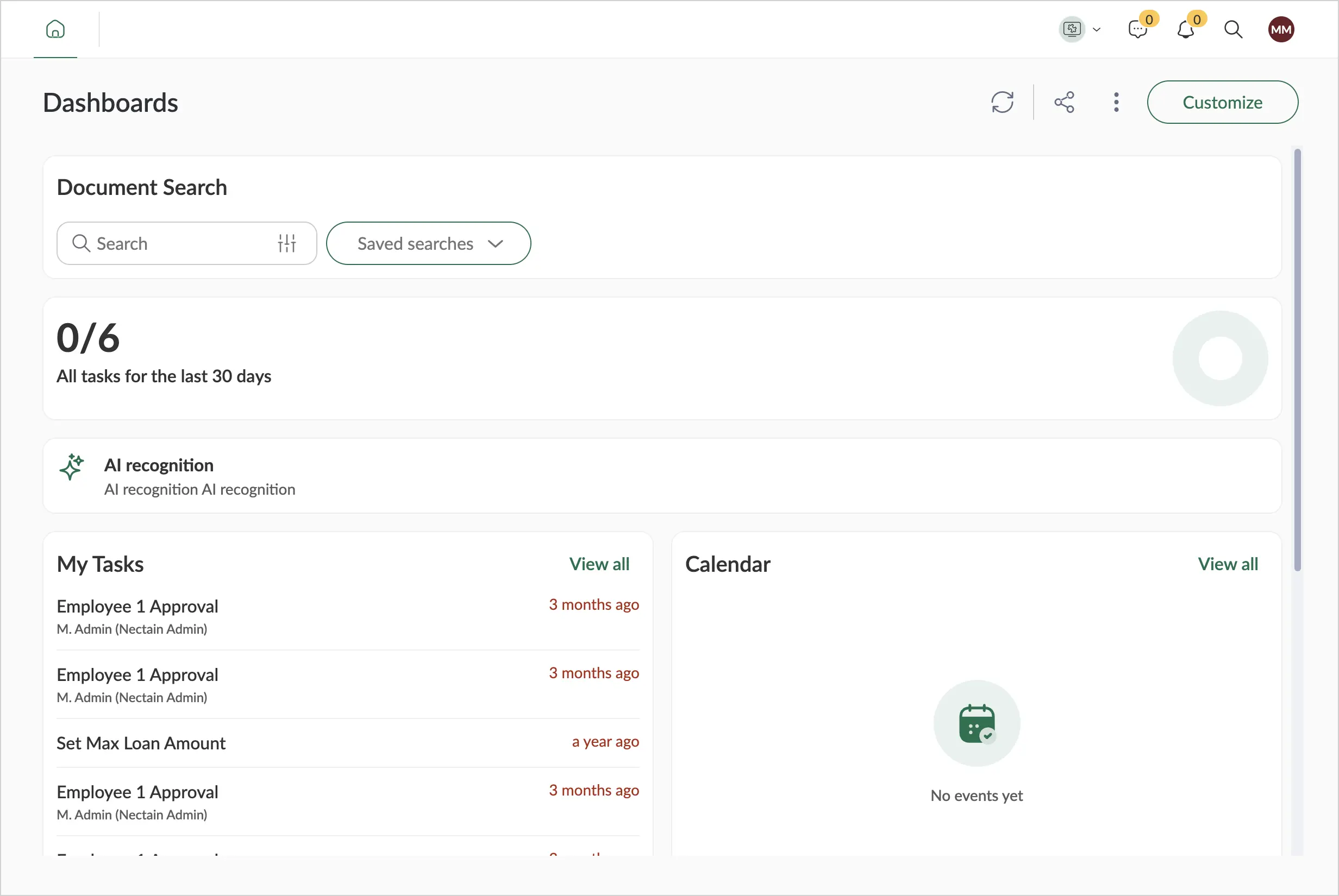
2.1.5.1. Create a Widget
Only users with the Developer or Admin role can create widgets.
-
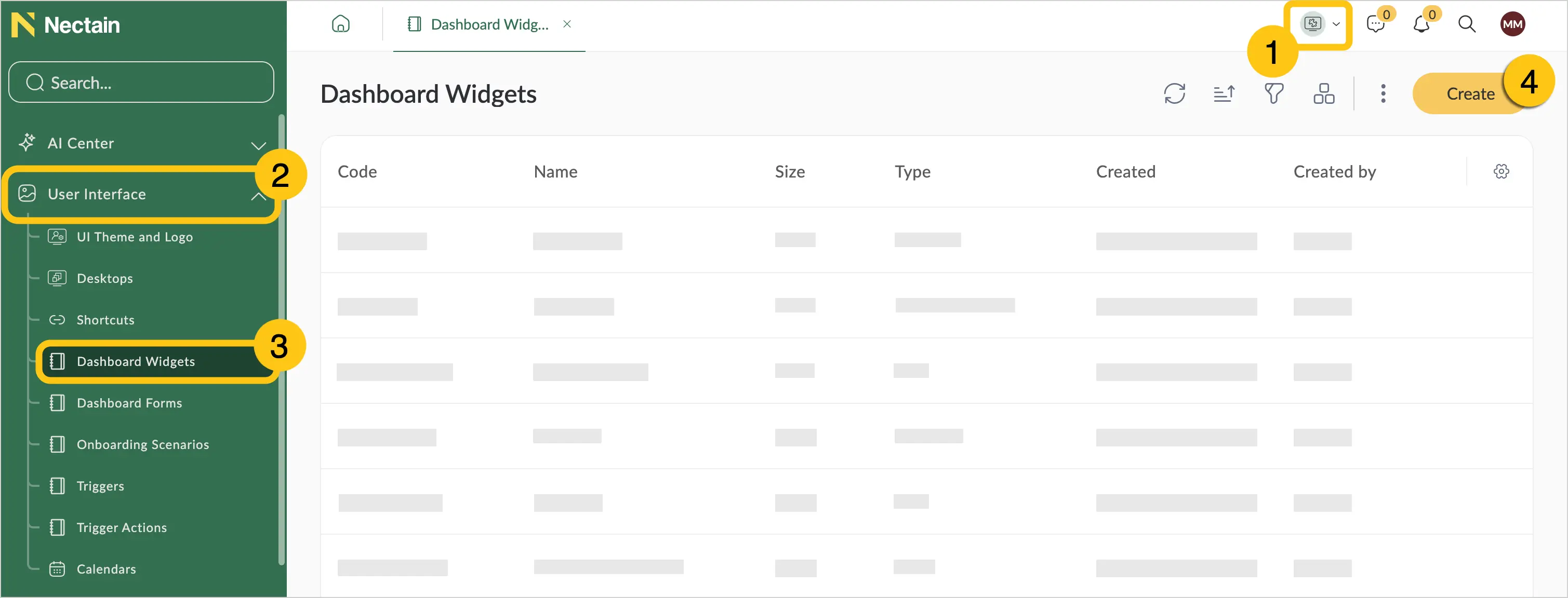
In the navigation panel, select the Studio desktop 1.
-
Select the Interface shortcut group 2, then select the Widgets shortcut 3.
-
In the toolbar, select Create 4.
-
Fill in the fields using the hints in the table below.
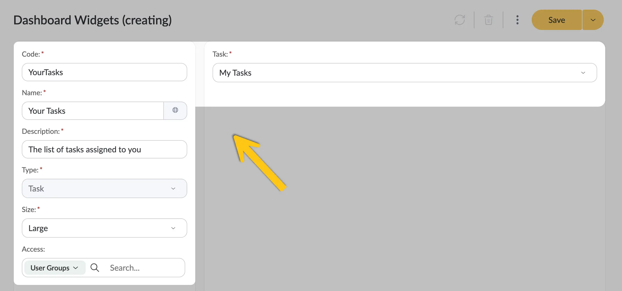
Field Description Code* - The code must be unique.
- The code must be short (usually up to 10 characters).
- Use only Latin letters and digits.
Name* Enter the desired widget name.
ℹ️ Note: you can set an alternative name for different languages. To do this, select the icon and fill in the fields for other languages, then select the Apply button.Description* Enter a short description of the widget's purpose. Type* Select one of the following options from the list: - Tasks — you can display the content of one of the system task shortcuts: All Tasks, Task Archive, or My Tasks.
- Calendar — you can display one or more calendars.
- Link — allows you to add any external or internal link and choose the text and icon with which it will be displayed.
- Rich Text Editor — allows you to create formatted content: add tables, links, images, and change text formatting. You can also view and edit the HTML source code if needed.
- Table — allows you to create a custom tabular data view: choose an entity, add columns from the required attributes, and configure filtering and sorting.
- Shortcut — allows you to display any shortcut in the system.
Size* Select one of the following options from the list: - Large
- Small
ℹ️ Note: only Small size is available for the Link and Shortcut widget types. Only Large size is available for the Table widget type.Access In this field you can select which system users will have access to view the widget. In the left part of the field, select the required role type, and in the right part, start typing the first letters of the name and select the required option from the suggestion list. Note:Fields marked with "*" are required.
-
Fill in the remaining settings according to the widget type:
Widget type: Tasks
Field Description Tasks* Select from the list the shortcut you want to display in the widget. All system task shortcuts are available: - All Tasks — the user will see all tasks in the system they have access to, even if they are not a participant of the task.
- Task Archive — the user will see all cancelled or completed tasks. This shortcut is available only for the Large size.
- My Tasks — the user will see tasks where they are the assignee.
Note:Fields marked with "*" are required.
Widget type: Calendar
Field Description Calendars In the list, check the boxes next to the calendars whose events you want to display in the widget. Make sure that all users you plan to grant access to the widget also have access to the selected calendar. Widget type: Link
Field Description Icon* Select the icon, then choose the required icon from the menu. This icon will be displayed next to the link. Label* Enter the text that will be displayed as a clickable link. For example, if the link leads to the National Bank of Ukraine website, you can enter "NBU" as the label. Link* Paste the URL. This can be an internal link to a platform element or an external link to a web resource. Description* Enter a short description of the link. This text will be displayed below the label. Note:Fields marked with "*" are required.
Widget type: Rich Text Editor
Add the content you need.
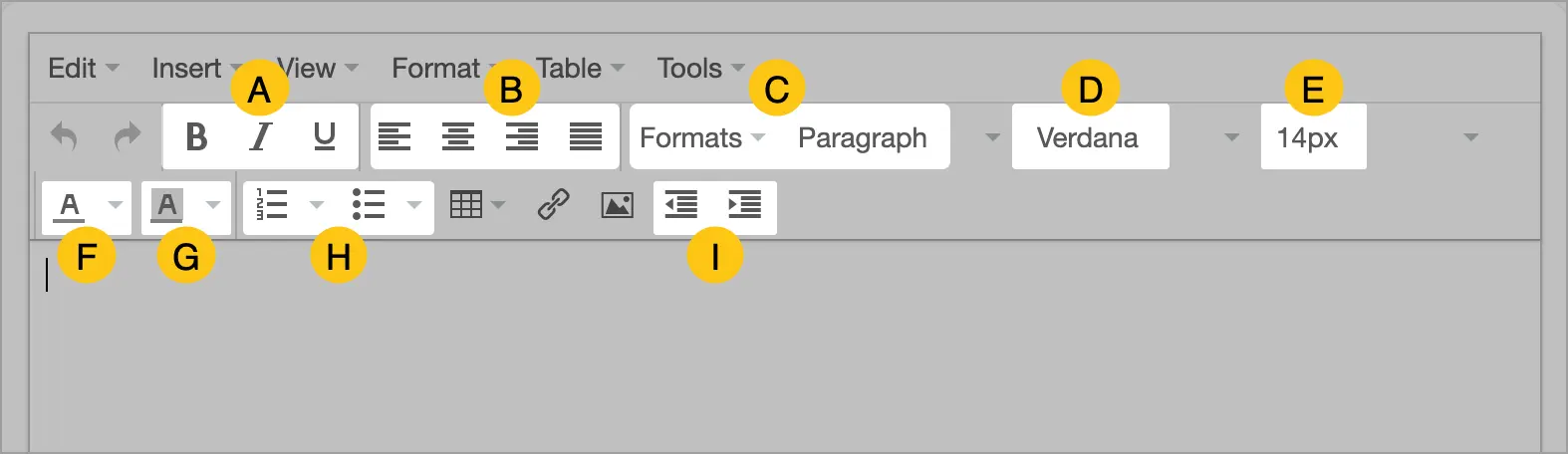
The editor provides flexible text formatting options, including:
- A text styles
- B alignment
- C styles
- D font
- E font size
- F font color
- G background color
- H numbered and bulleted list formatting
- I left indentation
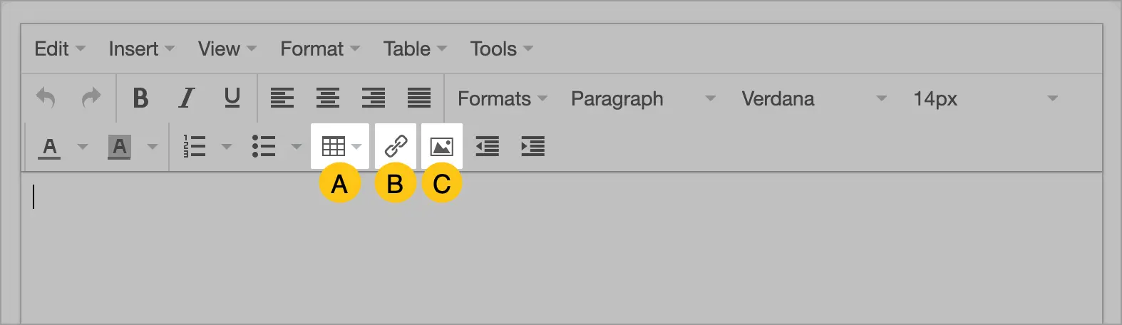
You can also add tables A, links B, and images C.
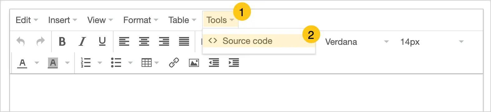
If necessary, you can view and edit the HTML content through the Tools 1 > Source Code 2 menu.
Widget type: Table
This widget type is similar to the Shortcut type, but more flexible — it lets you manually choose which table columns to display, without being tied to an existing shortcut.
-
In the Entity field, select from the list the entity whose attributes you want to display as table columns.
Note:For the Documents (dfx_Document) and Tasks (bpm_Task) entities, you can display not only standard attributes but also custom ones.
-
Only for the Tasks (bpm_Task) entity: In the Related Entity field, select the binding option:
- No binding — only task attributes will be available.
- Document — both task and document attributes will be available. This allows you to display a list of tasks belonging to a specific document type.
-
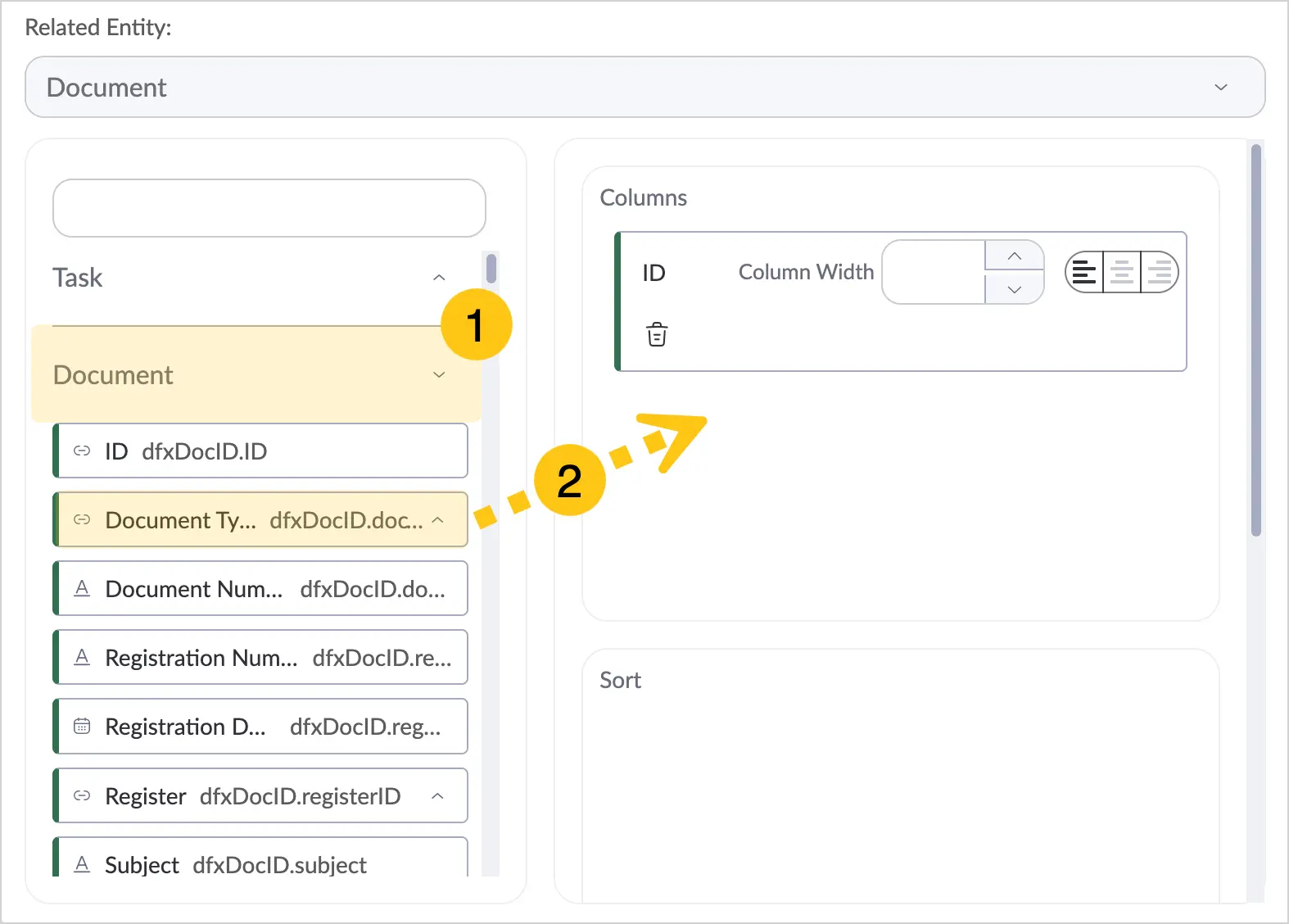
Expand the required attribute folder 1. The folders and attributes in this panel depend on the entity you selected in the previous step.
-
Drag the required attributes to the Columns section 2. These attributes will form the columns of the table displayed in the widget.
-
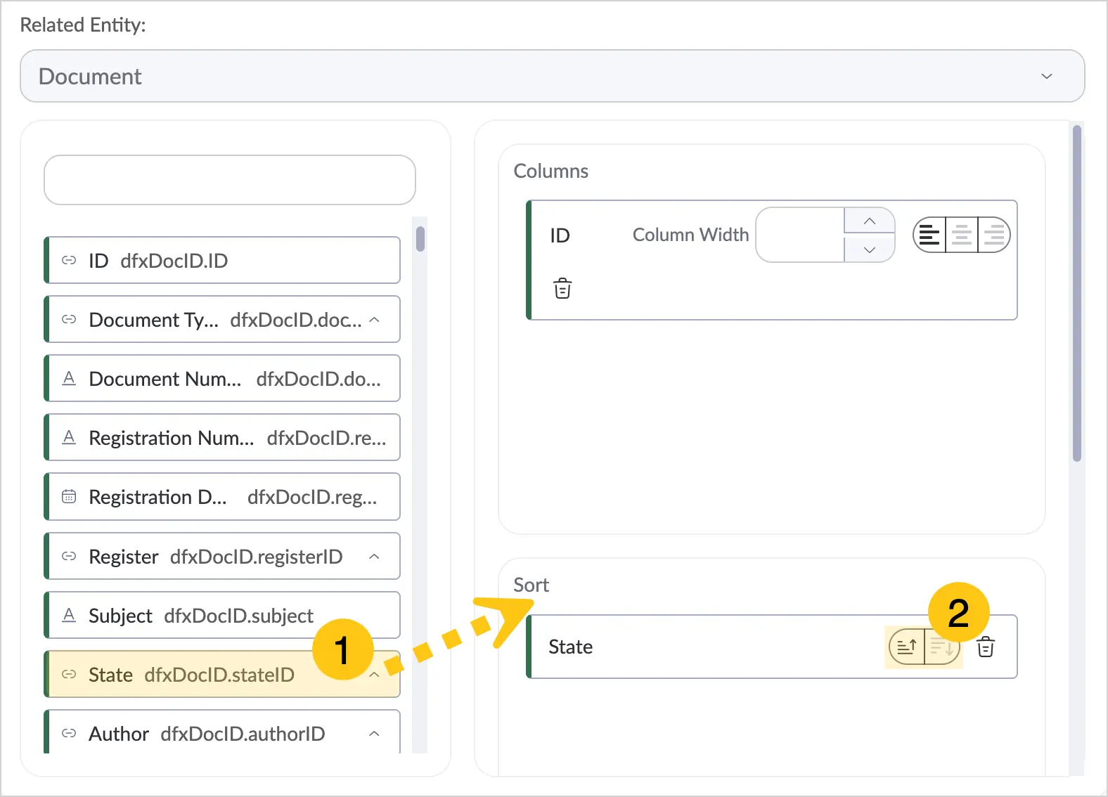
Drag the required attributes to the Sorting section 1, then in the added attributes select the sorting condition 2: ascending or descending. This determines the order in which records are displayed in the table.
-
Drag the required attributes to the Filters section 1, then in the added attributes select the filter condition 2.
For example, you can add the Author attribute, set the filter condition to "one of", and in the Value field specify the required user. This way, the widget will display only tasks whose author is the selected user.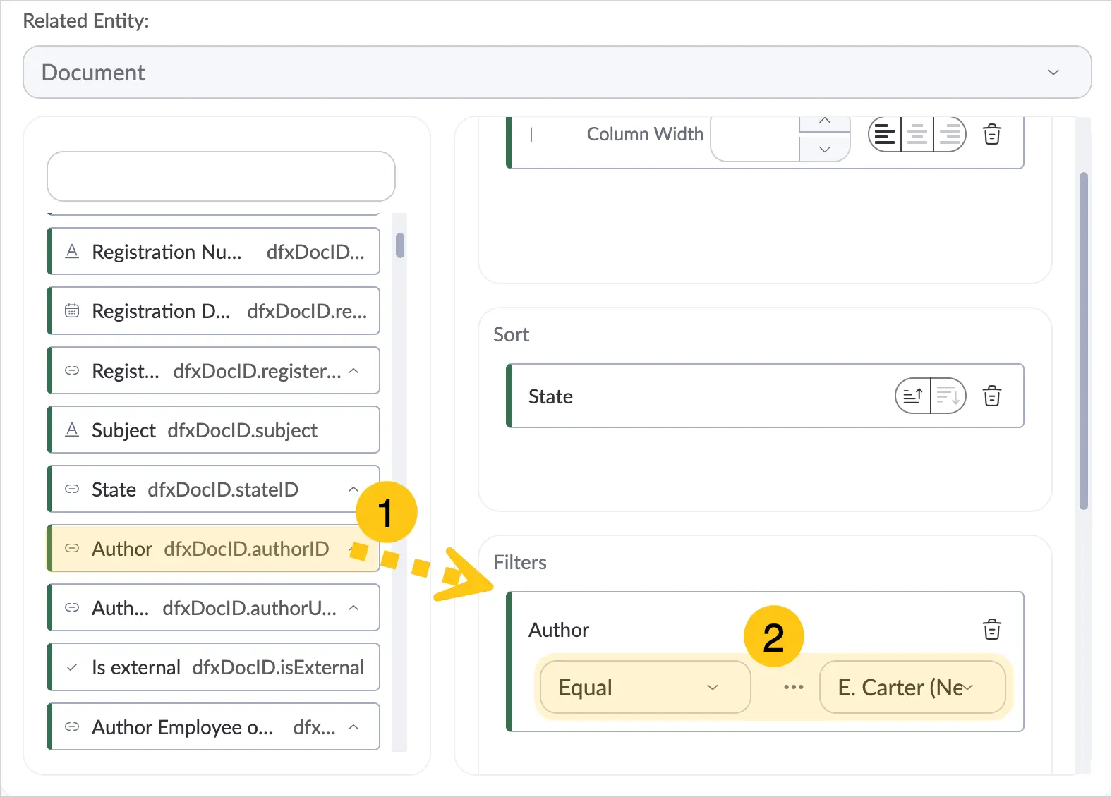
Widget type: Shortcut
In the Shortcut field, select from the list the shortcut you want to display in the widget.
-
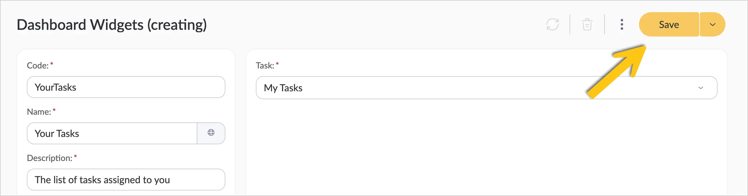
In the toolbar, select Save.
2.1.5.2. Create a Dashboard
Dashboards can be created by users with the User and Admin roles.
Method 1: for User
-
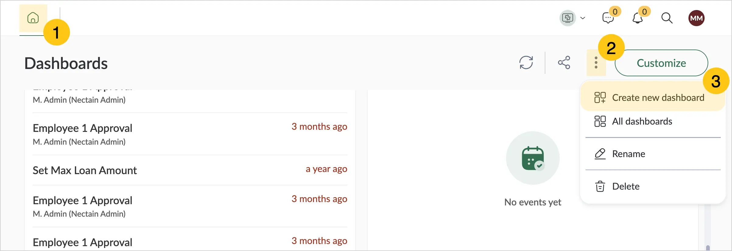
In the upper-left corner, select the icon 1.
-
Select the icon 2.
-
Select Create New Panel 3.
Method 2: for Admin
-
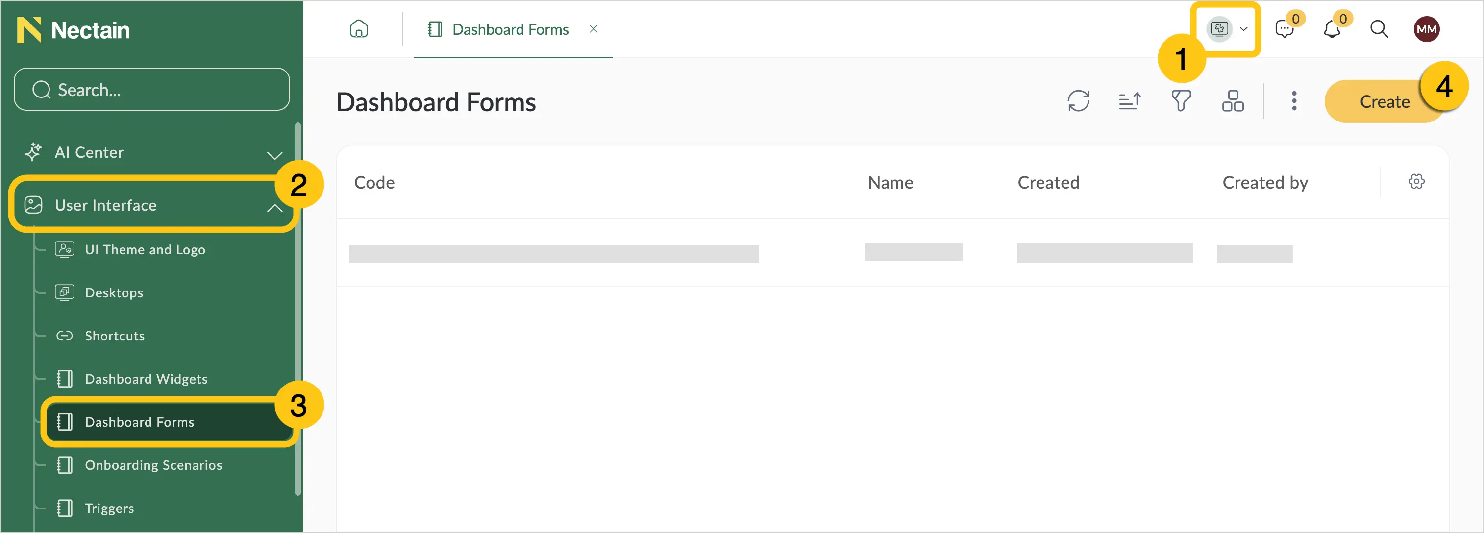
In the navigation panel, select the Studio desktop 1.
-
Select the Interface shortcut group 2, then select the Dashboards shortcut 3.
-
In the toolbar, select Create 4.
The remaining settings are the same for both methods:
-
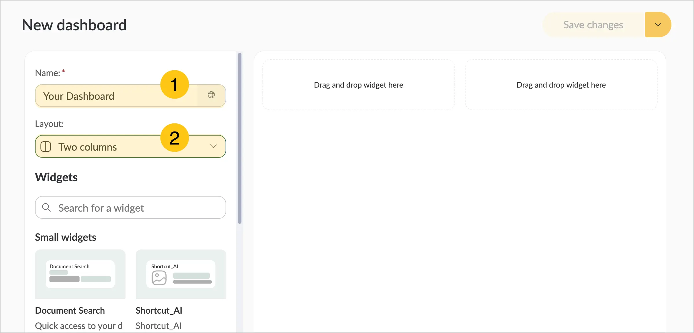
In the Name field 1, enter the desired name. It will be displayed at the top of the panel.
-
In the Layout field 2, select the number of columns for the form from the list.
-
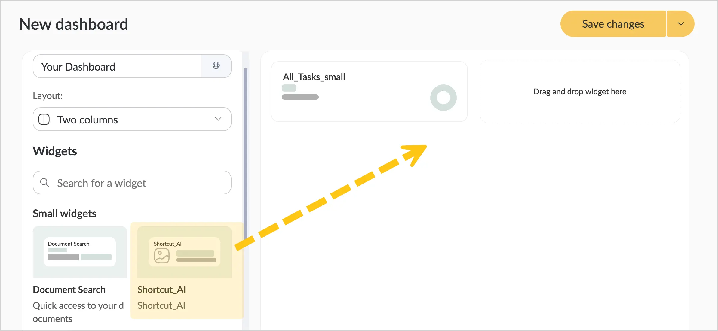
From the Widgets panel, drag the required widgets onto the dashboard.
 Tip:
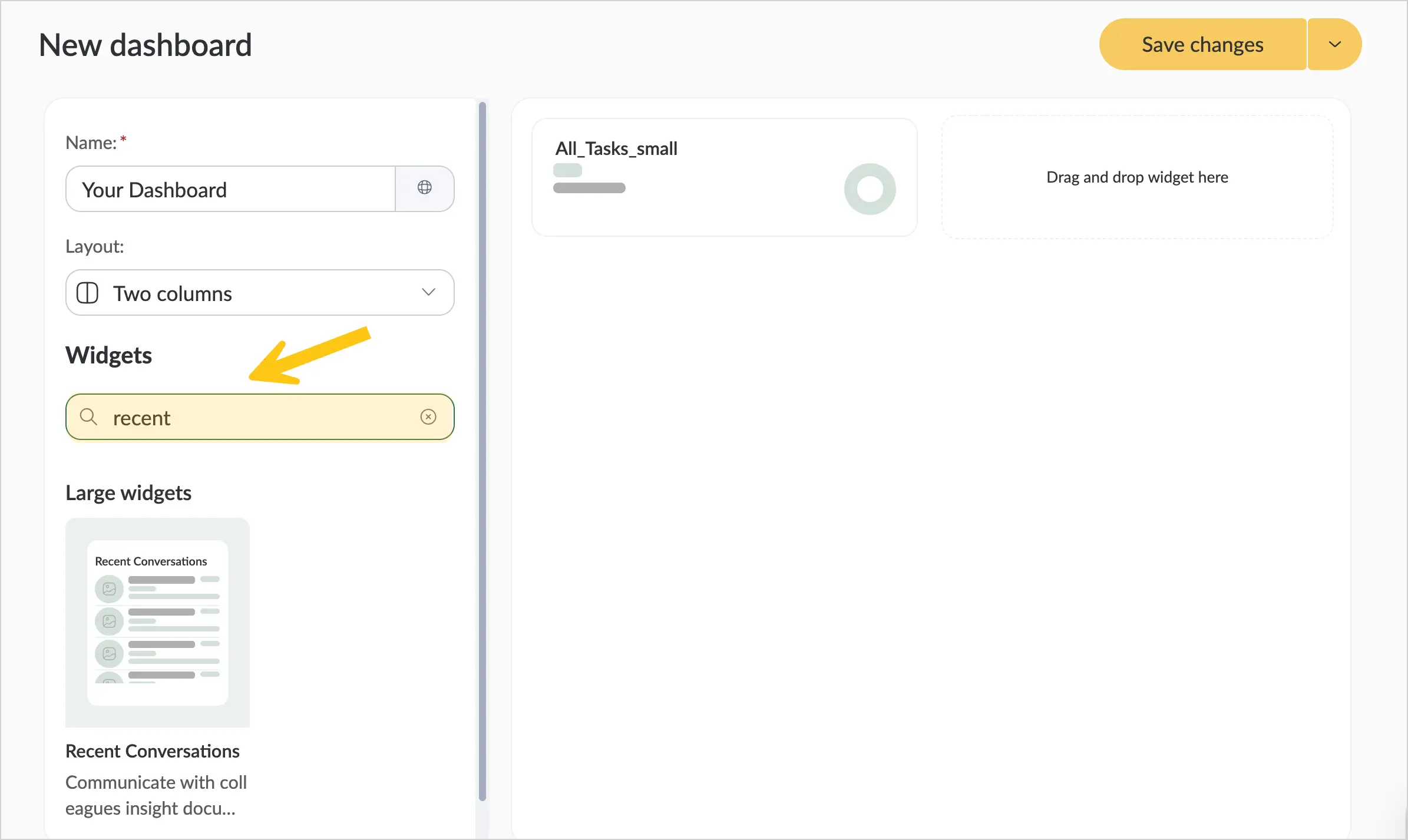
Tip:If you have many widgets, you can use the search to quickly find the required widget by its name or description.
-
To change the order of widgets, simply hold and drag a widget to the desired position on the form.
Notes:-
If you are using a two-column layout, a small widget cannot be placed in the same row as a large one. Large widgets can only be placed in the same row as widgets of the same size.
-
If there is free space on the panel, widgets automatically expand to fill the available width proportionally.
For example: in a three-column layout with two widgets, each occupying one column, after saving they will share the third column — effectively each widget will occupy 1.5 columns.
-
-
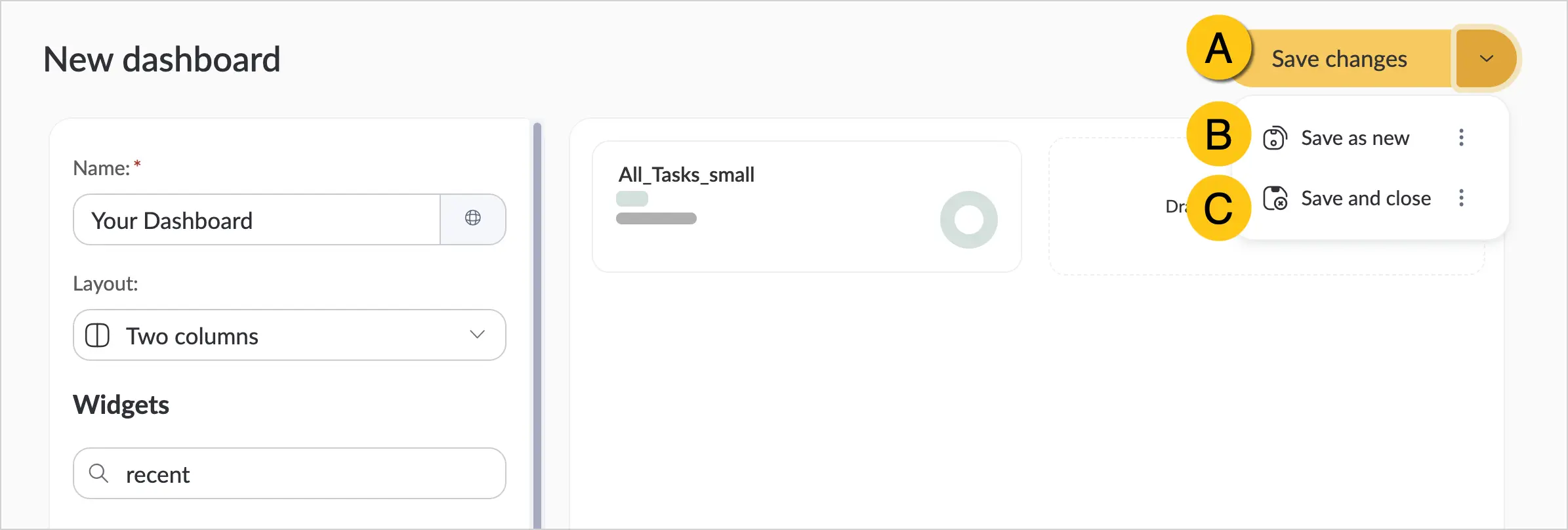
In the upper-right corner, select a save option:
-
A Save Changes — saves your new form by default. After saving, you will see the saved dashboard.
-
B Save as New — creates and saves a copy. This allows you to continue making changes to the original version, while the copy with the captured changes is saved separately in the system. Creating copies is useful when you need to develop different versions of forms for different audiences. When selecting this option, a Name field will appear where you can enter a name for the copy.
-
C Save and Close — saves your new form and closes it.
-
2.1.5.3. Share a Dashboard
-
After creating and saving the dashboard, in the toolbar select the icon 1.
-
Choose one of the options:
- A Share with — you can add a specific user or user group.
- B Link — you can copy the link and send it, for example, using the Messages feature or any other method.
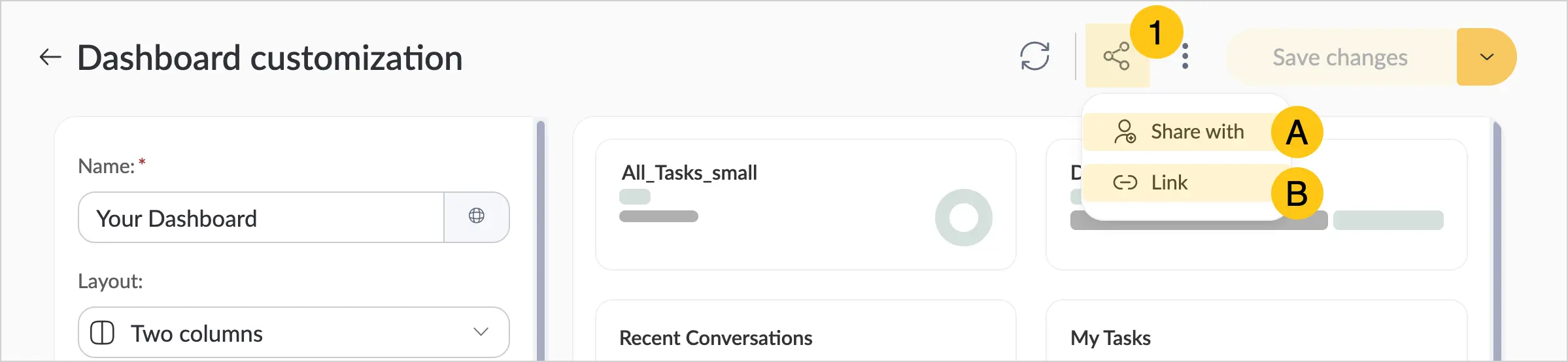
After this, the user with whom you shared the dashboard will be able to see it in the All Panels list.
2.1.5.4. Open a Dashboard
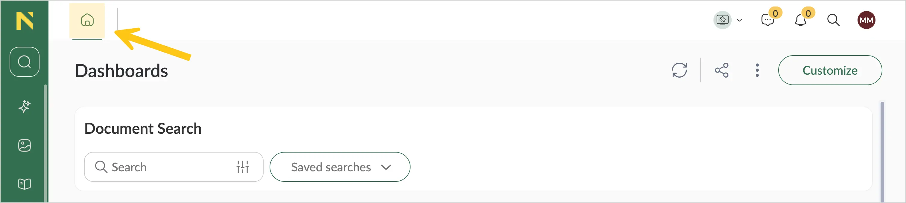
To open a dashboard, select the icon in the upper-left corner.
2.1.5.5. View All Available Dashboards
-
Select the icon 1, then select All dashboards 2.
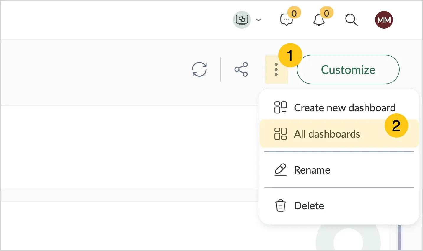
In this tab you will see all dashboards you have been granted access to. After logging in, the panel set as the default will open. See the Set Default Dashboard section.
2.1.5.6. Set Default Dashboard
-
Select the icon 1, then select All dashboards 2.
-
On the required panel, select Set as Default.
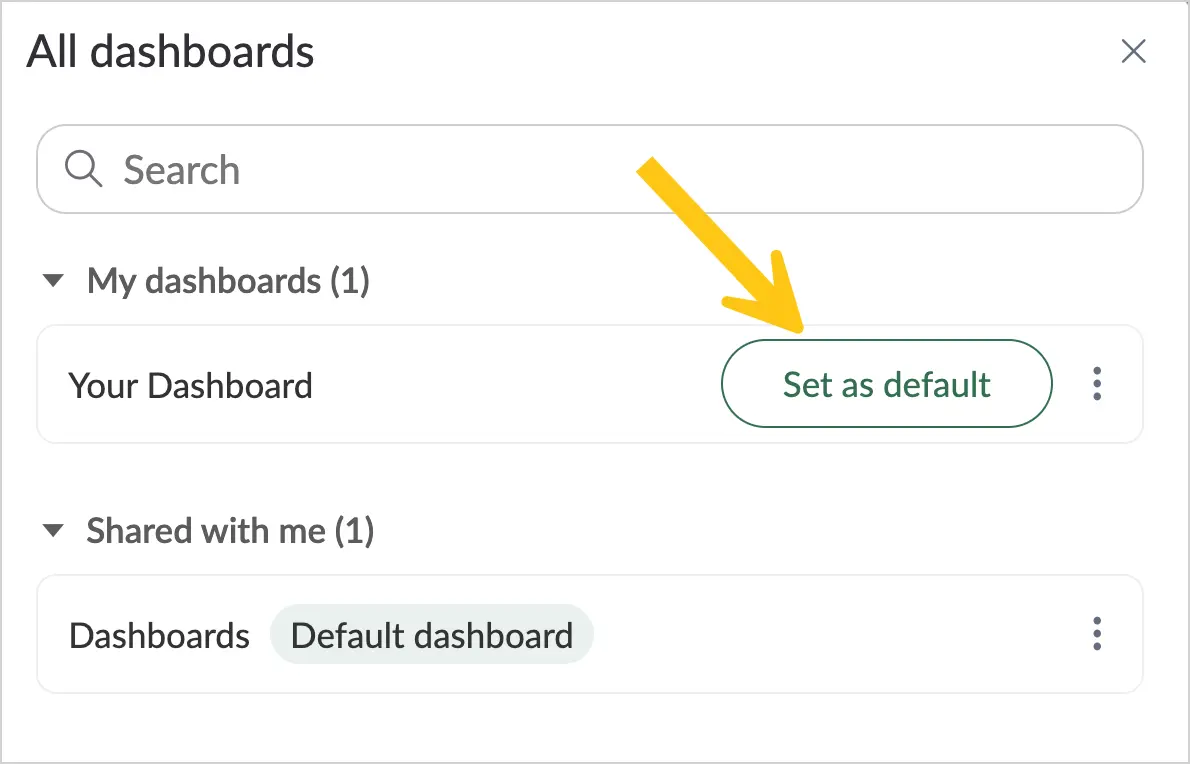
After logging in, the dashboard set as the default will open.
2.1.6. Onboarding
Onboarding is a feature that allows you to guide users through the interface and system capabilities step by step while they work. You can prompt users where to click, what to fill in, or how to complete an action by displaying messages next to interface elements. This is especially useful for training new users and explaining new features after updates. An administrator can create different onboarding scenarios for different audiences — for example, for new users, specific roles, or departments.
To configure onboarding, complete the following steps:
- Create a trigger — define the event that will launch the scenario (for example, opening a shortcut or clicking an element).
- Create an onboarding scenario — configure the sequence of steps and messages the user will see.
- Create a trigger action — link the trigger to the scenario and define for whom and under what conditions it will run.
2.1.6.1. Create a Trigger
-
In the navigation panel, select the Studio desktop 1.
-
Select the Interface shortcut group 2, then select the Triggers shortcut 3.
-
In the toolbar, select + 4.
-
Fill in the fields using the hints in the table below.
Field Description Code* - The code must be unique.
- The code must be short (usually up to 10 characters).
- Use only Latin letters and digits.
Name* Enter a short and clear name for the trigger.
For example: Opening User Profile — for an onboarding scenario that introduces the user to profile settings.ℹ️ Note: This field supports localization. Select the icon to add values for other languages, fill in the corresponding fields, and select Apply.
Type* Select one of the following options: - Element — the trigger fires when a specific interface element is interacted with.
- Desktop — the trigger fires when the selected desktop is opened.
- System Form — the trigger fires when a system form is interacted with.
- Shortcut — the trigger fires when a shortcut is opened or closed.
Element
available only for the Element typeSelect the interface element whose interaction will launch the onboarding scenario.
To select an element:- Select the Select on Page button 1 to enter the interface element selection mode.
- Enable the Start Element Selection toggle 2.
- Click the required element 3, for example, the user profile image.
- Select Select to confirm your choice. The system will automatically record the code of the selected element in the Element field.
Desktop
available only for the Desktop typeSelect the desktop whose opening will launch the onboarding scenario. System Form
available only for the System Form typeSelect the system form whose opening, closing, or saving will launch the onboarding scenario. For example, this can be a document creation form, a task form, or any other entity form. Add Filters
available only for the System Form typeEnable the toggle if you want to launch the scenario only when the form meets certain filter conditions. For example: if you selected the dfx_Document form so that the scenario launches when a document form is opened, you can add a filter so that the scenario launches only for documents of a specific type.
To add filters:- Expand the required attribute folder in the left part of the form.
- Drag the attributes you want to use as filter conditions to the Filters section.
Note: You can add multiple attributes and combine them to build complex conditions. - For each attribute in the Filter field, specify the values by which the system will identify records.
Shortcut
available only for the Shortcut typeSelect the shortcut whose opening or closing will launch the onboarding scenario. Action* Select the event that will trigger the onboarding scenario. Available values depend on the selected type: - Click — when the element is clicked
- Focus — when the element becomes active (for example, when clicked or when a input field is focused)
- Blur — when the user moves from the element to another
- Open — when opened
- Close — when closed
- Saved — after the form is saved
Depending on the type, the following actions are available:- Element: Click, Focus, Blur
- Desktop: Open
- System Form: Open, Close, Saved
- Shortcut: Open, Close
Note:Fields marked with "*" are required.
-
In the toolbar, select Save.
2.1.6.2. Create an Onboarding Scenario
-
In the navigation panel, select the Studio desktop 1.
-
Select the Interface shortcut group 2, then select the Onboarding Scenarios shortcut 3.
-
In the toolbar, select + 4.
-
Fill in the fields using the hints in the table below.
Field Description Code* - The code must be unique.
- The code must be short (usually up to 10 characters).
- Use only Latin letters and digits.
Name* Enter a short and clear name for the onboarding scenario. ℹ️ Note: This field supports localization. Select the icon to add values for other languages, fill in the corresponding fields, and select Apply.
Allow User to Skip Onboarding Check this box to allow the user to stop the onboarding scenario at any time. In that case, an × icon will appear in the onboarding message, which the user can click to close the scenario. -
Go to the Steps tab.
-
If you want to add localized versions of the scenario for users with different interface languages, perform the following steps:
- Select + Translations 1.
- Check the boxes next to the required languages 2.
-
Tabs for the selected languages will appear 1. For each language, you can fill in the Name and Description fields in the corresponding language 2. Other step settings will be the same for all languages.
-
In the Name field 1, enter the text that will be displayed as the message heading. For example: Set up your profile.
-
In the Description field 2, enter the main message text that will be shown to the user. For example: Go to profile settings to change your password, connect a scanner, or change the interface language.
Note:Using the Insert tab, you can add an image A or a link B to the text.
Using the Tools tab 1, you can view the source code 2 and, if needed, add custom HTML (for example, to apply custom text formatting).
-
Select the Select on Page button to identify the interface element next to which the message will be displayed.
-
Enable the Start Element Selection toggle 1.
-
Click the interface element 2 that should be highlighted during the scenario and next to which the message should be displayed.
-
Select Select to confirm your choice.
-
Check the Auto-click on Transition checkbox 1 if you need to automatically click the selected element when moving to the next step. For example: you can select the user profile image and enable auto-click so that when moving to the next step, the profile settings window opens automatically.
-
In the Position field 2, select the placement of the message relative to the element (top, bottom, left, or right).
-
In the Alignment field 3, select the alignment of the message relative to the element (for example, center, left, or right).
Tip:To preview how the message will look, select the icon.
-
Select Add Step if you need to create additional steps, and repeat steps 7–15 for each of them.
-
Select Save.
2.1.6.3. Create a Trigger Action
-
In the navigation panel, select the Studio desktop 1.
-
Select the Interface shortcut group 2, then select the Trigger Actions shortcut 3.
-
In the toolbar, select + 4.
-
Fill in the fields using the hints in the table below.
Field Description Code* - The code must be unique.
- The code must be short (usually up to 10 characters).
- Use only Latin letters and digits.
Trigger* Select the trigger that defines the event for launching the onboarding scenario. Priority* Specify the execution priority of the trigger action. If multiple trigger actions are configured for a single element, the action with the higher priority will execute first. The lower the number, the higher the priority. Target Entity Name* Select Onboarding Scenario. Target Entity* Select the onboarding scenario that will be launched when the trigger fires. Execute Once Enable this if the scenario should run only once per user. If disabled, the scenario will run every time the trigger condition is met. Access Defines which users this trigger action will be active for.
To grant access:- In the left part A, select the type of unit to grant access to (for example, user groups, system roles, users, organizations, departments, positions, or executor groups).
- In the search field B, start typing the name of the required unit and select it from the list.
Note:Fields marked with "*" are required.
-
In the toolbar, select Save.