1.3. Interface Elements
Nectainium is a single-page application (SPA) with a responsive interface that automatically adjusts according to the user’s roles and access rights. This allows users to:
- Work within a single browser tab
- Use a unified interface for all users
- Efficiently manage access permissions for different functions
Navigation in Nectainium is built around three key elements:
- Desktops
- Shortcuts
- Tabs
1.3.1. Desktops
Desktops are sections that contain shortcuts and shortcut groups.
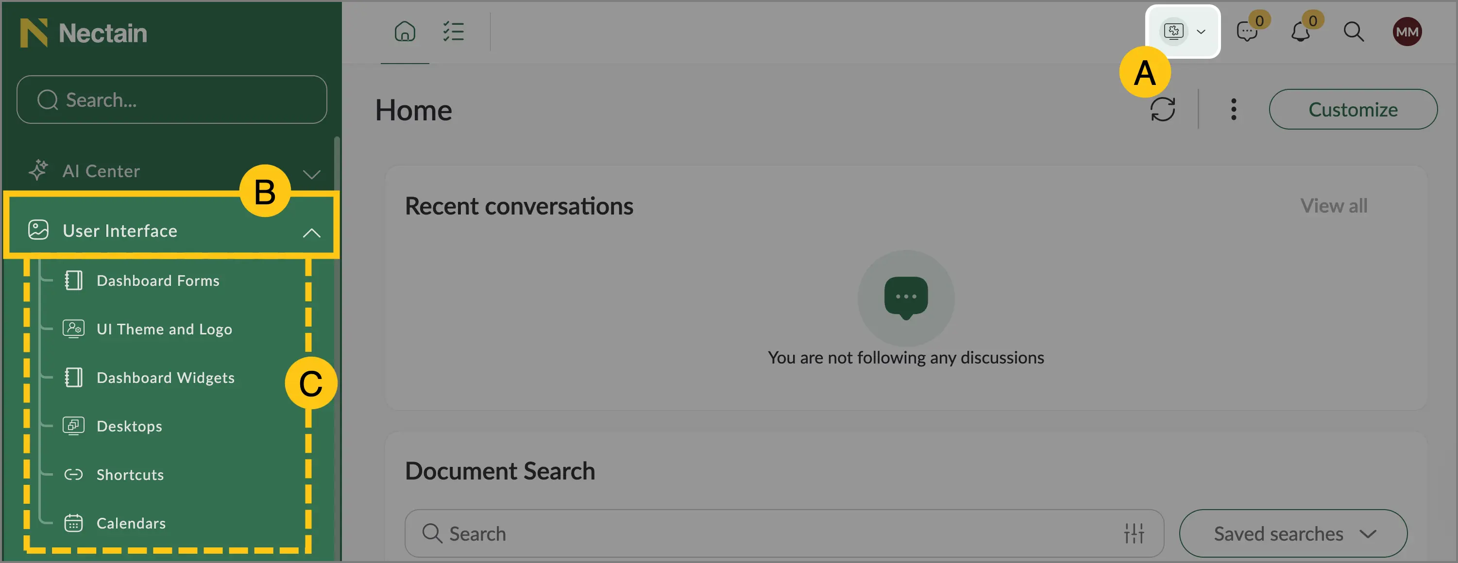
- A — desktop
- B — shortcut group
- C — shortcuts
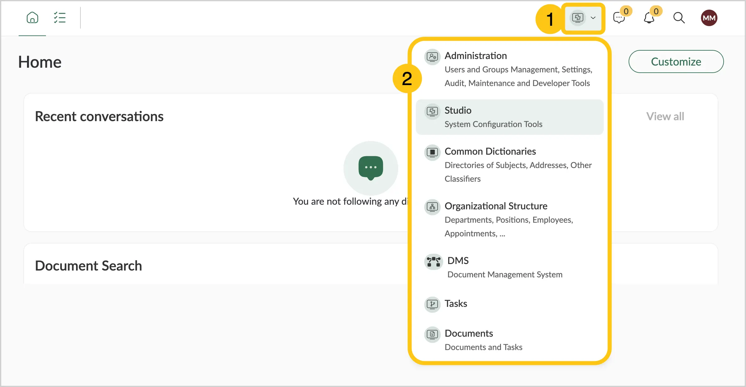
By default, the following desktops are available:
- Administration — user and group management, system settings, audit logs, maintenance and development tools
- Studio — platform configuration tools
- General Directories — directories of entities, addresses, and other classifiers
- Org. Structure — departments, positions, employees, and assignments
- Tasks — tasks
- Documents — documents
To open the desktops menu, at the top of the navigation menu, select the desktop icon 1, and then the Select Desktop menu will appear 2.
You can create your own desktops. For details, see Create Desktop.
1.3.2. Shortcuts
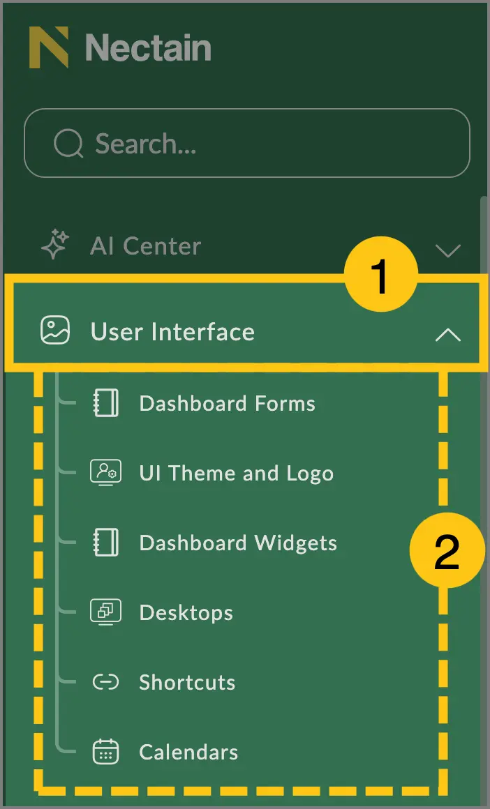
Shortcuts 2 are navigation elements located within shortcut groups 1 or directly inside desktops.
You can create your own shortcuts and shortcut groups. For details, see Create Shortcut.
1.3.3. Grids
A Grid is a collection of elements such as records or documents located within shortcuts.
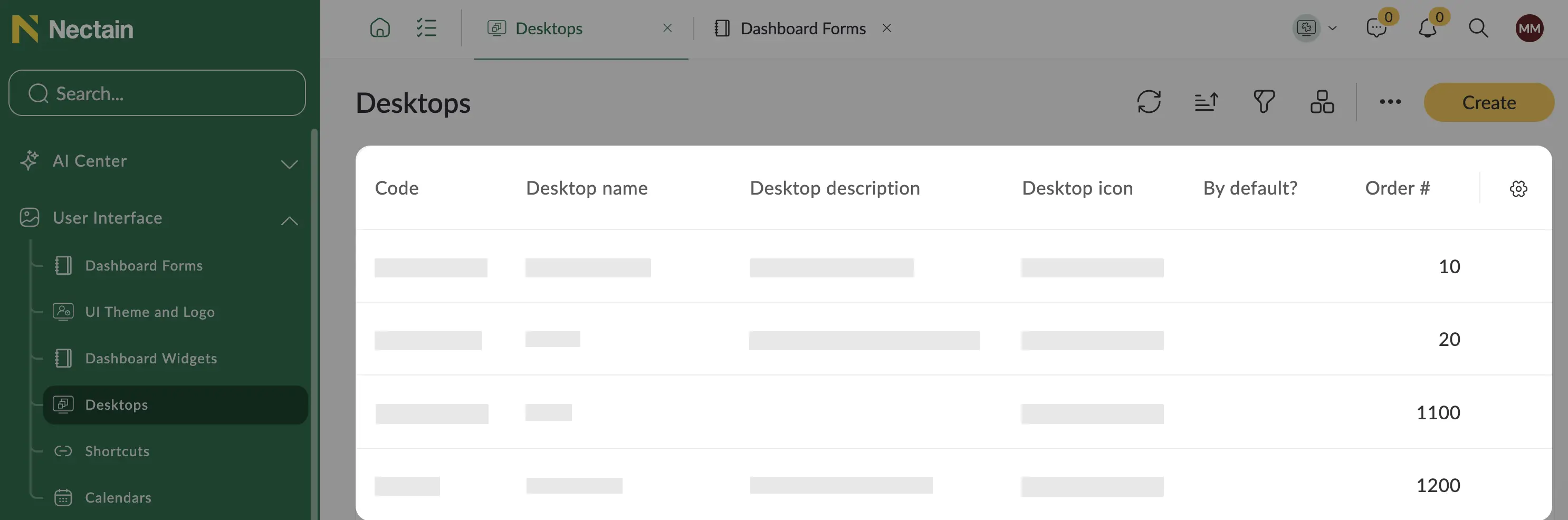
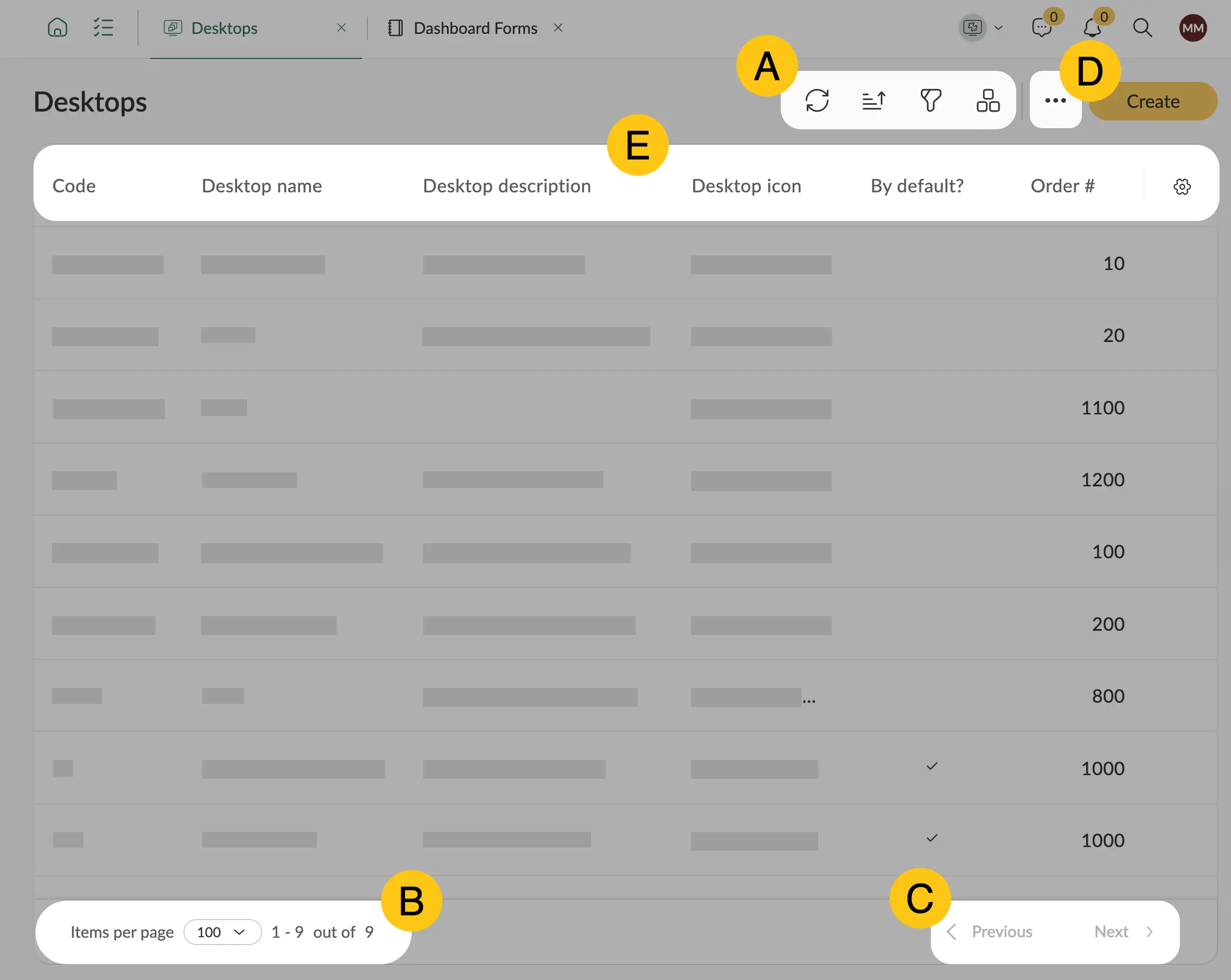
Grids also include the following interface elements:
-
Top menu buttons A: Refresh, Add, Filters, Sorting, Multi-selection mode, Folders, and others. The buttons in the top menu may vary depending on the grid.
-
Number of records in a grid B — the platform displays up to 100 records per page.
-
Page navigation buttons C.
-
Grid settings menu D.
-
Grid columns E — when creating custom shortcuts, you can configure grid columns manually. In standard shortcuts, grid columns cannot be changed.
1.3.3.1. Configure Grid Rows and Columns Display
The Manage Columns function allows users to customize which columns are displayed in the record list.
The changes you make are stored in your browser, not on the server, so these settings will disappear if you clear cookies or switch browsers.
There are now three available ways to adjust column display: through each column’s context menu, the settings menu in the upper corner, or by dragging and dropping columns with the mouse.
1.3.3.1.1. Sort
-
Open the required grid whose columns you want to configure.
-
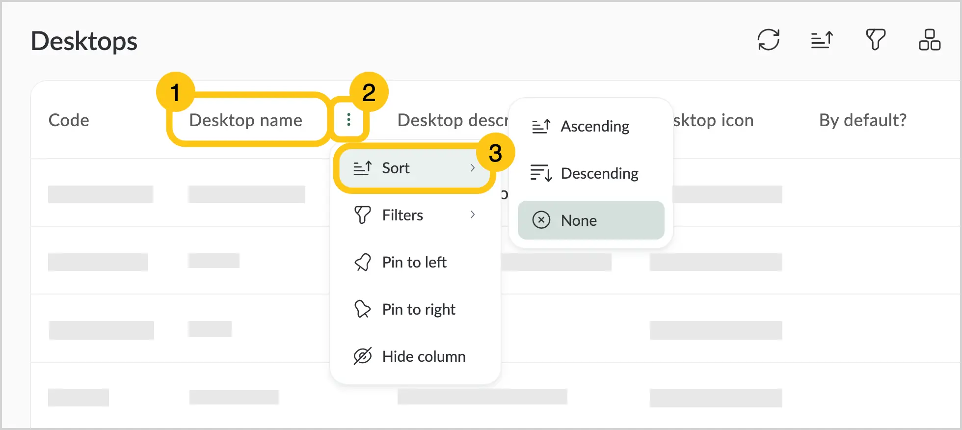
Hover over the column name to display the context menu icon 1.
-
Click the icon 2 and select Sort 3.
-
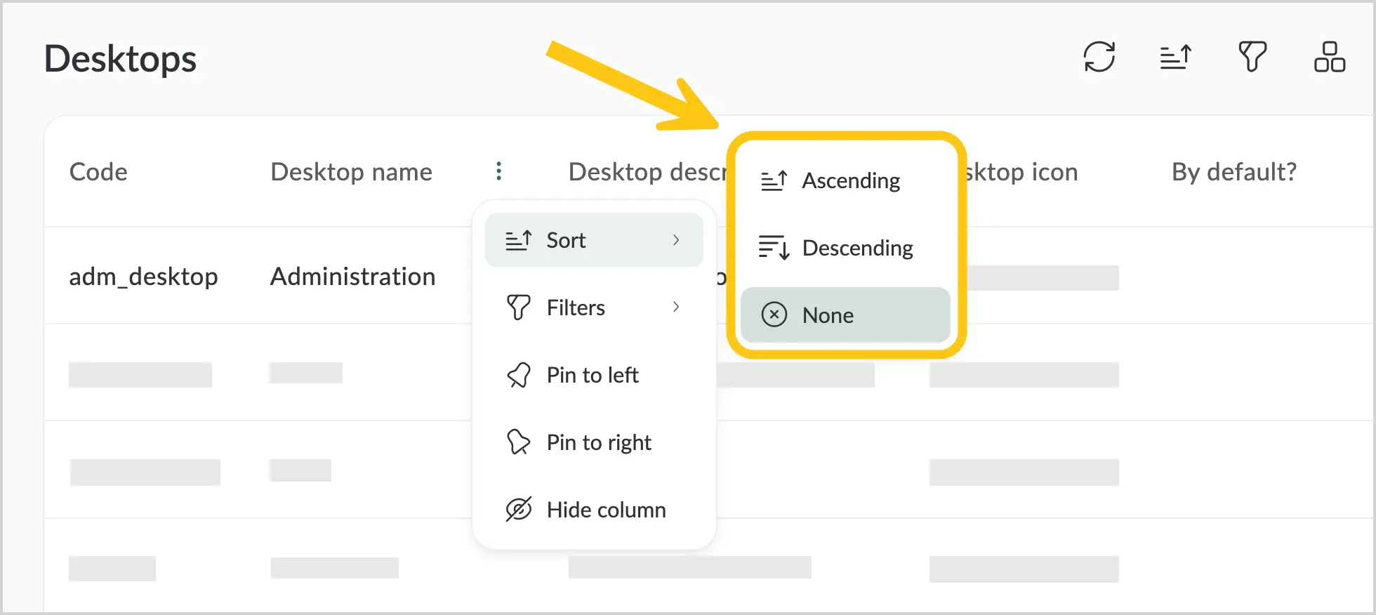
Choose the desired sorting order:
- Ascending — displays values from smallest to largest.
- Descending — displays values from largest to smallest.
- None — cancels the previously applied sorting.
1.3.3.1.2. Filter
-
Open the required grid whose columns you want to configure.
-
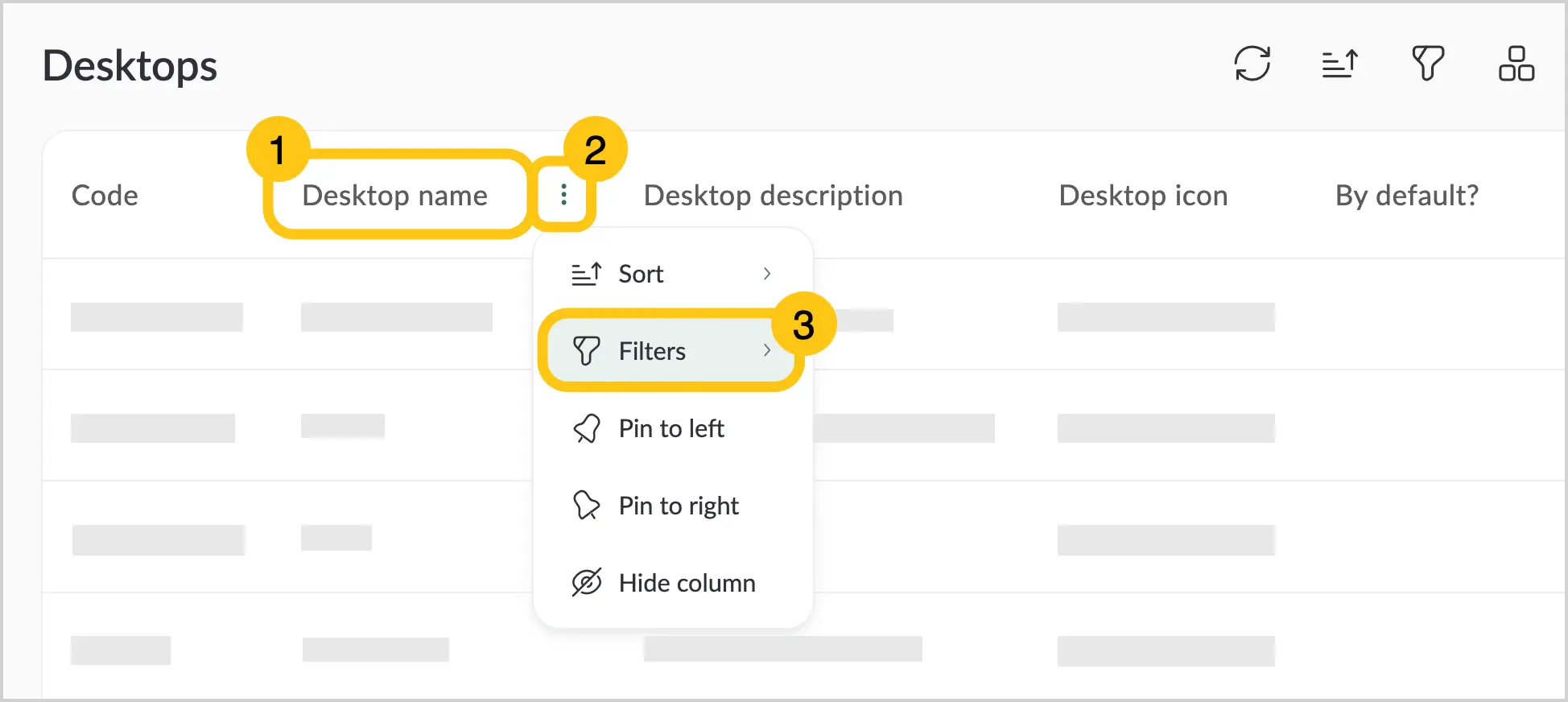
Hover over the column name to display the context menu icon 1.
-
Click the icon 2 and select Filters 3.
-
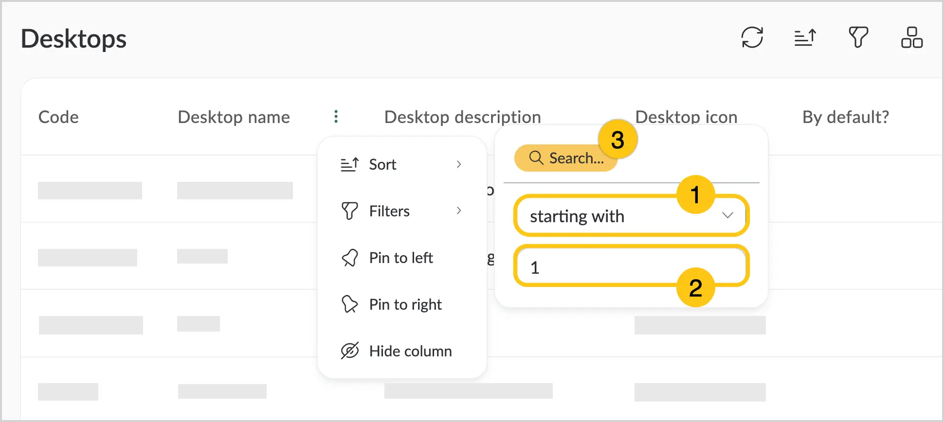
Configure the filter criteria:
-
Select the required condition from the dropdown list 1.
- Equals — matches the specified value.
- Not equal to — shows all items except the one matching your condition.
- Greater than — shows values greater than the one entered in the text field.
- Less than — shows values smaller than the one entered in the text field.
- Range — matches the “from — to” range you specify in the text fields.
- Empty — displays items with an empty selected field.
- Filled — displays items with any value in the selected field.
- Starts with — displays items that begin with the entered value.
- Contains — displays all items where the selected field contains the specified value.
- Does not contain — displays all items except those containing the specified value.
- From (date) — displays all items from the entered date onward.
- On date — displays items related to a specific date.
- To (date) — displays all items up to the entered date.
- One of — displays all items containing the specified criterion.
Note:Filter conditions vary depending on the data type in the table.
-
Manually enter a filtering criterion into the text field 2.
-
Select Search 3.
-
1.3.3.1.3. Pin a Column
-
Open the required grid whose columns you want to configure.
-
Hover over the column name to display the context menu icon.
-
Click the icon and select either Pin to the left A or Pin to the right B.
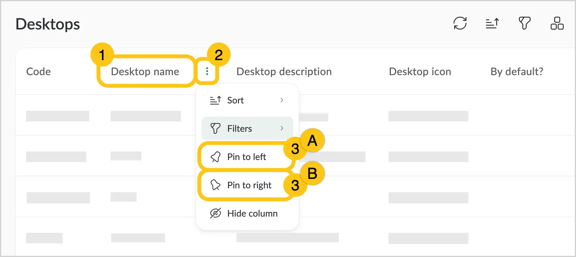
You can pin up to two columns on each side. The names of pinned columns are displayed in bold.
1.3.3.1.4. Unpin a Column
-
Open the required grid whose columns you want to configure.
-
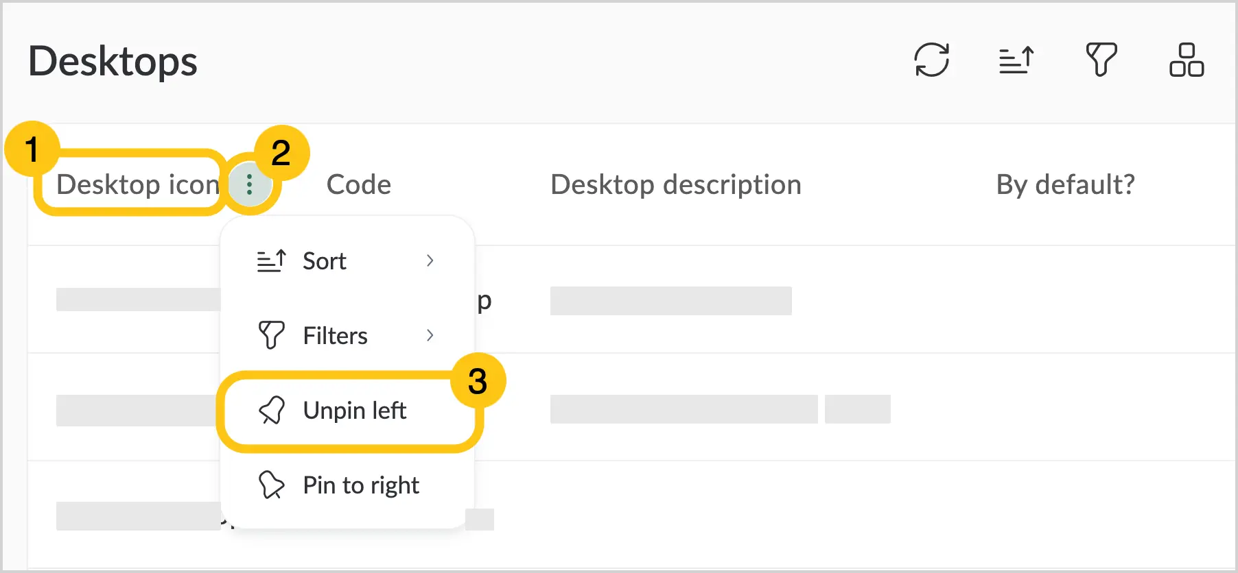
Hover over the name of a pinned column to display the context menu icon 1.
-
Click the icon 2 and select Unpin 3.
1.3.3.1.5. Hide a Column
Method 1. Using the context menu
-
Open the required grid whose columns you want to configure.
-
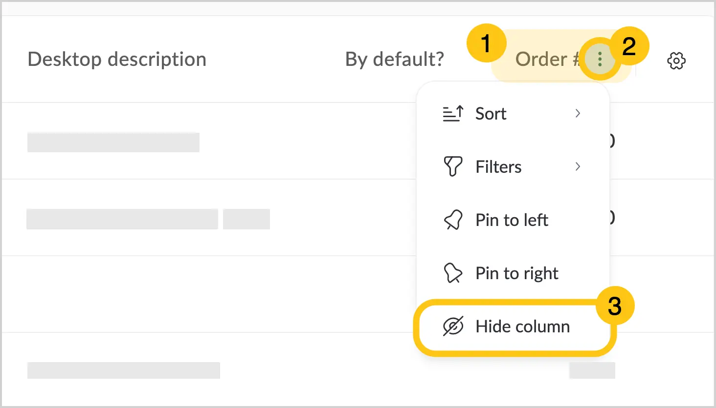
Hover over the column name to display the context menu icon 1.
-
Click the icon 2 and select Hide column 3. Hidden columns will disappear from the view but can be restored through the settings menu.
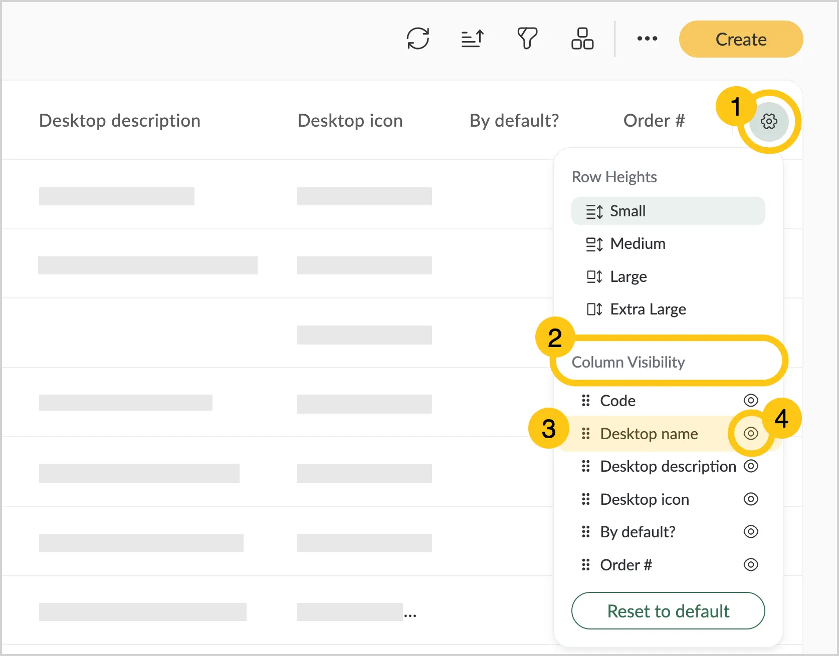
Method 2. Using the settings menu
-
Open the required grid whose columns you want to configure.
-
In the upper-right corner, select the settings icon 1.
-
In the Column visibility list 2, choose the column you want to hide and click the icon next to its name 4.
1.3.3.1.6. View Available Columns for This Grid
-
Open the required grid whose columns you want to configure.
-
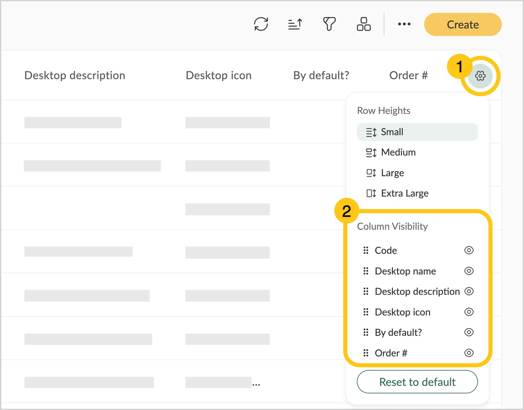
In the upper-right corner, select the icon 1. Go to the Column visibility section 2.
-
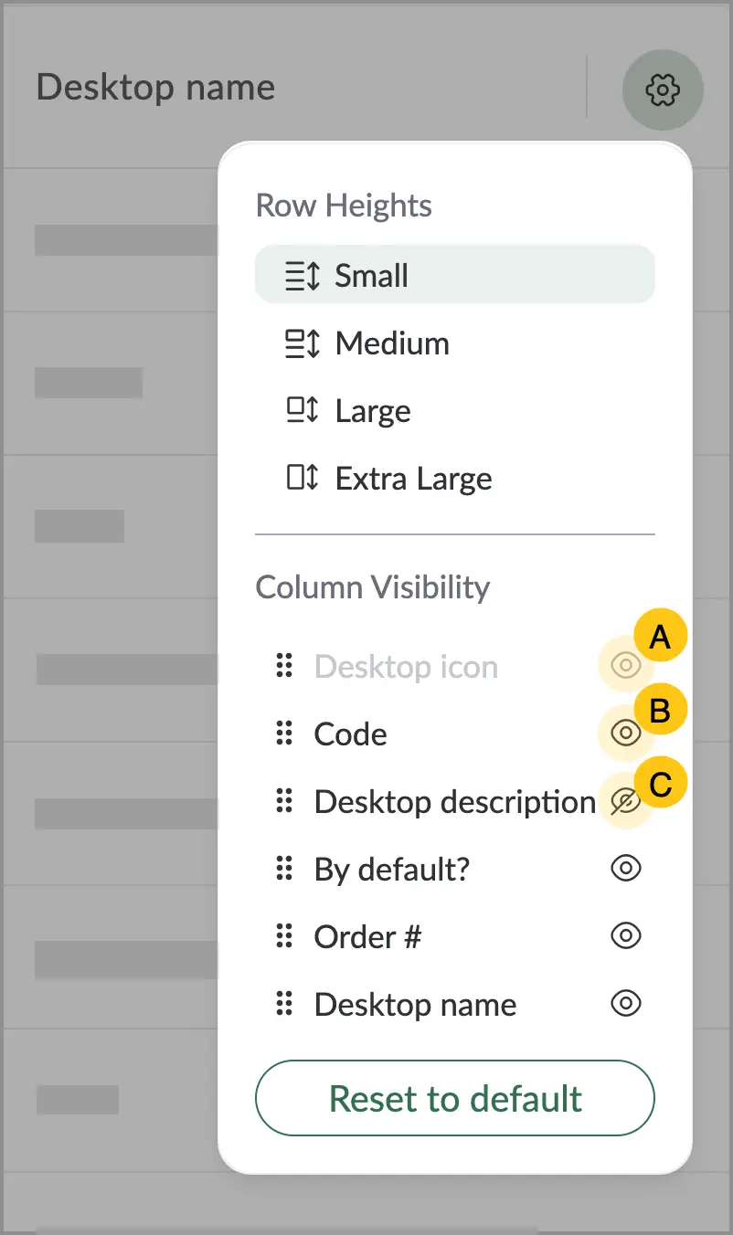
In this section:
- Pinned columns are displayed in gray and cannot be modified in this menu A.
- Hidden columns are shown in regular font and marked with the icon B.
- Visible columns are shown in regular font and marked with the icon. You can hide them by clicking the icon C. See also Hide a Column for an additional way to hide columns.
1.3.3.1.7. Change Row Height
-
Open the required grid whose columns you want to configure.
-
In the upper-right corner, select the icon 1. In the Row height field 2, choose the preferred size:
- Small
- Medium
- Large
- Extra large
1.3.3.1.8. Show Hidden Columns
-
Open the required grid whose columns you want to configure.
-
In the upper-right corner, select the icon 1. In the Column visibility field 2.
-
Select the hidden column you want to make visible.
-
Click the icon next to the name of this attribute.
1.3.3.1.9. Reset Custom Settings
-
Open the required grid whose columns you want to configure.
-
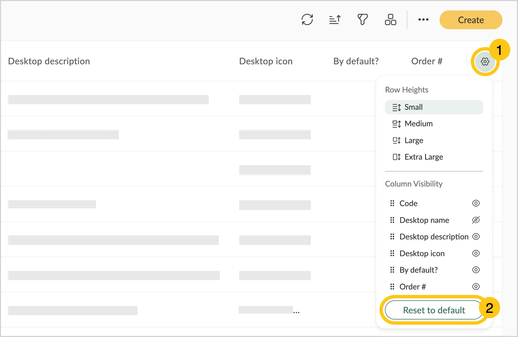
In the upper-right corner, select the icon 1.
-
Click the Reset to default button 2.
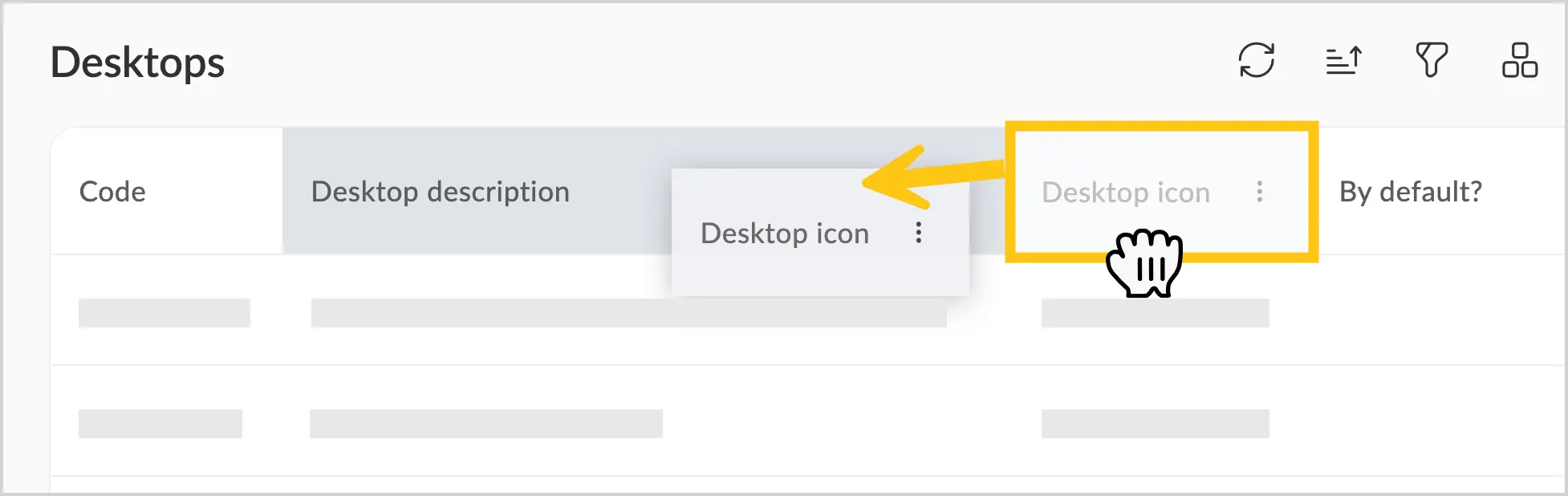
1.3.3.1.10. Change Column Order
-
Hover over the column name.
-
Hold down the left mouse button.
-
Drag the column to the desired position.
1.3.3.1.11. Adjust Column Width
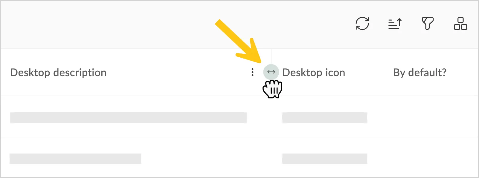
-
To change the column width, hover over the right edge of the column header.
-
Hold down the left mouse button.
-
Drag right or left to set the desired width.
1.3.4. Grid Settings Menu
The settings menu contains the following elements:
-
Refresh — updates grid data
-
Add — adds a new item
-
Open — opens and edits the selected record
-
Delete — deletes the selected record
-
Edit Labels — assigns a label to a document. Available only in Documents grids.
-
Audit — displays the change history of the selected item
-
Show Totals — displays the total number of items
-
Export — exports grid records in one of the following formats: Excel, HTML, CSV
-
View Mode — changes how records are displayed. There are three view modes:
- Table — the default classic view for all shortcuts, where each record is one row of a table.
- Cards — displays each record as a rectangular card.
- Preview — available for both standard and custom shortcuts of the Documents and Tasks types. Opens the task or document form in preview mode upon a single click. See Open a Task in Preview Mode for details.
-
Mass Export — available only in Documents shortcuts if the additional package dfx-mass-export is installed for users with the dfx_massexporter role.
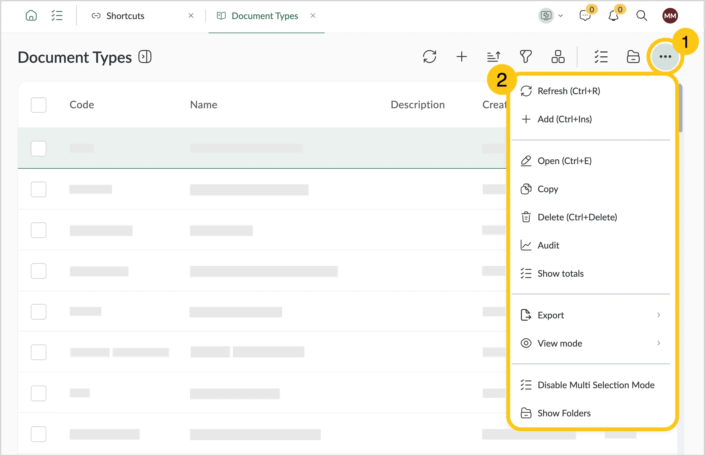
The items available in the settings menu may vary depending on the grid.
1.3.5. Record Context Menu
To open the record context menu, select a record and right-click it.
The record context menu contains the following elements:
-
Open — view or edit the selected record
-
Copy — copy the selected record
-
Delete — delete the selected record
-
Link — copy the link to the selected item to the clipboard
-
Audit — display the change history of the selected item
-
Edit Labels — assign a label to a document. Available only in Documents grids.
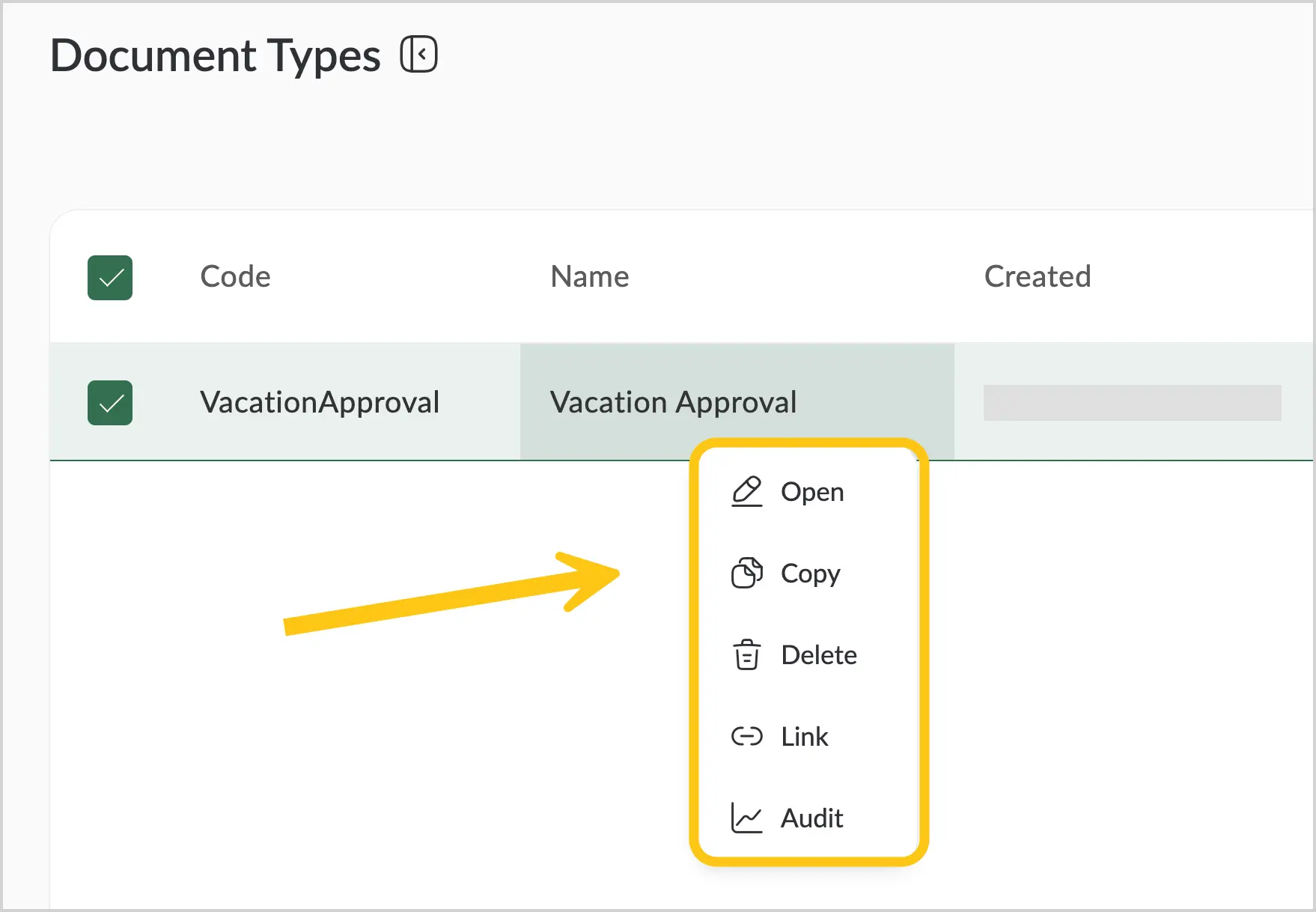
The items available in the record context menu may vary depending on the grid.
1.3.6. Tabs
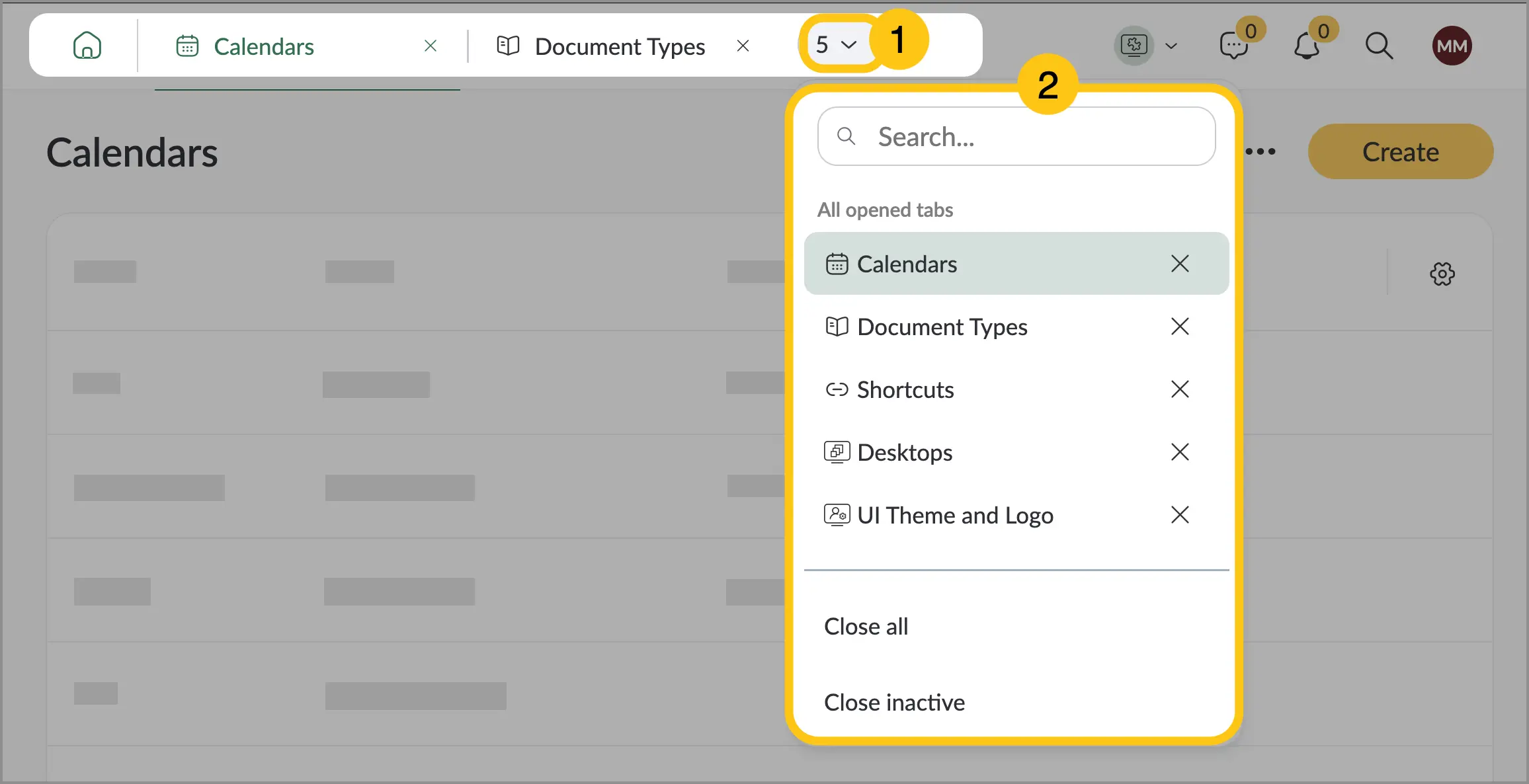
A Tab is a navigation element in the top menu that enables working with records. The system automatically creates a new tab when you double-click a record. In the top menu, you can select the number of open tabs 1 to open the tabs menu 2. In the menu you can:
- Switch between tabs
- Close individual tabs
- Close all tabs
- Close inactive tabs
No more than 20 tabs can be pinned simultaneously.
1.3.7. Folders
Some shortcuts, such as Document Types or Process Library, contain folders that you can create to organize records. This section explains how to work with folders and manage records within them.
1.3.7.1. Enable or Disable Folder View
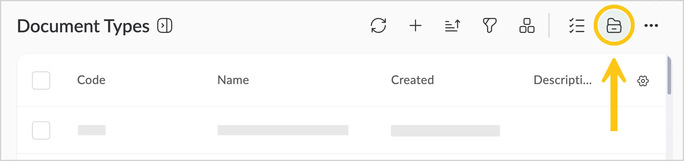
To enable or disable folder view mode, select the folder icon.
1.3.7.2. Create a Record in a Folder
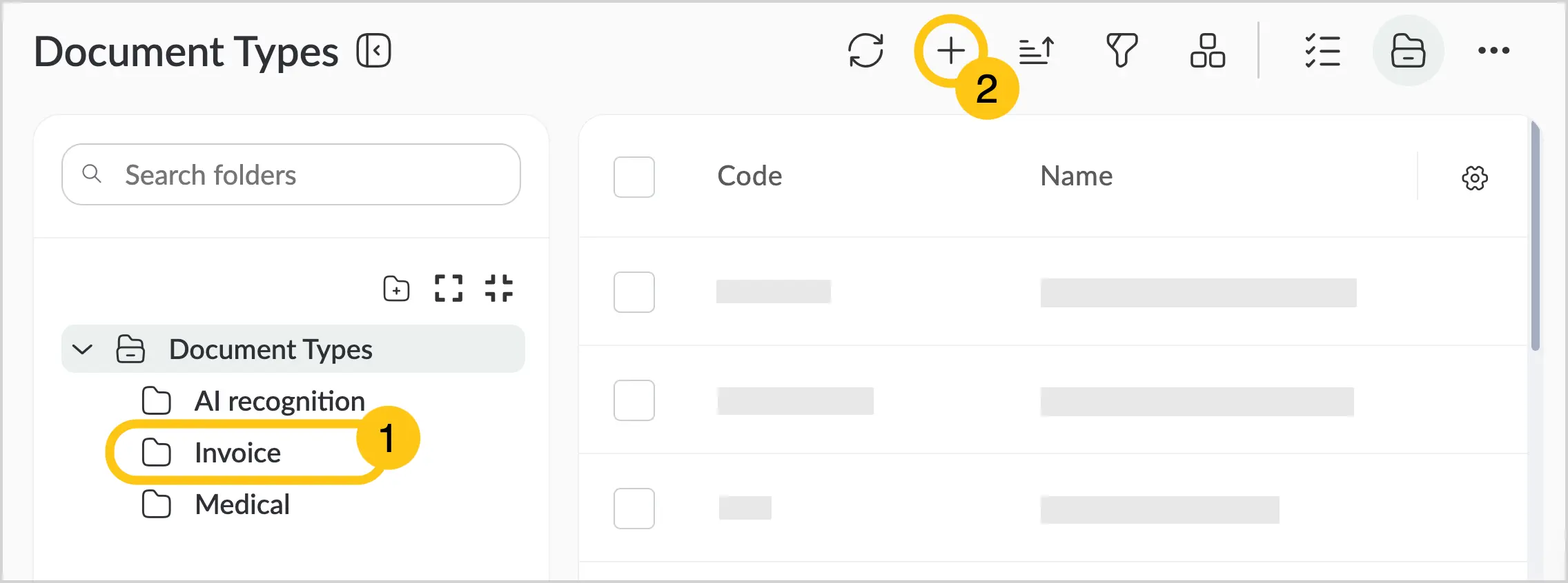
To create a record within a folder, click the folder where you want to add the record 1, and then in the toolbar, select + 2.
1.3.7.3. Move a Record to a Folder
-
Enable folder view mode (see Enable or Disable Folder View).
-
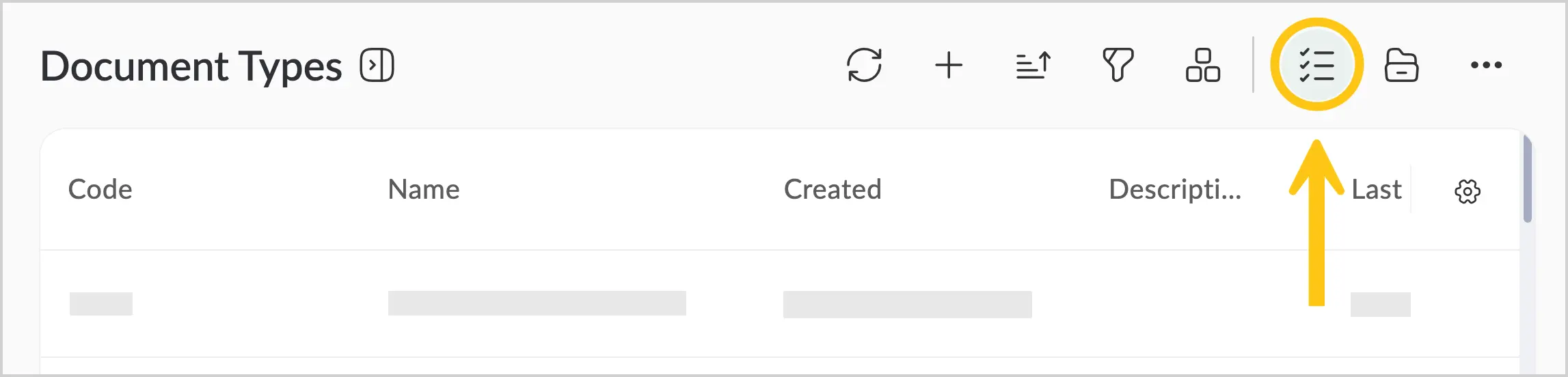
In the top menu, select the icon.
-
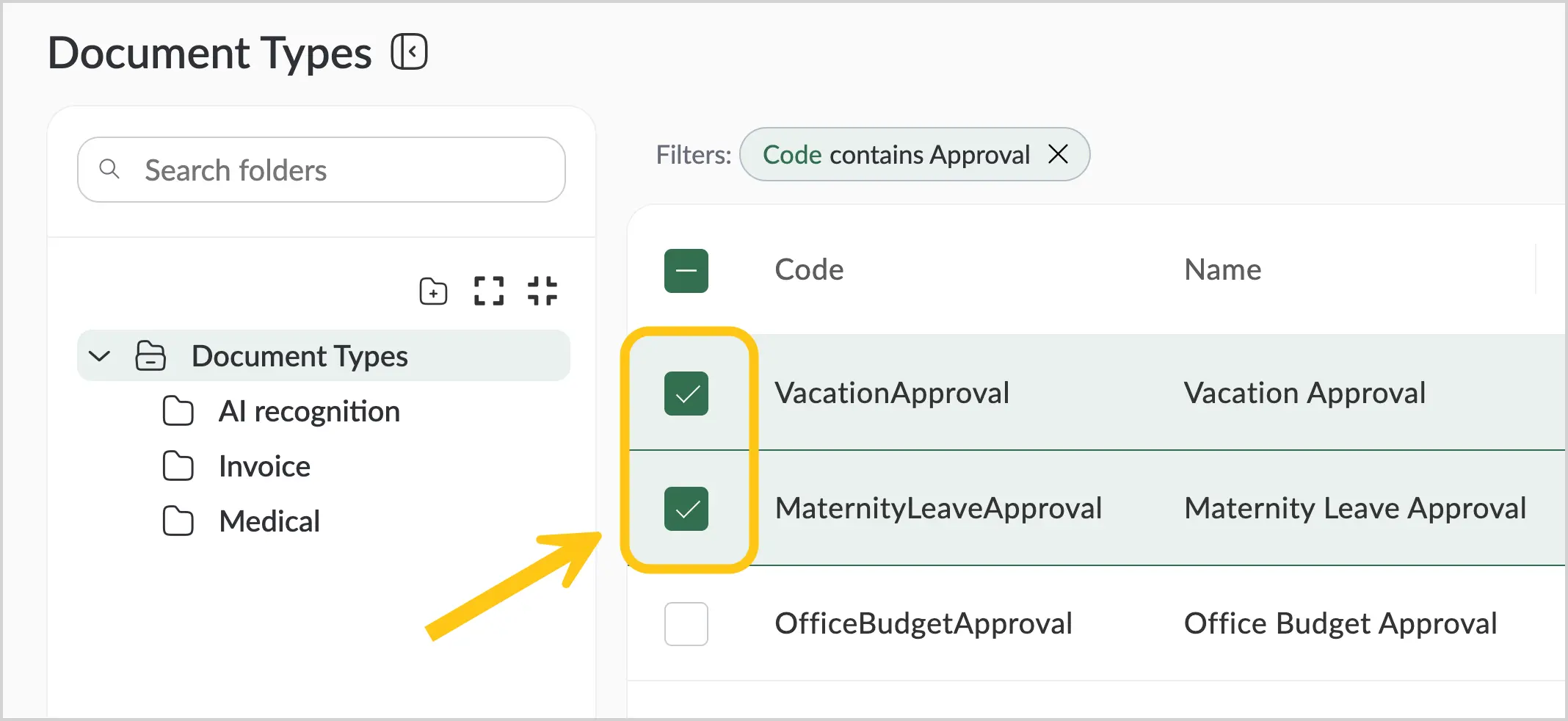
Check the boxes next to the records you want to move.
-
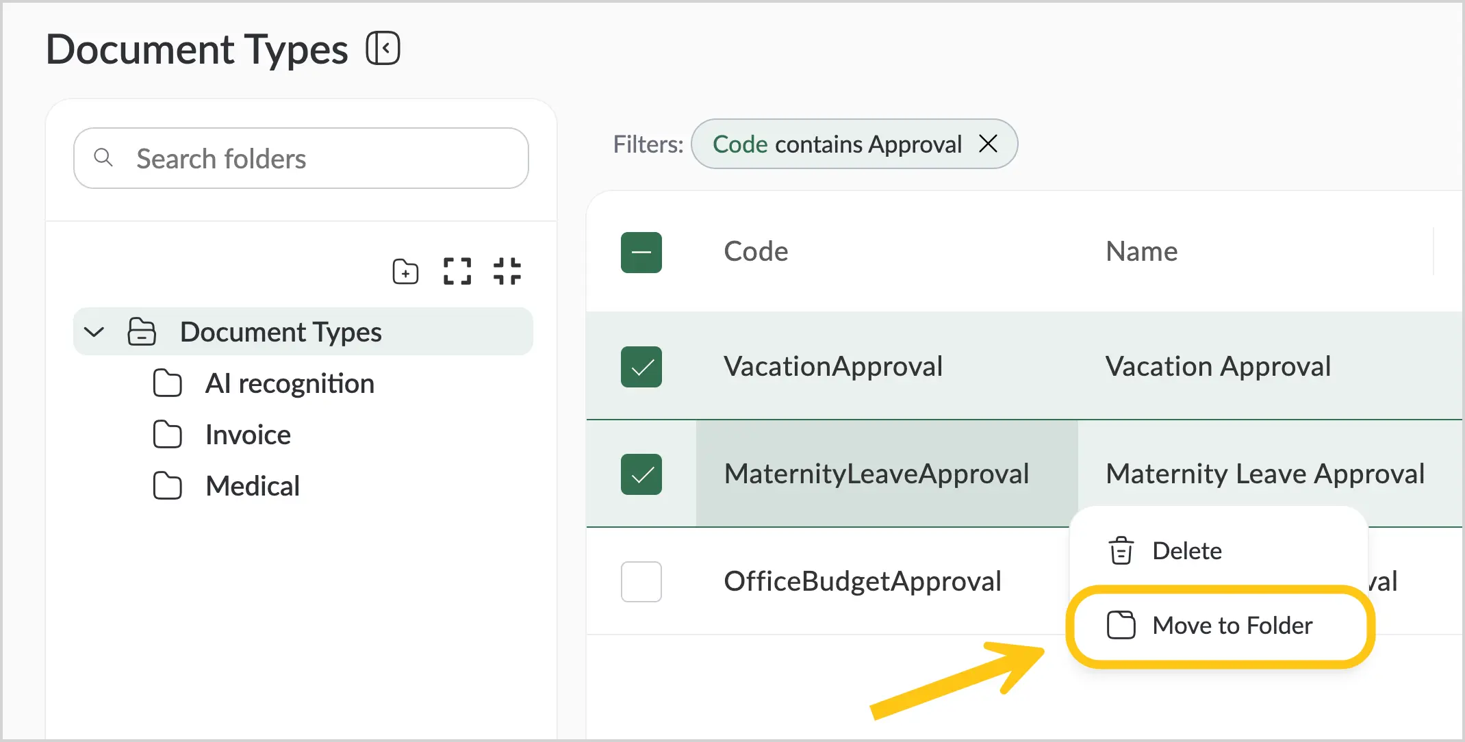
Right-click and, in the context menu, select Move to folder.
or
-
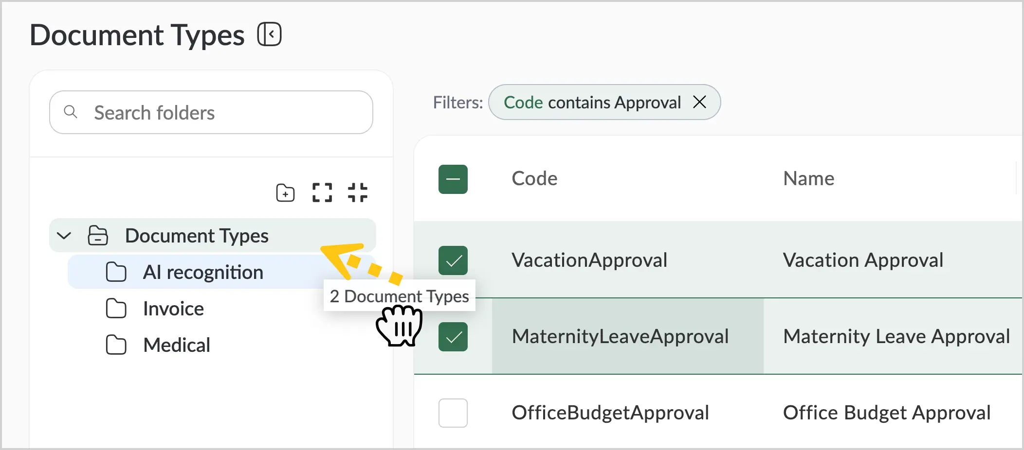
Hold the selected records with the left mouse button and drag them to the desired folder.
-
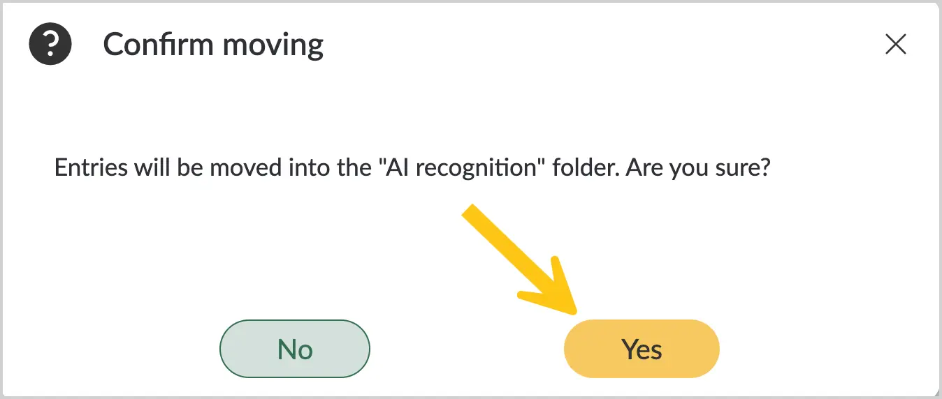
Confirm the move by selecting Yes.
1.3.7.4. Find a Folder
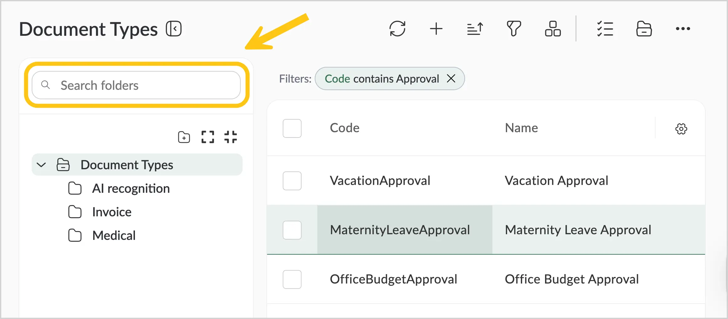
In folder view mode (see Enable or Disable Folder View), you can search for folders using the search bar in the top menu.
1.3.7.5. Create a Folder
-
Enable folder view mode (see Enable or Disable Folder View).
-
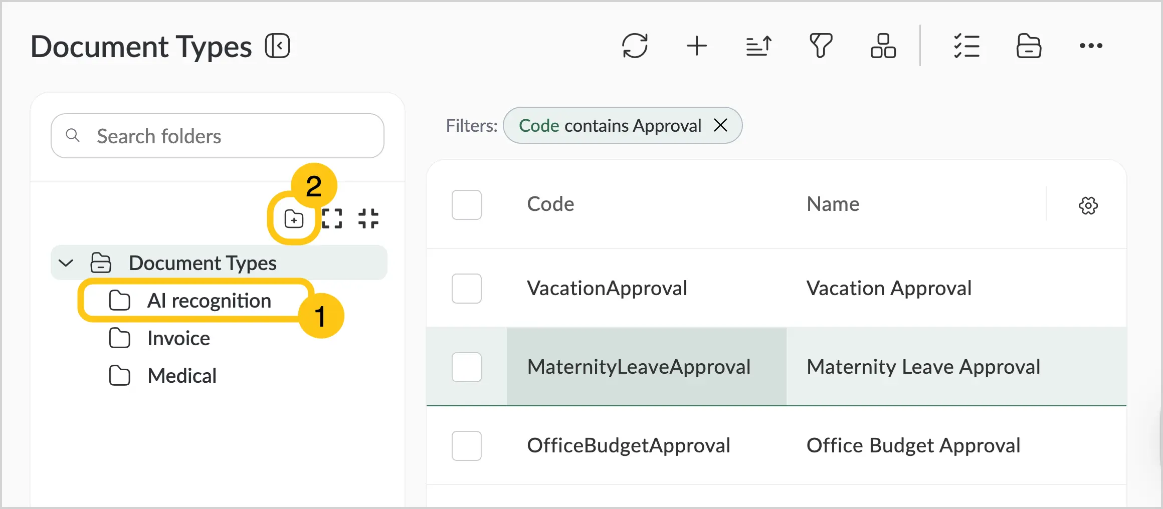
Select the folder where you want to create a new one 1, then select the icon 2.
-
In the Name field 1, enter the desired folder name, and then select Save 2.
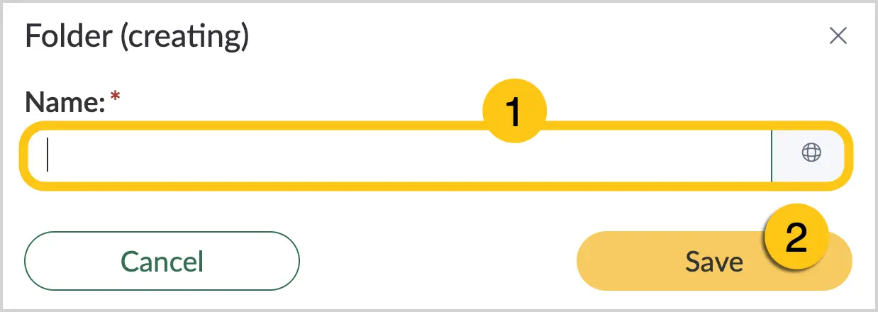
You can set alternative folder names for different languages. To do this, select the icon and fill in the fields for other languages.
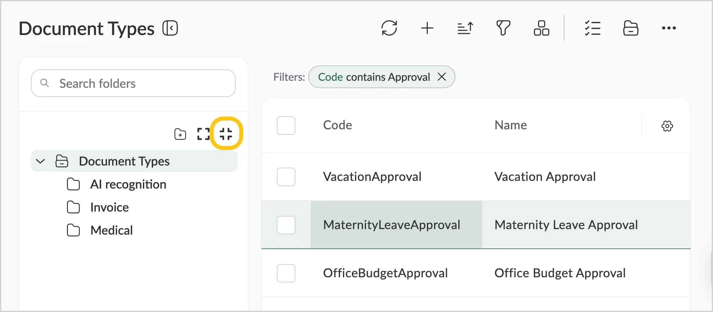
1.3.7.6. Collapse or Expand Folders
You can collapse or expand all folders to show or hide their subfolders.
To expand all folders, in the top menu, select the icon.
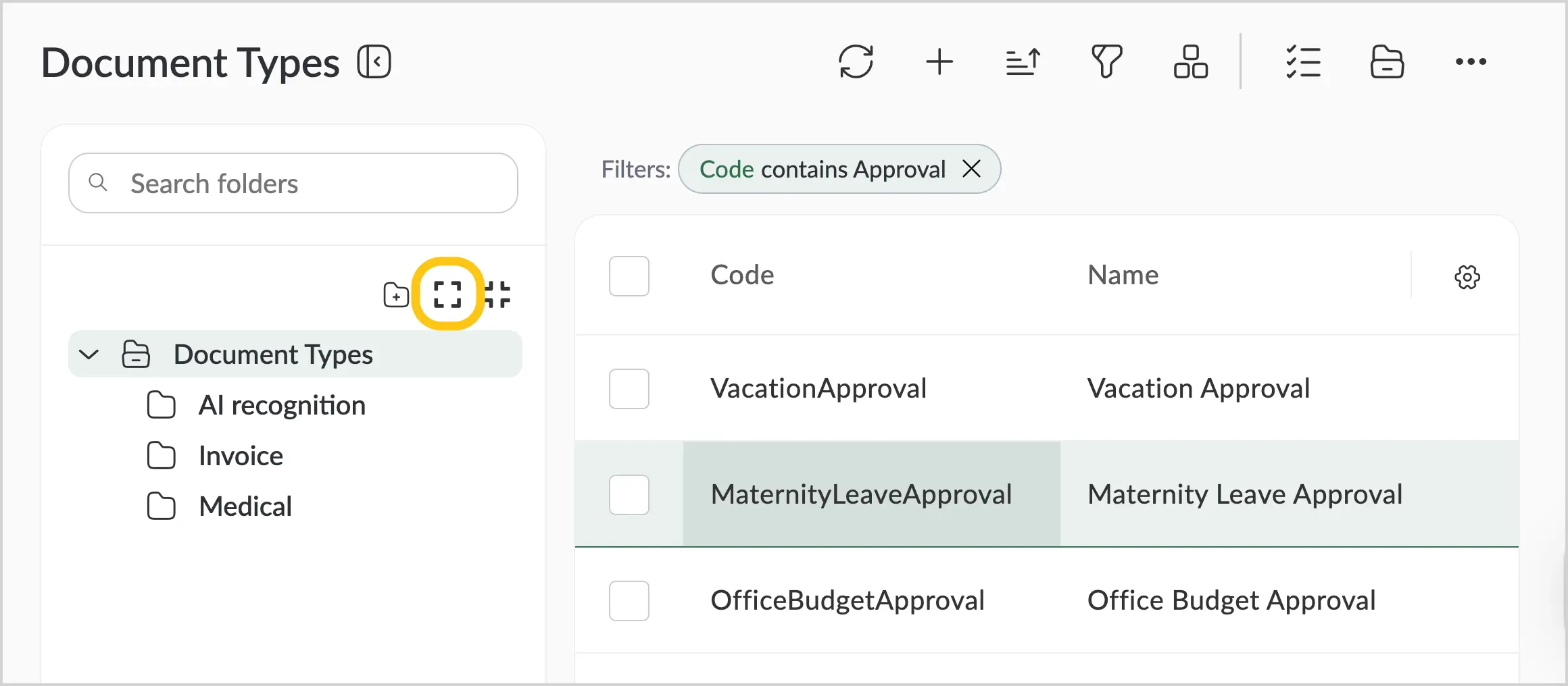
To collapse all folders, in the top menu, select the icon.
1.3.8. Records
Records are the elements that fill the grid table. Almost every shortcut contains records.
You can view, edit, copy, and delete records. You can also copy a link to a record or view its change history.
1.3.8.1. Edit a Record
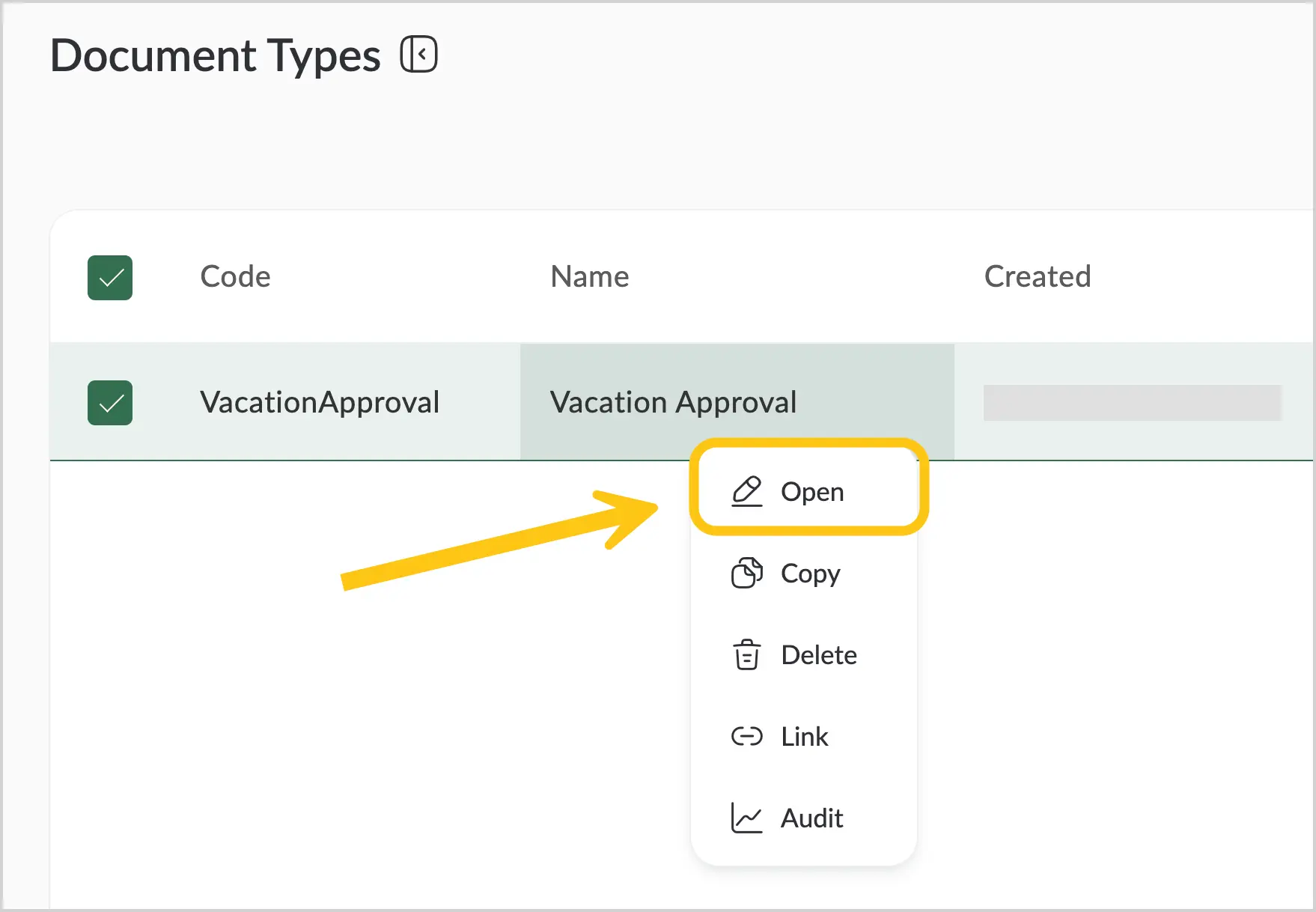
-
Open the record’s context menu by right-clicking the record.
-
In the context menu, select Open.
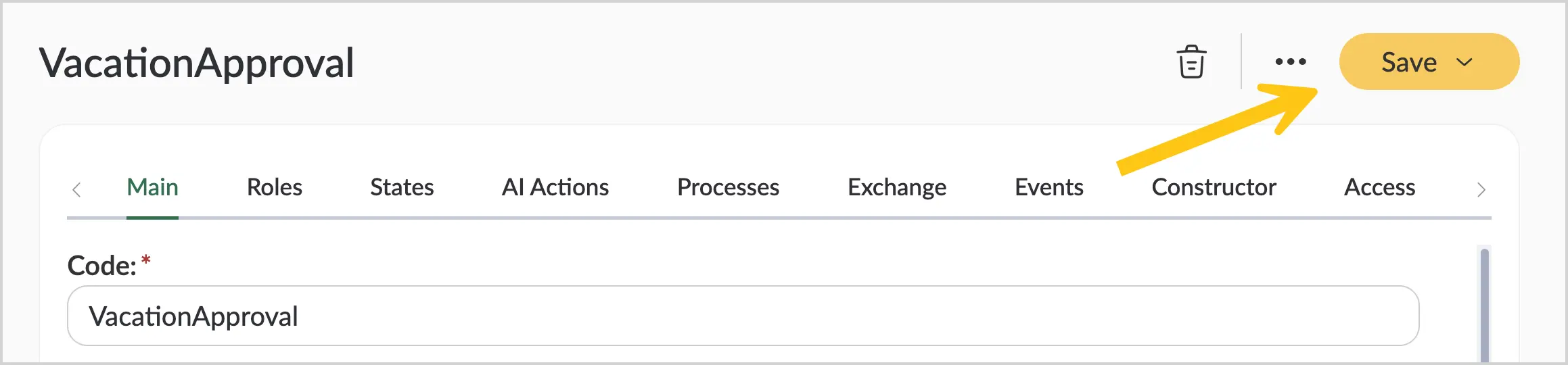
-
Make the necessary changes, then in the toolbar, select Save.
1.3.8.2. Copy a Record
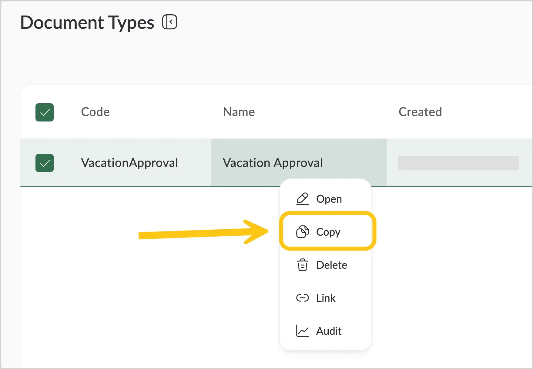
-
Right-click the record to open the context menu.
-
In the context menu, select Copy.
-
If needed, edit the copied record, then in the toolbar, select the Save.
1.3.8.3. Delete a Record
-
Right-click the record to open the context menu.
-
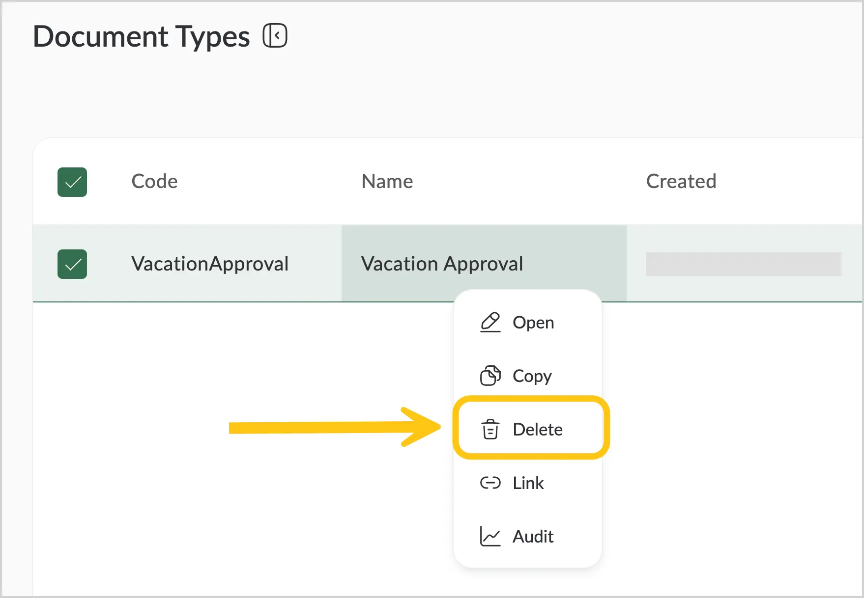
In the context menu, select Delete.
-
Confirm the deletion by selecting Yes.
1.3.8.4. Copy a Record Link
-
Right-click the record to open the context menu.
-
In the context menu, select Link.
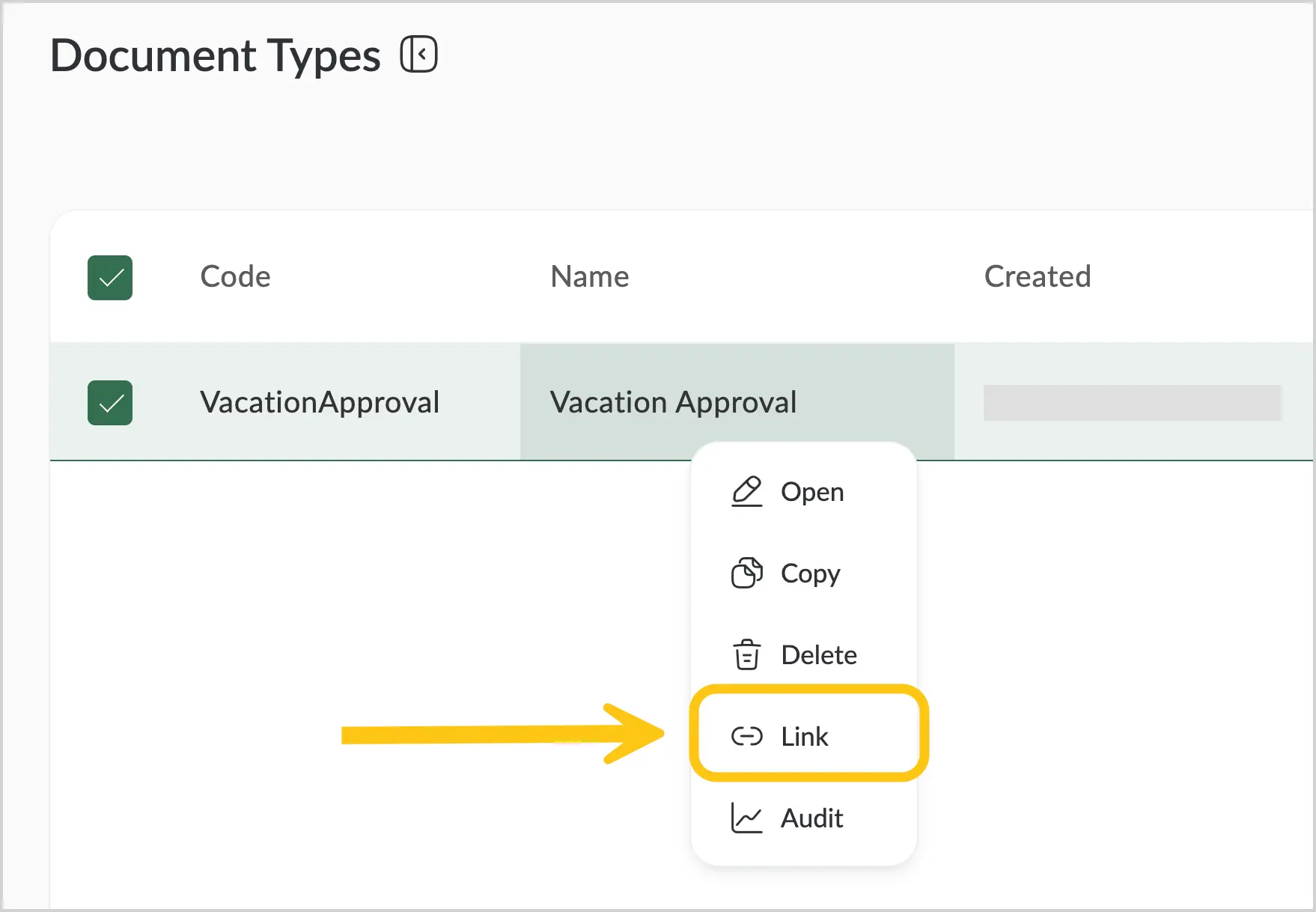
The link will be copied to the clipboard. To paste it where needed, press Ctrl+V.
1.3.8.5. View Record History
-
Right-click the record to open the context menu.
-
In the context menu, select Audit.
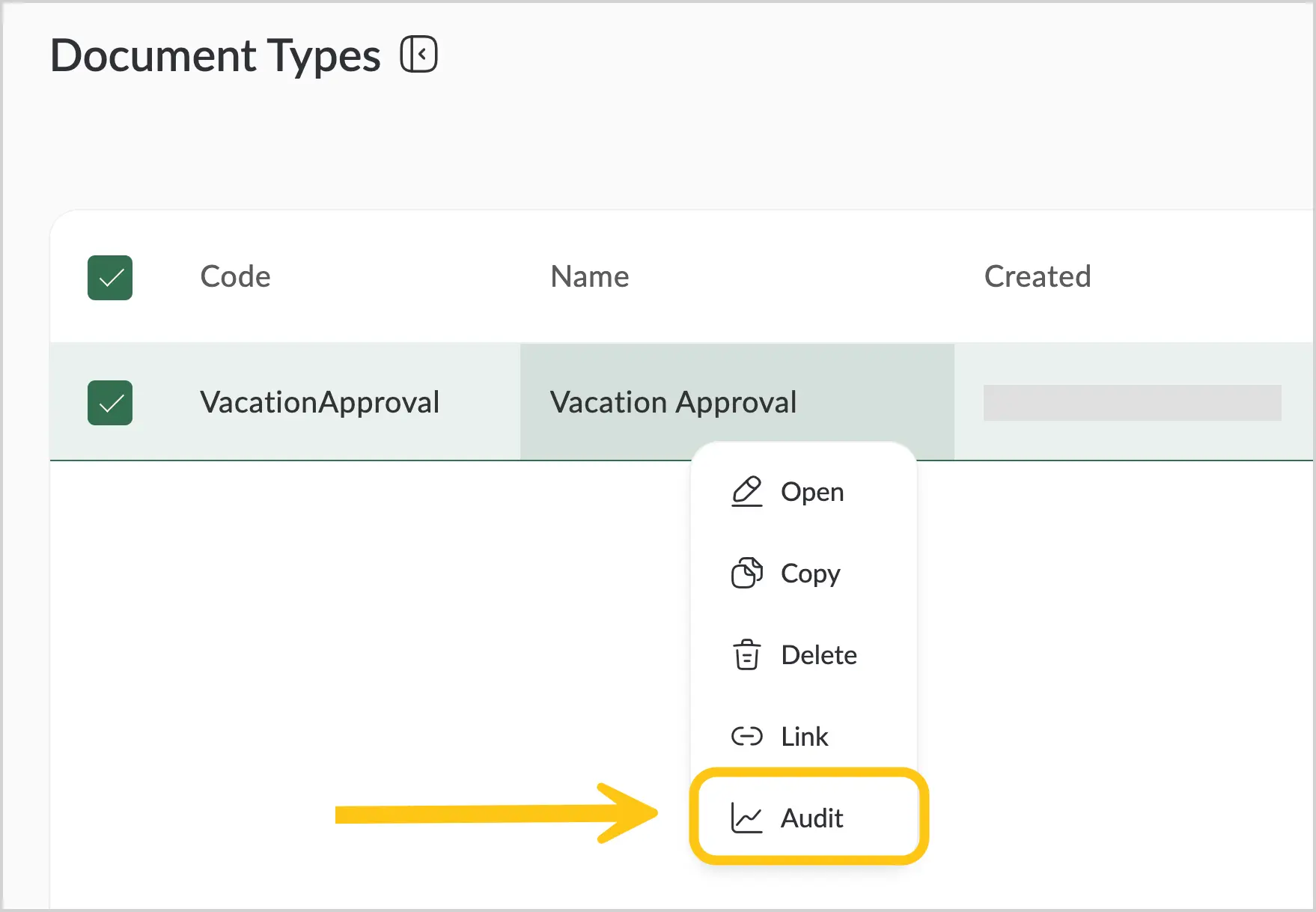
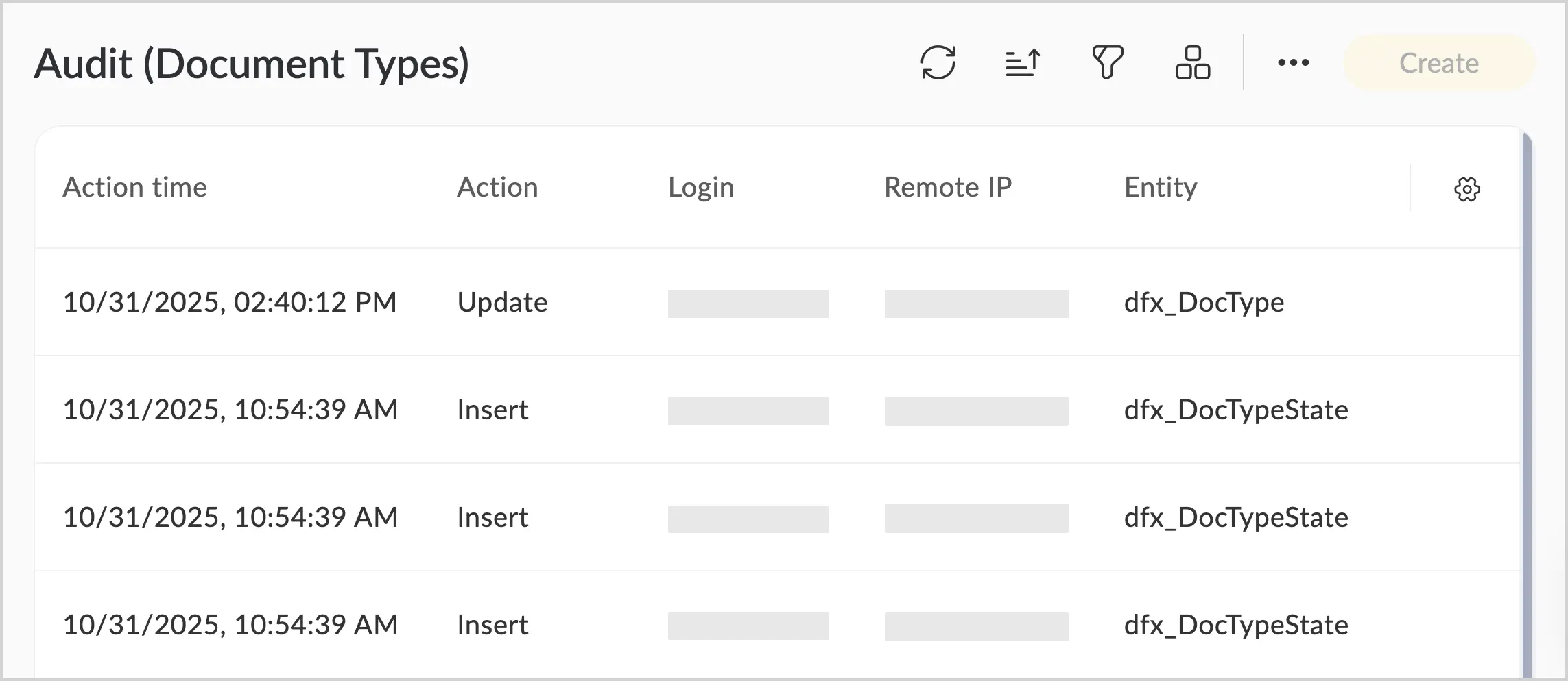
You will see the entire record history with the following details:
- Actions performed on the record
- Users who performed the actions
- Date and location of the actions
1.3.8.6. Select Multiple Records
For some shortcuts, the Multi-selection tool is available, allowing you to select several records and apply an action — for example, delete records.
-
In the top menu, select the icon.
-
A new column with empty cells will appear. Click the cells next to the records you want to select, then perform the required action.
1.3.9. Notifications
In the platform, you can receive notifications. To view them, in the top menu, select the icon.

A window will appear showing notifications for the current day. To view older notifications, select Messages History.
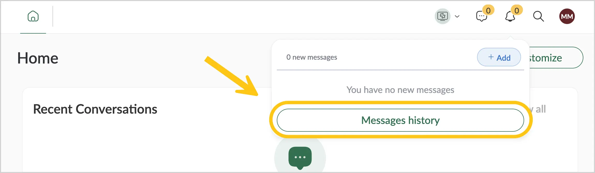
By default, notifications are stored for 30 days.
1.3.10. Buttons
This section selectively describes platform buttons whose functionality may not be immediately obvious.
1.3.10.1. Save a Record in a Grid
The save button for a record in the grid has two variants:
- Save (Ctrl+S)
- Save and Close (Ctrl+Enter).
To configure which button variant is displayed for saving created/edited records on the platform:
- Expand the button 1.
- Select 2.
- Select Set as Default 3.
This setting is stored in the browser, not on the server, so it will be lost if you clear cookies or switch browsers.
1.3.10.2. Copy Codes and Names
When building solutions on the platform — for example, processes or scripts — you often need to use codes and names of roles, actions, events, states, and so on. The button is convenient for this purpose. It becomes available when you hover over a code or name. A single click copies the value to the clipboard.
List of data for which the copy button is available
-
In the document type:
Roles tab
In the Roles tab, the following are available for copying with the button:
- Role name A
- Role code B
- Role participant C
- Participant code D
States tab
In the States tab, the following are available for copying with the button:
- State name A
- State code B
- Action code C
- Action name D
AI Actions tab
Note:The AI Actions functionality is only available when the additional package dfx-IDP is installed.
In the AI Actions tab, the following are available for copying with the button:
- AI action name A
- Action code B
Processes tab
In the Processes tab, the internal process code is available for copying with the button.
Exchange tab
In the Exchange tab, the following are available for copying with the button:
- External system message name A
- Internal code of the external system message B
Events tab
In the Events tab, the following are available for copying with the button:
- Event name A
- Event code B
-
In the task form:
In the Actions tab, the following are available for copying with the button:
- Action name A
- Action code B
-
In the email processing rules:
In the Variables from Letter tab, variable names are available for copying with the button.
1.3.11. Login Page
It is possible to choose alternative login page options. Changing the login page can be done upon request through the implementation team.
The following login page variants are available:
-
Standard login page — contains fields for entering a username and password, as well as a login button. This is the page used by default.
-
Domain login — domain login is performed using SSO (Single Sign-On), which allows users to access the platform using their corporate credentials without re-entering a password.
-
Open ID login — it is possible to log in using, for example, Azure or Google.
All these options can be combined, meaning a single platform can have all three login options available, and users can choose the method that suits them best.